Making Of
The Making of The House in the Woods
NOTOS from Argentina has an detailed new tutorial on the making of their recent House in the Woods scene.
Visit the NOTOS Facebook page to see more of their work.
A Brief Introduction
We created this image with the help of all the members of the studio in a period of seven business days. Everybody gave something to the project, and that is what made it really special.
Notos art direction for this pic
This is an image we created for an Argentinian studio named www.estudiobabo.com.ar. It is a house designed for a midle aged couple for their second marriage. The first thing that came to our minds was Autum, as an Autum in life. We decided not to portrait any human figures in this image, it had to go deeper in the feeling we wanted. Another very important point was that the architects made a very strong request in the character of the brickwork, it had to have the same tones as the trees, since the colors and the way the bricks locked to each other was an attempt to make the house a part of the landscape.
First thing for us was "how do we find this idea of autum, besides just leaves on the ground?"
We found some pictures that helped us find our way. It was about colors and mood, and then it was about finding some way to create a narrative through light but trying to avoid cliche, which is always very hard.
A very important source of inspiration colorwise and lightwise is fashion photography, we try to go around architectural photography only to go back to it in the end. Here are some pictures we liked and tried to keep in mind throughout the process.

Altera-by-Virginie-Plauchut

Forest in belgium

Scott-Morgan7

Paula-Pire1
3ds Max scene general settings
Let start with the basics on the scene: 3ds Max 2012, V-Ray 2.0

Scene setup

Sun parameters: We used a vraysun even though we had a vraydomelight, because we needed to get the shadows proper really quick and vraysun was way faster for us than moving the domelight.

We used a dome light with an HDRI to get the overall look of the image.

HDRI Settings

Fill light

We’ll try to show you some of the different modelling and texturing tools we used.
HOUSE & BRICKS
The house was modeled brick by brick. We created 5 different bricks (some minor changes on their shape to have an “accurate real aspect”). We used classic modifiers like: connect, chamfer, turbosmooth. Nothing difficult. Then we made proxies of each one them.
Here´s a capture of the 5 proxy bricks:

All the randomized bricks in the scene in “display as box” mode.


Diffuse texture for the bricks downloaded from CGTextures.

Brick Settings

We used a Blend Material: Brick material as “Base Material” and 2 different dirt materials as “Coat Material”
Dirt 1

Dirt 2: VRay Distance Text for the low sector of the brick walls.


Here´s the Vray Distance Text Parameters
The Vray Distance Text was linked to an invisible perimeter line (orange color) to the house to achive the moss effect near the ground.

THE METAL
We used a simple blend material with a dirt mask to make the dirt.

Metal material Parameters as material 1:

DirtTexture as material 2:

Black & White texture as a Dirt Mask:

EntireShot:

The Trees
First we made a simple mesh in 3ds Max and exported it to Zbrush. We used basic tools in Zbrush like pull, push and smooth, and we came up with this:


Back in 3ds Max, they looked like this:

The Branches
To create the branches we used one of the newest 3ds Max modelling tools: freeform-branches:

We basically got a number of planes and created branches out of them.
The process is something like this:
Plane must be an edit poly

You apply freeform branches

The freeform is going to create a branch out of any face you choose. Something like this:


We applied materials, and voila.


The trees were quite tricky to unwrap, here is the texture:
Diffuse

Normal bump


The unwrapping was really basic, just a scale in the texture.
MULTISCATTER
On this part of the “making of”, we will explain what techniques we used to create the groundcover and the little plants that grow from the trees.
We used Multiscatter plugin from iCube.
GROUNDCOVER SCATTER
We used several proxy objects in every scatter.
This is a top view of the scene, showing all the MultiScatter and MultiPaint dummies we created. You can also see the house in the middle of the terrain, and a little piece of road on the left. The big brown rectangles are the background trees, and the small green rectangles are the trees that we see in front of the camera.

We used seven different pine cone models to create this scatter. You can see the settings we used on the right side of the image.

We used six different leaf models to create this scatter. You can see the settings we used on the right side of the image.

We used a hedge all around the border of our terrain to prevent viewing the horizon line of the scene. You can see the settings we used on the right side of the image.

We used five different types of branches to create this scatter. You can see the settings we used on the right side of the image.

TREES SCATTER USING MULTIPAINT
To add realistic detail to the tree trunks, we used the Multipaint feature to paint a variety of little types of plants. We used leaves, clovers, grass, etc. You can see the settings we used on the right side of the image.


You can see here an isolated top view of all the scatters.

This is a wireframe view showing all the objects we used to create the scatters. They are a total of 45 objects; you can count them if you don’t believe us. ;)

Some renderings of the scattered objects: Grass and little plants.

Some renderings of the scattered objects: Dry groundcover, Pine cones, leaves, clovers, etc.

Some renderings of the scattered objects: Medium size branches.

Some renderings of the scattered objects: Large size branches.

After all this, the render was ready to go.
Settings


LAST BUT NOT LEAST - PSD
It took a bit long, with a lot of layers, blending modes, render element lay outs, color correction, etc.
Here, the details…
RawRender

Background Added

Some Color Correction to the background.

Now, some contrasting curves.

Ambient Occlusion (in soft light mode) added only on the bricks.

Specular render element in screen mode (it gives highlights to the materials like bricks, grass, metals)

Raw lighting render element in color dodge mode (see the difference between this image and the last one, you can see now the trees and the grass a lot more illuminated).

Reflection render element in soft light mode (observe the metals)

Shadow render element in color dodge.

Raw reflection render element in Soft Light.

Now we added some minor curves, color balance and levels.

Contrast to the interiors windows using curves, it gives a “warm feeling”.

Hue Saturation to the grass (less color & less green)

Same color balance, curves and saturation to the background.

Glow effect to the interior lights using flares in screen mode.

Some flare textures we used in screen mode.

For the trees, we use a regular bark texture downloaded from a generic internet site. This is used in overlay mode in order to achive the imperfections of the tree´s bark of every tree in the scene.

Just put it in overlay mode and…voilá.

Now photo filter in sepia mode to give a “light-brown effect feeling”

For the dirt metal, we did the same process as for the trees.

(Zdepth render element to give the “fog effect” especially in the background.

Some curves again

Dirt texture added to the windows.

Soft light mode.

SUN RAYS
We used “Digital Film Tools Rays v1.01” software which is very easy to use. All you need is your ability to understand how the sun rays work in a place like the scene we did.
Just follow these steps:
Merge all your layers in another PS file.

Add contrast and curves, try to make an image like this:

Once you get your “black & white” version of the image you are ready to use the rays tool. Goto FILTER, DIGITAL FILM TOOLS, RAYS V1.0.

It´s easy to use. All you have to do is try different settings like ray length, amount, opacity, brightness. You'll get something like this:

Now, you can use this very image as a render element in screen mode and you´ll get the GOD RAYS!

Some birds added in the foreground.

And the last tweeks, vignetting, color balance and black and white filter in overlay mode which gives more contrast to the overall image.

AFTER EFFECTS
Dust
For dust particles we used After Effects and Trapcode's plugin from red giant. The first and most important thing is a thought and preparation for animation. As we are making a still image it is necessary to be very careful with the time of setting the parameters. First we flatten the image that is going to serve as the reference. Given the complexity of the settings and the artistic treatment that the image requires, we are going to make three layers of dust. One on the foreground (that is going to be blurred) and others for the light cones (that are going to be in center). It is going to have two differences, the amount and the size, since some dust particles are closer than the others.
Close up of dust particles


For the foreground layer, we use an After Effects camera so we can control deblur with the camera options.

FOG
We isolate and extract the alpha channel from Photoshop. We will use it as a mask.

For the fog we used After Effects' turbulent noise effect.
First we are going to make a luma with the mask we extracted from Photoshop.

We are also going to make 2 layers: one for the forground, on the ground, and another one for behind the house. Because one is closer than the other, the difference is going to be the scale.
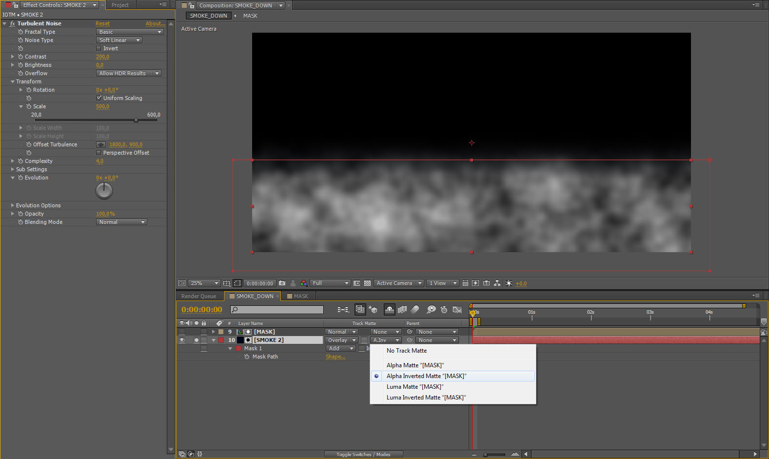

All these elements will be exported as separate layers, in black and white, for later use in Photoshop.
Splashes on the lenses
To add an analog look we are going to use these 2 images, which we took from the optical flare video copilot site.

And as you well know, after all this, we blended the layers. We came up with here, with our already really large Photoshop file, and the result was this:

We hope youve enjoyed it!!
See you soon!







About this article
NOTOS from Argentina has a detailed new tutorial on the making of their recent House in the Woods scene.


