Interviews
Transparent House Reimagines Sutro Tower in San Francisco
Can you tell us about Transparent house, how you got started and the type of work you specialize in?
Transparent House is a creative agency based in San Francisco, with offices in Moscow and Los Angeles. We specialize in photorealistic CGI and live action VFX for both real estate and product marketing & advertising. TH was founded in 2004 to address the lack of high quality architectural visualization that was available to real estate developers in the early 2000s. but our services quickly expanded focus to 3D animation and product visualization. After 2010, Transparent House began producing live action video, and, in 2014, added an Interactive Department, specializing in Application Development and Virtual Reality.
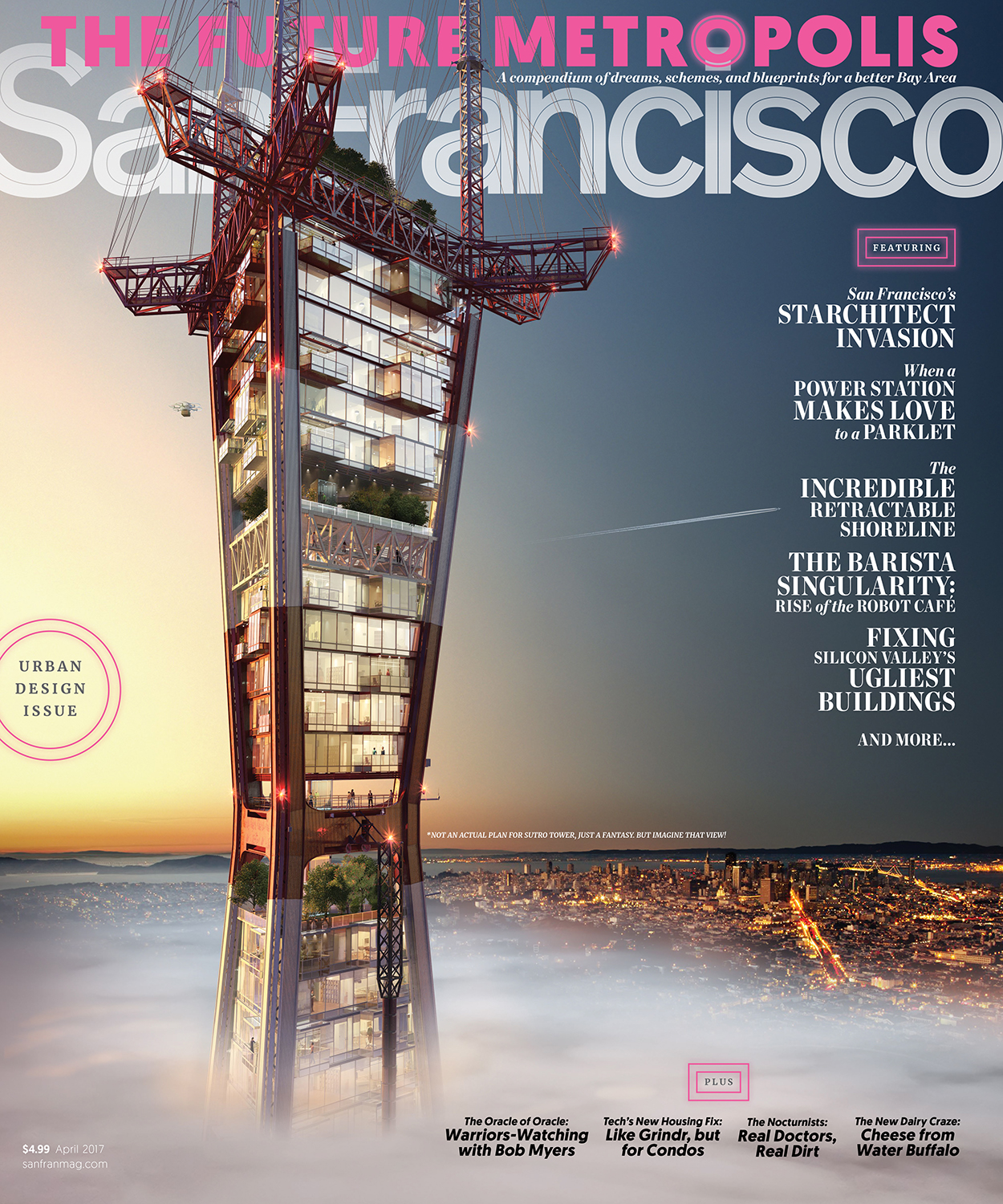
Transparent House recently landed the cover of San Francisco magazine with an audacious image of a re-imagined Sutro Tower. Can you tell us a bit about the internal project that landed you this coveted spot?
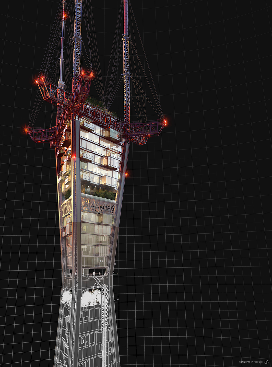
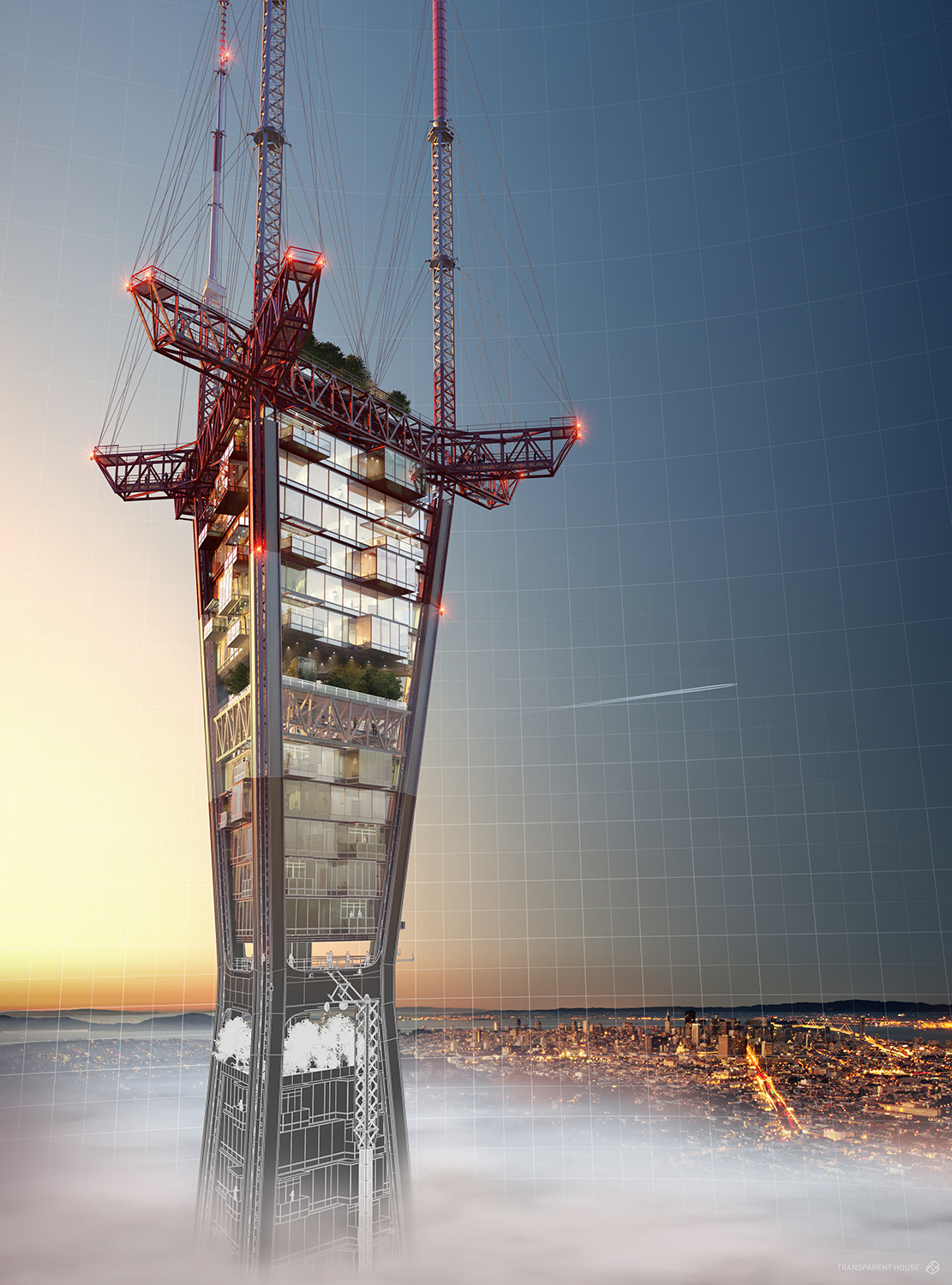
In 2016, we conceived an internal marketing campaign that we called “San Francisco Reimagined.” It was predicated on the idea of transforming iconic SF landmarks into fantastic alternate realities – the TransAmerica Building became a wind farm, Alcatraz became single family homes, and the Sutro Tower became condos. We also did Coit Tower as a giant Christmas ornament. The concept may owe its origins to an original Virtual Reality greeting card that we produced for the 2015 Holiday Season (the first known commercial VR Holiday Card ever produced) where we strung the TA Building in holiday lights.
Can you tell us a bit about the backgrounds of the artists who worked on this project?
Hideki Kawata (Lead Artist) comes from a industrial design and engineering background where he used to design energy efficient lighting fixtures. After completing his graduate degree in Europe, he shifted gears and joined the gaming industry for a few years to develop games for the web and mobile devices. He now leads the technical development of VR at Transparent House and enjoy's fusing his industrial design and gaming experience to develop immersive experiences.
I can imagine the reaction of the developers for the properties you re-imagined and the public in general must have been quite shocked? Any funny or unexpected opinions coming your way?
Haha. Well, yes, actually. The owners of the TA building actually called me (David) one day and prefaced the conversation with something along the lines of ‘Don’t worry, we’re not going to sue you, but we want to talk.’ Turns out they had seen the ad and thought it was pretty cool. They came by our office and we discussed some great ideas for future projects.
As this was an internal project, what was your ultimate goal and did you succeed?
We wanted to leverage our expertise in 3D Visualization to send a message to the greater Bay Area creative community and our clients – that not only are we experts at what we do, but our DNA is deeply woven into the fabric of San Francisco…and we have a sense of humor too. The idea was ‘come to us and we’ll get creative and help you push the boundaries on your marketing campaigns too’. I feel it was absolutely successful in that we ‘stirred the pot’ a bit, getting a lot of positive feedback from clients & peers, as well as some negative feedback from critics who were uncomfortable with the idea of turning the tower into condos! I feel if the response is strong, positive or negative, you have done your job. There’s nothing worse than a ‘meh’ when it comes to advertising…
Can you walk us through how you decided up on the designs you did of each iconic piece of San Francisco architecture?
Main objective for each concept was to preserve the iconic form factor of each landmark while adding elements to make the use case unique. For example, we worked on Sutro Tower by setting certain geometric constraints for framing. We accurately modelled the Sutro Tower first then worked within the framing to add supporting elements for the condo, green roof, and observatory areas. A similar approach was taken for Transamerica Pyramid and Coit Tower. For Alcatraz, we modeled the existing island topography, blocked in the pre-existing prison structures and surrounding infrastructure first. We then built roads and plates for the homes to be built on, imagining a functional island.
Looking at each image, there was obviously very careful thought into the composition, grading and lighting. Can you talk us through some of the things you were focusing on and artistic details that were most important to the success of the image?
The first step was to create a highly detailed model of the concept, taking into account the smallest of details (bolts, brackets, etc.). The second step was situate the model in its environment and really dial in the camera angles to get a good balance in composition. The third and most important step was focused on lighting the scene, working on a variety of HDR's and fill lights to get good defining shadows, highlights and chromatic contrast. Texturing the model came last, where we baked in normal maps and created layered materials for final rendering.
What was the most rewarding and most challenging part of this project?
Challenge: Re-Imagining each landmark structure within acceptable / physically feasible bounds while still respecting the look, mood and feel of each iconic form. Each structure had to be recognizable yet look unique enough to look different but not too unrealistic. Reward: It's always the same for any creative project: Seeing our ideas come together to create a reality that does not exist that ultimately sells itself creatively.
Any there any plans to continue the series or use the models for another campaign?
Well, San Francisco Magazine came to us earlier this year because they loved the image of the Sutro Tower from our campaign and ended up using it on their April cover. Beyond that, we don’t have plans for the models right now.
Do you have plans to do this type of marketing campaign again? Any hints as to what we might expect next?
At Transparent House, we are always thinking of ways to push the boundaries, regardless of the media. Today it’s (still) print & broadcast, and now we have Virtual Reality. Tomorrow it will be something different. Because good creative is always our focus, any way you slice it technology-wise, we will always strive to shake things up. I’d say keep your eyes peeled for more non-traditional entries in the real estate marketing video sphere, some exciting interactive product marketing campaigns leveraging VR, and a few fun OOH deployments this year!

About this article
Transparent House Reimagines Sutro Tower in San Francisco


