Reviews
QA Graphics Uses CINEMA 4D to Help a McDonald’s Franchise Tell the Story of its Green Building

QA Graphics Uses CINEMA 4D to Help a McDonald’s Franchise Tell the Story of its Green Building
Most eco-friendly building materials don’t look much different from traditional ones, so people often can’t tell they’re looking at sustainable, green features when they see them. To help raise awareness about all that goes into a green building, Ric Richards hired Iowa-based QA Graphics to create an interactive, in-store educational tool when his company, The Richards Advantage (a 20-year-old McDonald’s franchise organization in North Carolina), opened a new restaurant in Cary, North Carolina earlier this year.
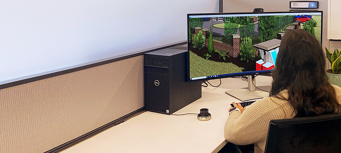
The Energy Efficiency Education Dashboard (EEED), as it is called, makes it easy for McDonald’s customers of all ages to use an LCD touch screen displayed in the lobby to explore the exterior and interior of the new restaurant in 360-degree view. One of many EEDS QA Graphics has made for clients since 2006 using a combination of MAXON’s CINEMA 4D and Adobe’s Photoshop and Flash, the dashboard offers viewers a virtual tour of the restaurant. Blinking icons on surfaces throughout the spaces can be touched to reveal deeper explanations of energy-efficient features, including LED lighting, Solatubes (which allow in natural light) and electric car charging stations, as well as details about fixtures and recycled countertops and flooring. The various graphic overlays and pop-ups were designed in Adobe Illustrator; interactivity was programmed in Flash.

3D Developer Marc Emmert used the Xfrog plugin for CINEMA 4D to create the realistic-looking trees used in the restaurant’s landscape.
After being introduced to Richards by the architect working on the new restaurant, QA Graphics (www.qagraphics.com), a computer graphic development company specializing in building automation design, gave Richards a questionnaire on what had been done inside the building. Once that was filled out, everyone worked together to come up with the best way to tell the story. “It was our idea to do the interior 360,” says Dan McCarty, owner of QA Graphics. “Ric said he wanted it to be a showcase piece, the best possible thing we could do.” (In recognition of their innovative EEED design, QA Graphics received Building Operation Management magazine’s 2009 Top Product Award (http://www.qagraphics.com/about-us/awards-recognitions).

Once the 3D and graphics were completed, Michael Saathoff, Q A Graphic’s interactive design manager, used Flash to create the dashboard’s interactive interface.
Richards at first thought he might need to put up a sign to tell customers they could touch the LCD. Instead, he remains amazed by the number of people who stand in line to get a chance to use the dashboard. A big reason for this is the high quality of the graphics. Marc Emmert, QA Graphics 3D developer, began his work by importing the architect’s models of the building (made with Autodesk Revit) into CINEMA 4D. “This really helped save the client time and money because we already had the 3D skeleton we needed for the structure,” says Emmert who, along with the rest of his team, uses the Windows platform. (See the online demo of the dashboard here: http://www.qagraphics.com/mcdonalds/).

This model of the lobby, which includes one of two LED screens for continuous television broadcasting in the restaurant, was made from reference photos shot by the architect of the finished space. A 3D floor plan in the lower-right corner helps customers understand how to navigate the interior.
While the planning phase of the project began two months before the deadline, Emmert had just three weeks to model, texture, paint and animate interior and exterior scenes while Michael Saathoff, interactive design manager, used Flash to make the dashboard’s 360-degree rotation navigable. Rendering was done using NET Render. “We’ve switched entirely to C4D for 3D because we think it’s easier to use than other 3D software,” says Emmert, who learned how to use CINEMA 4D while earning his fine art degree at Iowa State University. “NET Render speeds up the process of all of our projects and makes our pipeline so much smoother because we can go back and forth between programs so easily.”

Emmert used an architect’s model of the structure (made with Autodesk Revit) as the basis for the project in CINEMA 4D.
Because the dashboard needed to be ready for the restaurant’s grand opening, Emmert modeled interior scenes using C4D as soon as he received photographs of each finished space, as well as drawings that included furniture placement, from the architect. A thick folder of reference images of many of the products that were used in the interior also came in handy.
In the restaurant’s bathroom, which included several blinking icons customers could touch to learn about tile made from recycled materials, as well as a water-saving urinal and energy-efficient hand dryers, Emmert focused on creating soft shadows using global illumination. “It was really nice how easy it was to set up reflections with CINEMA 4D, too,” he says. For the bathroom tiles, Emmert created a material that included color, reflection and other elements of the tile’s appearance. He also included a grayscale map in the displacement channel to create the indent for the grout between the tiles.
The bathroom tiles were created with a material that included color and reflection information, as well as a corresponding grayscale map in the displacement channel to create the indents for the grout between the tiles.
Most of the painting and texturing was done with Photoshop, which Emmert has used for several years. But for landscaping, he chose BodyPaint 3D, which allowed him to easily tackle organic shapes. One of the biggest hurdles was figuring out how to create convincing-looking trees that would cast shadows. After trying several options, Emmert decided to use the Xfrog plugin for CINEMA 4D to make his own trees. “They add so much beauty and realism, so I really wanted the trees to be right,” he explains, adding that while the rest of the project’s polygon counts were relatively low, the scene with the trees had 280,000 polygons, about 240,000 of those because of the trees. “I made all of the trees in about a day and they looked great, but it was fairly easy to do.”

Most of the restaurant is designed to use only natural light from windows and Solatubes during daylight hours. LED lights come on automatically at dusk. “It took some work to make the natural light coming in look realistic,” Emmert says.
Emmert didn’t have a lot of landscape experience before this project. So he did some quick thinking to come up with a way to create the rolling profile of a natural environment. Using a contour map of the area, he traced around the elevation lines with splines to create geometry with a loft NURBS object, then applied a cloth collider tag. Next, he created a large plane above the contour geometry, gave it a cloth tag and cranked up the stiffness so the cloth would be flexible but not droopy. “And then I animated that to drop onto the geometry so it would drape smoothly over the contours,” he recalls. “I don’t know if this was the right thing to do, but it worked.”
Meleah Maynard is a Minneapolis-based freelance writer and editor. Contact her at her website: www.slowdog.com
About this article
Most eco-friendly building materials don’t look much different from traditional ones, so people often can’t tell they’re looking at sustainable, green features when they see them. To help raise awareness about all that goes into a green building, Ric Richards hired Iowa-based QA Graphics to create an interactive, in-store educational tool.


