Interviews
Women in Arch Viz - Sam Slicer
Welcome to our third installment of our new Women in Arch Viz series. Over the few months we will be featuring some of the talented women who work in visualization in hopes of inspiring artists from around the world and the next generation of women visualizers. If you know a women who should be featured, please email us at jmottle@cgarchitect.com
Tell us about your current role and what you are doing in the industry.
From 2006-2016, I was the co-founder and Director of FloodSlicer, in partnership with Daniel Flood. Starting with just one employee in a tiny Melbourne studio, we grew to forty staff in two Australian cities - Melbourne and Sydney. My role grew from a hands-on 3D, photographic and post artist to creative director and CEO. There was a lot of learning on the job - particularly in the areas of running a business, client liaison, and most importantly how to ensure that all elements ran cohesively to guide, produce and deliver the best possible results.
Since departing FloodSlicer, I have been involved in a disparate array of projects, all of which involve visual representation in some form and one or two require sitting on boards and committees. At present, projects are generally less commercially driven, or are in the arts or education sectors. I don't have a simple job title to describe what I do - but Architectural Visualisation was never an adequate descriptor anyway!
Recent and current projects revolve around photography (portrait, aerial and documentary through to visual concept design) but I also continue to work in the 3D digital world for both design and presentation. Some of these are solo, some consulting and/or collaborative. I am running a pair of research art projects investigating emerging immersive technologies (VR/AR/MR) and the capabilities they are already revealing in narrative and representational impact. I am excited that these technologies are not just simple extensions of current tools in analogue and digital story making but are opening up a new interdisciplinary conversation and, potentially, removing a traditional frame that has surrounded art and storytelling for thousands of years.
Another new arm to my practice has been learning Photopolymer Intaglio Printmaking, which has provided a missing link for me as a photographer and visual artist in terms of real world, analogue end-output of work. The process poetically weaves a connection between 2D and 3D: I build an artwork through photography and modelling, then photographically and chemically etch the flattened digital images into metal plates, which are then printed onto flat art paper through a traditional printing press. The resultant images contain and convey a dimensional depth and beauty that I have not often found in digitally printed photographic work.
 Portrait of Samantha Slicer, 2016. Image by Samantha Slicer
What was the path you took to get where you are today and was this always the role you thought you would have? What was your dream job as a kid and why?
I have always liked the observation that a career trajectory makes better sense in reverse. This feels very true for me. It certainly felt a little haphazard in the forward direction!
As a kid, one of my dream jobs was to be a vet like James Herriot, but from a young age was always very attracted to making things and photography. By the time I went to the open day at Melbourne's RMIT University, I attended both the Photography and Architecture course sessions. I never applied for Photography - I'm not sure why. RMIT Architecture is a particularly rigorous and ideas-based liberal arts degree. I completed the five year course and (as well as retaining a connection with the Architecture department) latterly developed an ongoing relationship with the Photography course, for which I now sit on the Course Advisory Committee as an external consultant. I worked in the architecture industry for around 5 years but increasingly turned my attention to photos. My last architectural role was split between Graduate Architect and Architectural Photographer. Once a week I would go out and document the firm's built projects using a Nikon 24mm tilt shift lens, which I thought was utterly magic!
At this point, I knew I wanted to focus more on image making and less on architecture making - yet still somehow remain connected to architecture. I was genuinely unsure as to what this would look like.
My career side-step came through working at the studio of acclaimed Australian architectural photographer John Gollings. John was making analogue architectural photomontages by separately photographing the actual site (either ground level or aerial) and the architect's physical architectural model, then painstakingly combining the images in very early versions of Photoshop. This was in the early to mid-nineties when processing times for the simplest of commands were extremely slow.
This had an obvious trajectory into 3D, in which John was already interested and starting to procure small projects. I combined a role of Photographic Assistant (including aerial helicopter work, getting to know and understand my city and cities generally from the air) and 3D Artist - learning on the fly. Most of the 3D I taught myself was from software books as there was no one to teach me - no YouTube tutes, or internet forums! Over the years I was able to point out obsure fundmentals I had gleaned from those old 3D Studio Max manuals, of which my younger staff were often unaware. Photographic process, post production and, overall, how to create a powerful architectural image were mentored by John. I was fortunate that in him I found a rare role model who generously shared a lifetime of professional knowledge.
In those early years I battled to make what I considered beautiful pictures. Wrestling with the available technologies and incessant blue screen crashes was frustrating and challenging but I always believed it was possible to achieve outcomes more artistically pleasing than the cold and mechanical rendered imagery that represented the standard of the day.
Daniel Flood joined our team in 2001 to develop the animation side of what became FloodSlicer Gollings and eventually FloodSlicer in 2006. Our small number of clients were repeats or came by word of mouth. And, really, this never abated. The practice was built on people returning because they liked what we did.
Was this the role I always thought I would have? No. I have never been particularly good at projecting myself into the future and imagining what I will be doing. I'm still not comfortable with envisaging my next steps even now.
 Digital Leaves, Photopolymer Intaglio Print by Samantha Slicer, 2017
What is the best and worst decision you've ever made?
Best (I'm going to define the best decisions as the ones that required courage):
- Deciding to 'leave' architecture (inverted commas because it was a side-step in the end, not nearly so final as it felt at the time, plus I continue to enjoy a great involvement and connection with the architectural profession)
- Accepting the challenge to commence the FS journey
Worst (conversely, the worst decisions can sometimes revolve around not having had that courage):
- Not being brave enough to believe that our little company would enjoy such success. As a result, we made some early strategic decisions that made it more difficult for us when we started growing. I would advise people starting out to believe great success is possible! (Not that I thought we couldn't be successful - I just had something more modest in mind).
 Detail, Photopolymer Intaglio Print by Samantha Slicer, 2017
Based on our industry survey, women still only represent 7% of the industry. Do you have any thoughts on this, how it can be changed, and if it will be changed in the foreseeable future.
Yes. This is something I have given a lot of thought to over the years, often while I waded through piles of employment applications playing 'spot the girl' or fielded calls from people surprised to find that 'Sam' was female and also not the receptionist.
I recently heard a podcast called The Truth About Women in Computer Science that very succinctly summarised the 'why' of gender imbalance in a tech industry relatable to arch viz. The trajectory of gender familiarity, normalisation and confidence with tech starts with computer games marketed specifically to boys. Years of playing these games as children and teens normalises a male relationship with it (including the notion that 'men are good at tech'). This is then solidified by role-modelling in pop culture - such as movies and TV shows casting hackers and programmers as almost exclusively men (think Big Bang Theory). Overall, this has nurtured an environment of confidence for men and a corresponding culture of lack of familiarity and confidence for women.
There is an obvious connection between this and arch viz where there is a very high technical demand along with the creative and artistic input.
Moving forward, I note a couple of things. Firstly, the scenario painted above (in particular the example of single gender gaming campaigns) is changing. The relationship teenage girls have with technology is now very different to when I was growing up. And there is an ongoing, growing awareness about gender equity in all areas of society, which is already bringing about change. Secondly, arch viz technology is evolving and becoming more user-friendly, allowing high quality, highly realistic images to be created faster and removing some of the associated time-consuming tech barriers. The theory offered by some in the industry is that this will attract more artists (and perhaps more women) who are interested in cutting to the chase of image creation, not fiddling with endless layers of software adjustments.
This last point certainly resonates with me. I was always more engaged with the creative process than the technical. I made artwork using the available technology because I had no other way of making it. I embarked on my first 3D work in architecture school because I simply couldn't draw what I had designed. The technology in the early 1990s was just hard work - cumbersome, inconsistent, unstable and without a great link to the physical world. I am honestly incredulous how accurate some of my early architectural renders are, given the tools that were at hand (and the limited information the architects were willing to give me!) - let alone how they managed to convey mood or atmosphere.
It was very easy in those days to make Ugly. That was the prevailing aesthetic of the industry: ugly, tech-driven pictures that appeared to be made by technicians, not artists, devoid of a love of image making, and utterly lacking anything that looked like passion for the built environment. I figured it could be done much better. My mantra back then was simply 'It Doesn't Have To Be Ugly!'
Name three other women, who are not working in this industry, that impacted your work artistically and/or the path you took to get where you are today.
1. Patti Smith
I will just include this quote. This was Patti's advice to young artists which she received from William S Burroughs and it sums up perfectly how I have tried to work and how we built FloodSlicer:
"Build a good name. Keep your name clean. Don't make compromises, don't worry about making a bunch of money or being successful - be concerned with doing good work and make the right choices and protect your work. And if you build a good name, eventually, that name will be its own currency."
 Patti Smith by Judy Linn 1969-1976 - Portrait of Patti Smith by Judy Linn. Part of series of photos taken 1969 - 1976
Janet is an Australian businesswoman, philanthropist, and one of Australia's wealthiest women. She is an extremely passionate arts patron and was the Venice Architecture Biennale Commissioner the year FloodSlicer was involved with producing work for the Australian Pavillion (2010). I don't believe I had ever been in the presence of such an impressive woman. Her people skills were exceptional and in the short time I was able to observe her I attempted to absorb as much as I could. She was able to recall and accurately deploy people's names with really powerful results.
 Biomimetic City, Now + When Exhibition, Australian Pavillion, Venice Architectural Biennale, 2010. Image by FloodSlicer
3. Rosalie Gascoigne, a very successful (New Zealand-born) Australian contemporary artist. I love her work but I particular love her career trajectory, which I feel offers a story of hope with regards to late career changes or discoveries and working until a great age on what you love doing. She was unknown until well into her fifties, spending her life until then as a housewife, and didn't reach the height of her career as an artist until she was 82.
 Rosalie Gascoigne_Flash Art 1987 - Flash Art, 1987 by Rosalie Gascoigne
What motivates/inspires you the most?
Being intellectually engaged. And immersed in what I call the 'magic moment' of art when you transcend the mundanity of the everyday. It is an interdisciplinary experience and only needs to occur for a few seconds to be of benefit. I find this in visual art, film, landscape, music, dance, theatre and books and it energises, inspires and changes my outlook.
I have an extensive image library of visual art, film and architecture that I have collected over the years for lectures, articles and project reference. But I also use them like an inspirational jump start. In the old days this would have been my desk pin-board.
What lessons have you learned in your career to date that you think would benefit others in the field?
- Old time values like hard work, patience and persistence cannot be rated high enough. Good things take time to build.
- There is a simple formula for success. Do the job in the time you promised, for the amount of money you agreed and with no nasty surprises for your client.
- Reflect on your attitude towards your work and your industry and be aware enough to make adjustments before they are made for you.
- Believe that everything will work out, because a lot of the time they do.
- Juggling a family life is just that - juggling. For both men and women.
- Be transparent and honest about the help, support and step-ups you get along the way. It is not helpful for younger people to rely on personal branding myths for their own aspirations. The Super Woman myth is particularly unhelpful for everyone as we move into a new era of building industries that sustain economic as well as social growth.
- All the behind-the-scenes manoeuvring when running a business and individual projects in order to make good work can involve a lot more creativity (and is a lot more interesting) that I initially understood. And is enormously important.
What is the best piece of advice you ever received?
- Don't be ageist when meeting new people. There are worlds of wisdom and stories to be discovered in those older and younger than yourself.
- Don't lose your temper.
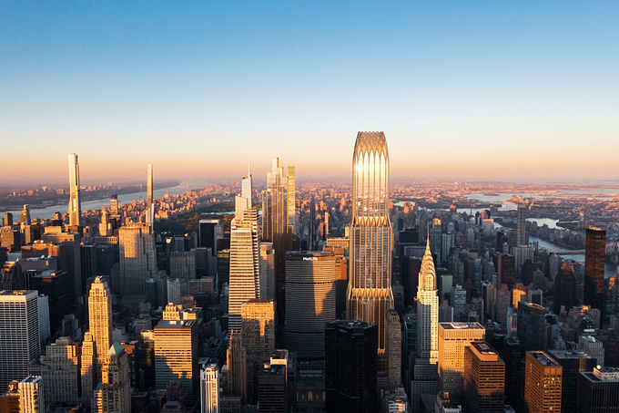
 Aerial Photograph, Melbourne Skyline. Photograph by Samantha Slicer
What has been your proudest achievement in business to date?
I was really proud to consistently run an office which, on the whole, operated in normal business hours for our staff - 9am-6pm. Of course, there were occasional weekends and longer hours, but these were generally reserved for emergency situations. Achieving this involved a firm hand with ambitious and unrealistic client requests and also required the courage to say no to projects or deadlines. I was surprised how responsive the majority of clients were to this. We were then able to reserve our short timeframes for favourite projects or clients or unavoidable timelines such as competition work. It also meant that our staff could be more responsive and available when those situations occurred.
I was also really proud of our contribution to the Australian Pavillion at the Venice Architectural Biennale in 2010 (a stereoscopic digital video installation representing futuristic Australian cities). We managed almost annually to be involved with at least one art-based, non-commercial creative project, but this was the biggest in scale and prestige. It culminated in travelling to Venice for the opening and seeing the rest of the Biennale for the first time, which was fabulous.
 Biomimetic City, Now + When Exhibition, Australian Pavillion, Venice Architectural Biennale, 2010. Image by FloodSlicer
What other artistic pursuits or creative outlets do you pursue outside of your day to day work?
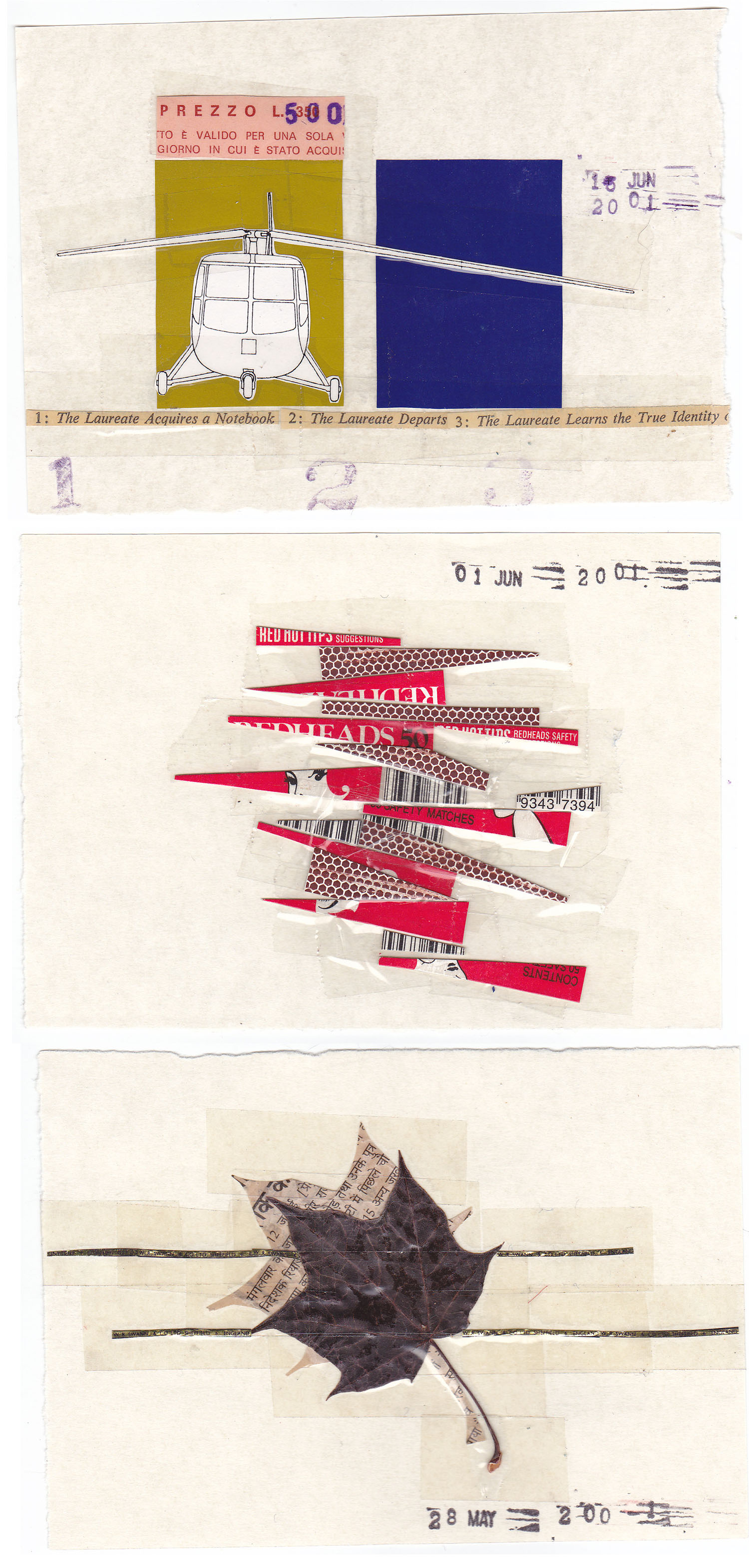
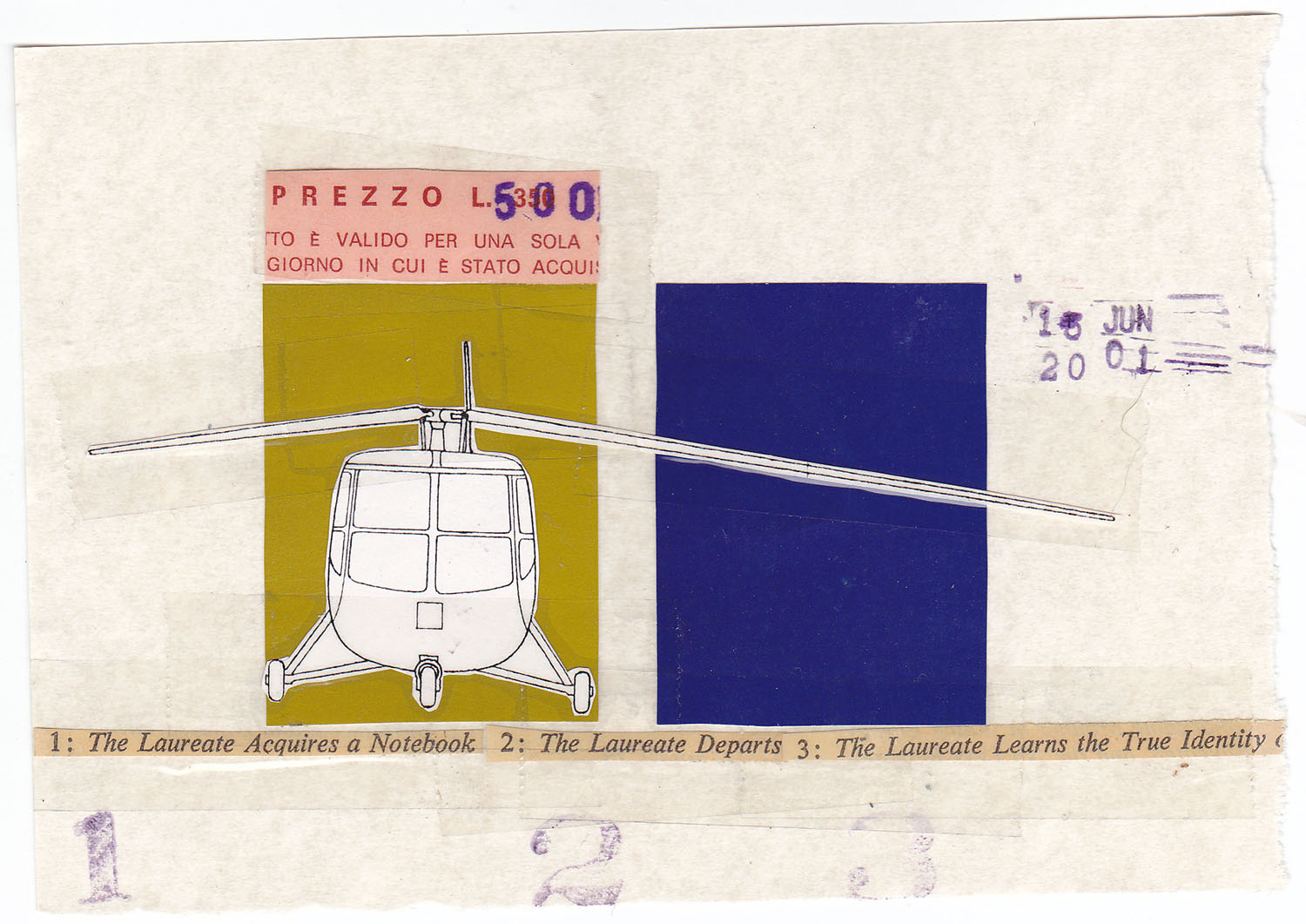
Over many years I have made analogue montages, like visual diaries, made from the collected debris of my everyday life. They form interesting and sometimes coded reflections of various eras. For example, there is an entire book of images I made when I was pregnant with my first daughter. As well as being a documentation of that personal journey, it also logs much of my parallel professional life, with fragmented glimpses of architectural projects, helicopter blades and sliced up renders I was working on at the time.
Also, I have a daily practice of taking photos. The advent of Instagram has formalised a part of this practice and provided a wider audience: @sliceslice
Where do you see the industry going? Does it look significantly different from where it is today? If so, how?
I think the new VR/AR/MR spaces are going to significantly evolve the industry, and that process has already commenced on a technical level. I have been interested in this space for awhile - its representative and narrative qualities are very different to still images and film. As a result, just as with the emergence of 3D tech in the 90s, there needs to be a new, artistically creative influence on how this work is produced. The potential is far greater than simply 360° film, or linear extensions of currently dominant forms that we have mainly seen so far in the industry.
Please name five artists, creatives or business people (outside of the archviz industry) who have inspired you.
Please name five artists within the industry you think have influenced your own work or have influenced the industry?
General industry influencers:
Alex Roman, Bertrand Benoit, Peter Guthrie
As a woman do you feel you had to work harder or do anything differently than your male counterparts to get where you are today?
I always felt that I needed to be better. And that I needed to prove that I wasn't a 'lightweight' because I was female. Some of the worst offenders in making assumptions about my skill levels were younger male staff or interviewees.
I have noticed over the years that men have had much better self-promotion confidence and skills. It took me a lot longer than significantly less-accomplished male counterparts to achieve what I considered a degree of worthiness in my work - in applying for awards for example.
And of course, as many other women report in corporate cultures, there were times where it was challenging to get a boardroom table full of white male suits to take you seriously.
On the other hand, as a younger practitioner, I found that being female often gave me permission to ask the 'dumb' or obvious questions which sometimes my male collegues were too proud to ask. I found this particularly so when working on architectural sites, where losing face with male builders seemed to present an ego challenge for the guys. Latterly in the architectural visualisation field, my gender often worked to my advantage when working with associated sectors such as marketing and government clients, who were often surprised to find that the 3D renderer didn't correspond to their preconceived CG technician stereotype.
Given all of the coverage we are seeing with the #metoo campaign, it begs the question if the architectural industry is any different. Have you seen or experienced similar issues yourself or seen others within the industry experience the issues the media is bringing to light about workplace harassment and assault?
I haven't personally experienced or witnessed the sort of incidents that are being brought to light in the media presently - particularly to the extremes that are being reported. That is not to say that I haven't been aware of sexism in the architecture and arch viz industries. That is still there but the general consensus is that things are improving. And this current global uprising of women's voices is assisting in raising awareness and creating better work environments for everyone. An organisation I am involved with recently published a good article on this topic in relation to #metoo in Australian Architecture.
http://archiparlour.org/is-there-an-architectural-metoo/
What advice would you give women thinking about entering into the arch viz industry?
- Do it.
- As well as understanding 'how' and 'what' you are producing, keep an eye on (and be able to articulate) why you are producing the work you do.
- As much as possible continue to develop your own ideas and images outside of your 9-6 job. Keep in contact with what keeps you inspired and passionate. Keep a log of this material.
- Keep an eye on the future, what you are getting out of the work, how technology is changing, how to maintain an edge either creatively or technically.
- Advocate for yourself with regards to best possible pay, conditions, rewards, awards that you deserve. Don't wait for anyone else to do this for you.
- Actively/consciously seek out mentors. As early as possible. Don't wait for them to find you. They don't need to be in arch viz, nor even a related industry, nor do they necessarily need to be female. And they may change over time as your career unfolds.
What will be the biggest challenge for the generation of women behind you as it pertains to working in this industry?
Same as for other industries: established cultural gender stereotypes, retention of talented women, and creating sustainable work practices. I'd like to add, these are challenges not just for women, but people generally. The adverse affects of unhealthy working environments are more statistically obvious for women in terms of seeing lower levels of participation or lower representation at higher levels, but the end result is not great for everyone. Balance of family life, for example, is a conversation that includes men as part of that future challenge. The change that is required is a reasonable shift and involves both men and women at higher career levels successfully and confidently role-modelling a new way of working.
If the industry retains its current links and influences with other unhealthy workplaces, such as architecture and advertising (where deadline-driven environments consistently overturn attempts at sustainability), then the same patterns will continue. While some of the changes I am referring to need to occur at a higher level (government, policy making) there are changes that can occur at a company level, particularly if there is community support. But this may require a more mature and supportive industry. Arch viz is still a young and small industry and does not necessarily yet have this cohesion.
Anecdotally, I have noticed that on average the women artists within the arch viz industry tend to be some of the most talented people in our field. Would you agree? If so, why do you think that is?
To be honest, I have simply not come across higher level female artists until very recently. Some of this is due to the tyranny of distance from which a somewhat remote country like Australia suffers. Over the years I only managed to employ a handful of female artists, starting at junior-mid levels - so their upward trajectories are still in earlier stages. So unfortunately, I haven't really been able to notice the trend you are asking about.
Hypothetically, women may exhibit stronger artistic flair because of a lower interest in the geeky tech aspect of arch viz and a greater focus on the content, as discussed earlier. But I doubt there is some genetic pre-disposition.
Where do you envision yourself 10 years from now? What are you doing and what did you do to get there?
I have always made images. I don't really see this changing. But I do see the forms of external expression changing, whether it's exploring new or old technologies - as I am currently doing with the emerging immersive technologies and the more historic printmaking and photographic techniques.
Please take one of your favourite projects and walk us through the piece from start to finish.
Looking through the presentations I have made over the last ten years, a single image sits at slide number one almost consistently. The Balencea apartment building hero render was produced over a decade ago and ended up being a pivotal branding image for FloodSlicer and our industry presence. It broke the mould of the expected architectural render aesthetic at the time and managed to capture an essence, not only this project, but of a much broader place and time. For years after, no matter the project, clients would turn up with that image in hand as a sample inspiration image.
Over a decade later, I can critique some of the technical production but the image remains emblematic of techniques, processes and the aesthetic approach that became central to my practice and FloodSlicer's signature work. The theories crystallised in Balencea - some very simple - were applied across a broad range of stills and animations, even as the complexities of the projects grew exponentially.
Balencea was located on an unattractive stretch of St Kilda Road, a boulevard leading into central Melbourne famous for its avenues of plane trees. Background photography was shot in deep winter when the trees were bare skeletons and the only angles available framed a collection of plain commercial buildings. While site challenges like these are hardly rare in arch viz, in those days our strength lay in photomontage, so it made sense to use existing context to bring as much detail to the project as possible. It has been one of my fundamental precepts that detail elevates image quality more than anything else.
Not unusually, the project was at a very early design stage for the architects Wood Marsh Architecture (https://www.woodmarsh.com.au/) and there was no resolved close-up detail available. I built from scratch a carefully crafted façade model that envisaged the architect's glazing system, not risking any cumbersome or low detailed supplied model, having worn the consequences of that same 'timesaving' decision in the past.
The building's form was geometrically photogenic from a number of vantage points but the task of camera matching to a real life angle reduced the genuine possibilities to very few. The angle needed to highlight the scalloped fluting of the highly reflective silvery glazed façade. I worked through many iterations of those angles with the client, with whom I had established a long term and very close collaborative relationship. He was located in another state, Queensland, and unlike other clients, we rarely met in person. Instead, we spent hours and hours discussing image amendments on the phone and via email. It was an intense and successful production process, which also allowed me to work alongside my then very young children either at home or in the studio. It taught me the value of good collaborative relationships.
 Portrait of Samantha Slicer and daughter Una Mitchell, 2002. Photographer John Gollings.
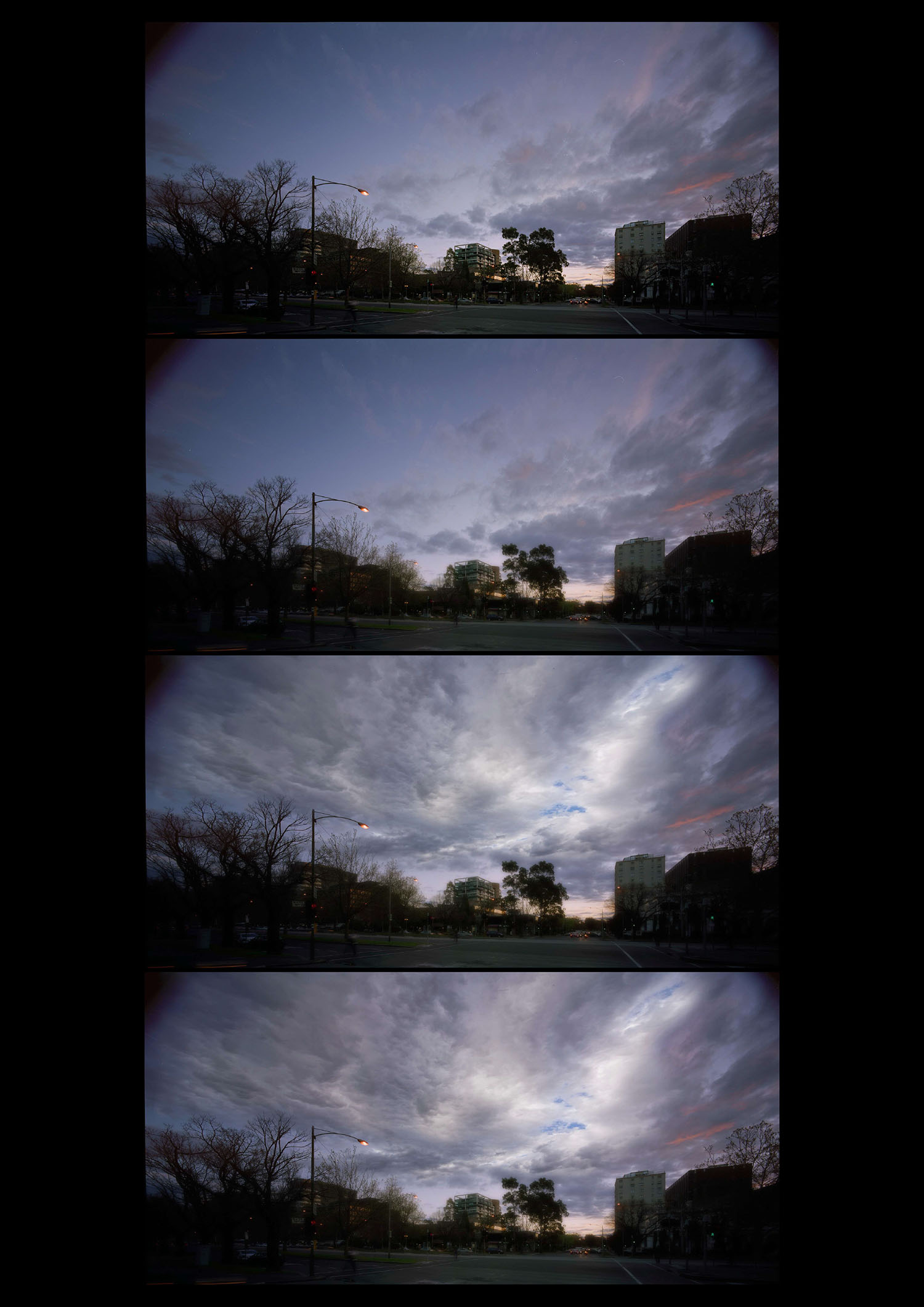
Image palette, art direction and time of day were all forensically weighed up to create a unique atmosphere, deal with the challenges of the site, and find a lighting condition that would bring out the beautiful qualities of the façade material. John Gollings' dusk photograph, taken prior to a full night sky but with lights on, captured a magical in-between time of day that brought a serene stillness to the image, softened and obscured everyday detritus, turned traffic into foreground light-painting and drew focus onto the building skin.
The materiality of the glass was worked up in 3D as well as post-production. Compared to how I would render these days (using HDR imagery for example) the reflectivity of the glass was developed via trial and error, using hand-crafted reflection maps until I achieved a result that was architecturally faithful and aesthetically unique.
Given the dominant sunny-blue-sky-render aesthetic of the time, I was impressed that the dusk photography was accepted by the developer (also from Queensland, where the marketing paradigm of sunshine and beaches was generally unquestioned). Even more impressive, during production we managed to add still more mood in the form of a cloudy, almost stormy sky. Despite numerous previous attempts, this was the first time we managed to get a moody, cloudy image past a client. And not only 'past' - they loved it! And it truly captured an authentic Melbourne spirit, which is known (or notorious) for its moody weather and art culture. To counter a certain coldness that crept in with the cloudscape, we multiplied and exaggerated a small hint of pink that was present in the original photography. This critical modification added richness, warmth and tonal balance and elevated the final image from moody to majestic.
About this article
Women in Arch Viz - Sam Slicer


