Making Of
Mastering Composition: The Art of Crafting Captivating Photographs and Renders
Composing Images in Photography/Rendering and the Importance of Good Composition with Examples
Composing an image is one of the most important parts of photography and rendering because it determines how the subject of the image will be presented to the viewer. A successful composition is able to capture the viewer's attention, highlighting the main subject and conveying a visually interesting message.
The Importance of Good Composition
The composition of an image is responsible for guiding the viewer's eye through the scene, highlighting what is important and creating a sense of balance and harmony. A good composition can create an emotional connection with the viewer, evoking feelings and sensations that reinforce the message of the image.
A good composition also helps create a sense of depth in the image, adding layers and dimension to the scene. This is particularly important in 3D rendering, where the image can appear flat and lifeless without the addition of depth elements.
Composition can be used to create a sense of balance and symmetry in the image or to create a sense of movement and dynamism. It can also be used to highlight the colors and textures in the image, creating a contrast that draws the viewer's attention.
Principles of Composition
There are several principles of composition that can be used to create a successful image. Among them are:
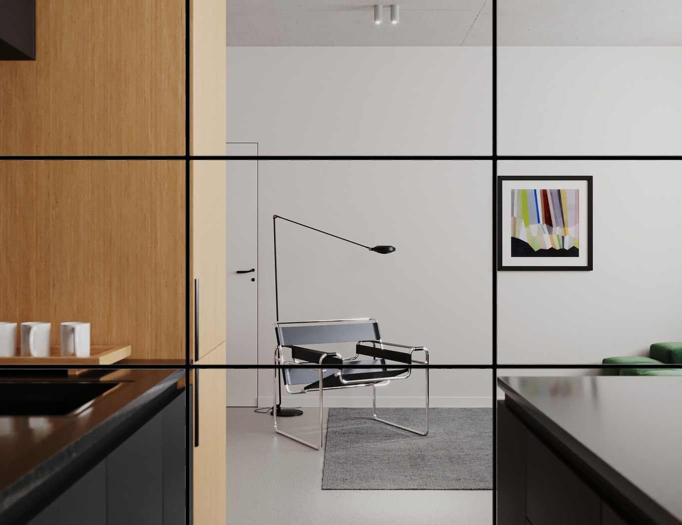
- Rule of thirds: The rule of thirds is one of the most common principles of composition. It divides the image into horizontal and vertical thirds, creating imaginary lines that intersect at four points. The main subject of the image should be positioned along these lines or points of intersection to create a sense of balance and harmony.
- Symmetry: Symmetry is a principle of composition that can be used to create a sense of balance and harmony in the image. It involves the use of symmetrical elements in the scene, such as buildings or trees aligned, creating a sense of order and balance.
- Leading lines: Leading lines are a principle of composition that can be used to guide the viewer's eye through the scene. They can be physical lines, such as a road or a fence, or imaginary lines created by the arrangement of elements in the image.
- Focal point: The focal point is the main element of the image, the one that should draw the viewer's attention. It can be highlighted through positioning in the image, color contrast, or texture.
- Depth: Depth is a principle of composition that can be used to create a sense of layers and dimension in the scene. It involves the use of elements in the foreground, background, and midground, creating a sense of depth and perspective.
Examples of Good Composition
To illustrate the importance of composition in photography and rendering, let's look at some examples of successful images.
Example 1: Rule of thirds.
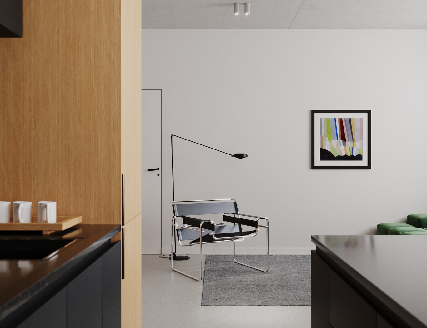
In this image, the focal point is the chair in the center of the image, which is positioned near the bottom right intersection point, one of the visual points of interest. This position helps to create a sense of visual balance, while still highlighting the chair as the most important element of the image.
Additionally, the image uses other composition techniques, such as the use of diagonal lines to create a sense of depth and movement, and the contrast between the chair and the ligth background to create a sense of prominence.
In summary, the image uses the rule of thirds to create a strong focal point and balance the composition visually. Additionally, it uses other composition techniques to create an interesting and visually appealing image.
Example 2: Symmetry
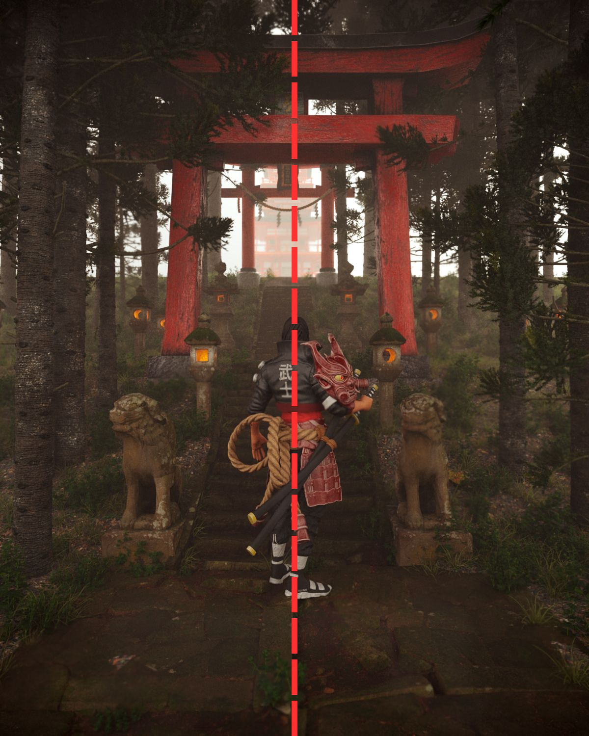
Symmetry is a common technique in composition, and in the "CGI Japanese Shrine" project, it is well used to create a sense of balance and visual harmony in the image. Symmetry is evident in the architecture of the shrine, with symmetrical elements on the left and right creating a mirrored effect.
Symmetry is a common technique in composition, and in the "CGI Japanese Shrine" project, it is well used to create a sense of balance and visual harmony in the image. Symmetry is evident in the architecture of the shrine, with symmetrical elements on the left and right creating a mirrored effect.
Symmetry helps to create a sense of balance and visual stability, which is appropriate for the image of a shrine. However, excessive use of symmetry can make an image monotonous and visually uninteresting.
In the "CGI Japanese Shrine" project, symmetry is balanced with other visual elements, such as vegetation and clouds, which help to break the rigidity of symmetry and add an element of visual interest to the image. The vegetation around the shrine is carefully positioned to break the symmetry of the architecture, and the clouds in the sky are varied in shape and size, adding texture and visual interest.
In summary, symmetry is a well-used technique in the composition of the "CGI Japanese Shrine" project, creating a sense of balance and visual stability. However, it is important to balance symmetry with other visual elements to avoid the image becoming monotonous and uninteresting. In this project, symmetry is well-balanced with other visual elements, such as vegetation and clouds, resulting in a visually appealing composition.
Example 3: Leading Lines
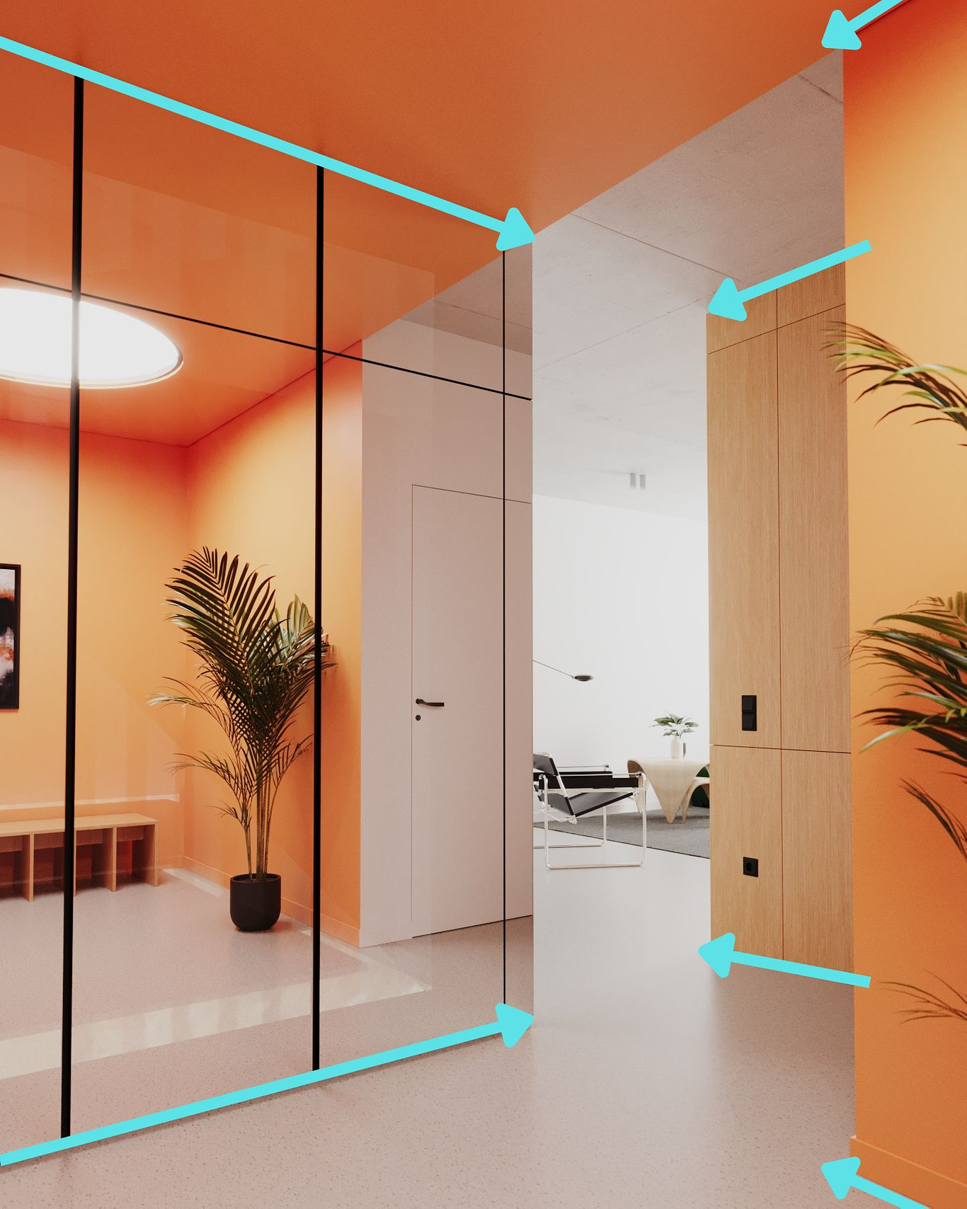
The image in question has a well-balanced and visually appealing composition that uses the "rules" of guide lines to create a sense of balance and visual harmony.
The image in question has a well-balanced and visually appealing composition that uses the "rules" of guide lines to create a sense of balance and visual harmony.
Guide lines are imaginary lines that can be used to guide the visual composition of an image. These lines can be horizontal, vertical, or diagonal, and are positioned to guide the viewer's eye towards the focal point of the image.
In this image, the guide lines are used to position the focal point of the image - the lighthouse - at the intersection of the diagonal lines. These lines also help to create a sense of depth and movement in the image, as the diagonal lines appear to point towards the lighthouse at the center.
In summary, the image uses the "rules" of guide lines to create a sense of balance and visual harmony, positioning the focal point of the image at the intersection of diagonal lines. Additionally, it uses other composition techniques to create an interesting and visually appealing image.
Example 4: Focal Point
The image in question has a visually appealing composition that makes use of several key elements to create a strong focal point.
The image in question has a visually appealing composition that makes use of several key elements to create a strong focal point.
The focal point of the image is the lamp which is positioned slightly off-center, drawing the viewer's eye towards it. This is further emphasized by the use of leading lines, which are created by the diagonal lines of the roof and the surrounding structures, all pointing towards the lamp.
In terms of color, the image makes use of a warm and muted color palette, with the use of earth tones helping to create a sense of timelessness and stability.
In terms of color, the image makes use of a warm and muted color palette, with the use of earth tones helping to create a sense of timelessness and stability.
Overall, the composition of the image is well-balanced and visually appealing, with a strong focal point created through the use of leading lines and focal point.
Example 5: Depth
The image in question has an interesting composition with a clear sense of depth created through the use of layers and guidelines.
The image in question has an interesting composition with a clear sense of depth created through the use of layers and guidelines.
The first layer of the image is composed of a light blue sky, which serves as a soft and pleasant background for the scene.
The second layer is composed of mountains in the background, which are darker and have irregular shapes, creating a depth effect.
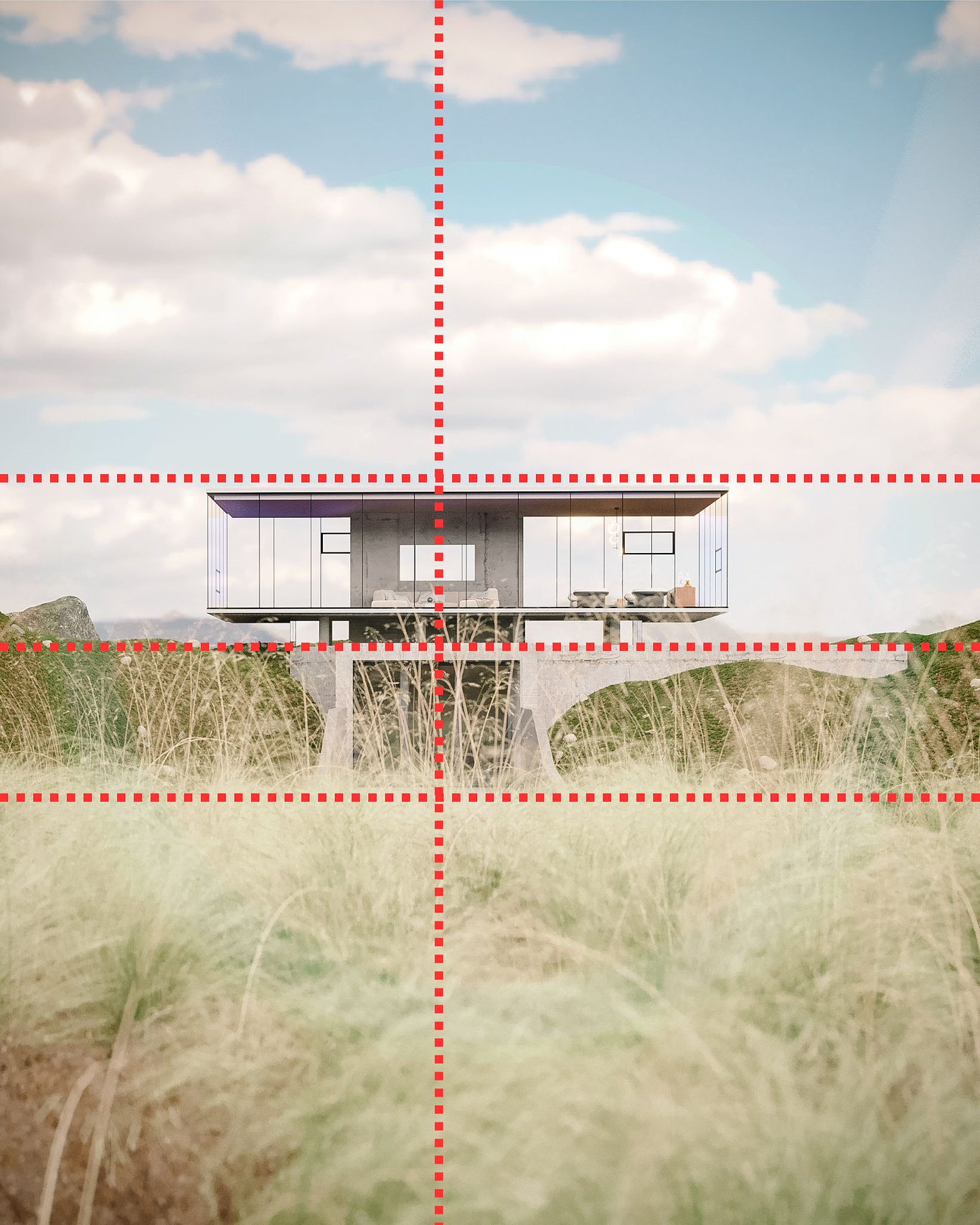
The third layer is composed of the "dunes," which are darker than the mountains and have more defined shapes, creating a smooth transition between the layers. The "dunes" are also positioned horizontally, creating guidelines that lead the viewer's gaze towards the house in the center of the image.
The fourth layer is composed of the house, which is the central piece of the image. It is slightly off-centered, creating a sense of balance and movement in the composition. The house has a distinct shape and is lighter than the "dunes" around it, creating a strong visual contrast.
The fifth and final layer is composed of the grass at the bottom of the image, which is lighter and has softer shapes than the "dunes" in the third layer. They serve as a foreground for the scene, creating even more depth.
Overall, the image's composition is well thought out and effective in creating a sense of depth. The layers and guidelines lead the viewer's gaze through the scene, creating a sense of movement and directing the gaze towards the central focal point of the image.
Conclusion
In conclusion, mastering the principles of composition is essential for any photographer or 3D artist looking to create captivating and visually engaging images. By understanding and applying techniques such as the rule of thirds, leading lines, depth, and contrast, you can elevate your work to the next level and truly stand out in a crowded field.
It's important to remember that no one becomes a master overnight. It takes time, practice, and a willingness to learn from others. Don't be afraid to seek out advice and guidance from more experienced artists, and don't be discouraged if your early attempts don't meet your expectations.
As you continue to hone your craft and apply these composition techniques, you'll find that your work becomes more refined, and your ability to communicate your message through your art becomes more effective. Ultimately, the art of composition is a lifelong journey, and I hope that these tips and insights will help you along your way.
I hope you have helped
Dinis Ferreira
Portugal
I hope you have helped
Dinis Ferreira
Portugal
You must be logged in to post a comment. Login here.
About this article
In this article, we explore the importance of composition in photography and 3D renders. We discuss the fundamental principles of composition, such as the rule of thirds, leading lines, and symmetry, and how they can be used to create compelling and visually appealing images. We also analyze various examples of photographs and renders that demonstrate effective composition techniques. Whether you are a beginner or a seasoned professional, this article will provide you with valuable insights into the art of composition and help you improve your skills as a photographer or 3D artist.
visibility304
favorite_border1
mode_comment0


