Making Of
Making of: Project Soane - Consols Transfer Office
PART 1 - Still Images
Introduction
Hoare Lea’s Project Soane submission was created by Hoare Lea CGI in collaboration with Hoare Lea Lighting, specialist visualisation and lighting design teams respectively.
In this article we will explain the processes and workflows used in the 3D modelling, texturing and rendering of the Consols Transfer Office at Sir John Soane’s, now demolished, Bank of England, whilst also touching on the design of the lighting scheme and its implementation into our 3D model.
We went on to create an interactive VR experience for viewing with Oculus Rift and Cardboard VR. Using the model scene, we generated stereo-cubemaps combined with Unity 3D, to showcase daylighting features, and to give a glimpse of how the Consols Transfer Office might have looked today, had it survived and been lit with artificial lighting. We will describe this process in a follow-up article.
Software Used
Autodesk Revit 2016
Autodesk 3ds Max 2016 & Vray
Adobe Photoshop CC
About the project
Our still images and the VR scene were created for the Project Soane competition organised by HP and NVIDIA in collaboration with Robert A.M. Stern Architects, Sir John Soane’s Museum, Sir John Soane’s Museum Foundation, Autodesk and, of course, CGarchitect.
The task was to recreate and visualise in 3D the Bank of England as designed by Sir John Soane, and built from 1788 to 1833. Sir John Soane pioneered techniques to introduce daylight into his architecture. Sadly, most of Soane’s Bank of England was destroyed in the 1920s, and today only historical drawings, sketches and a few rare photographs exist to show how the space appeared.
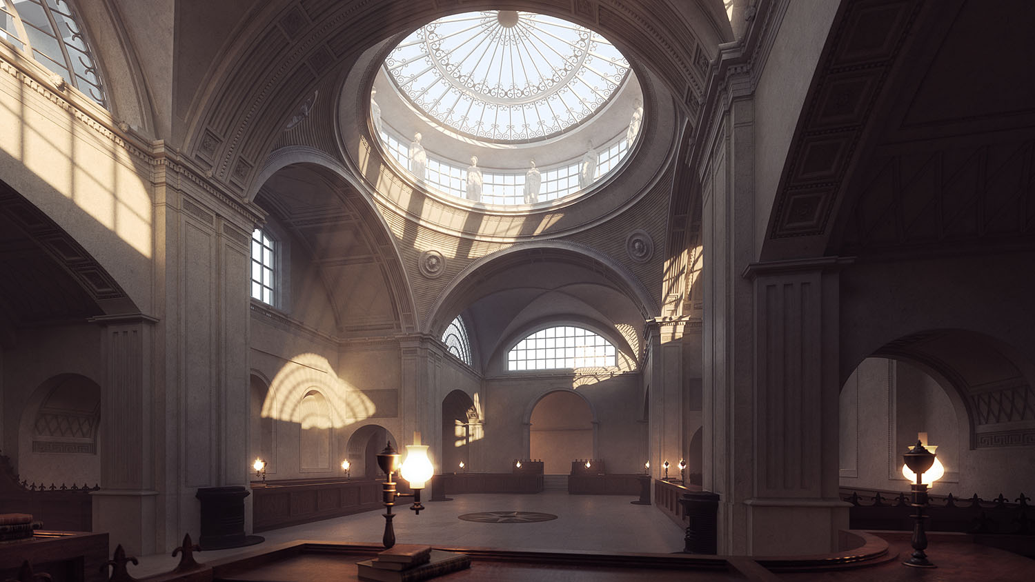
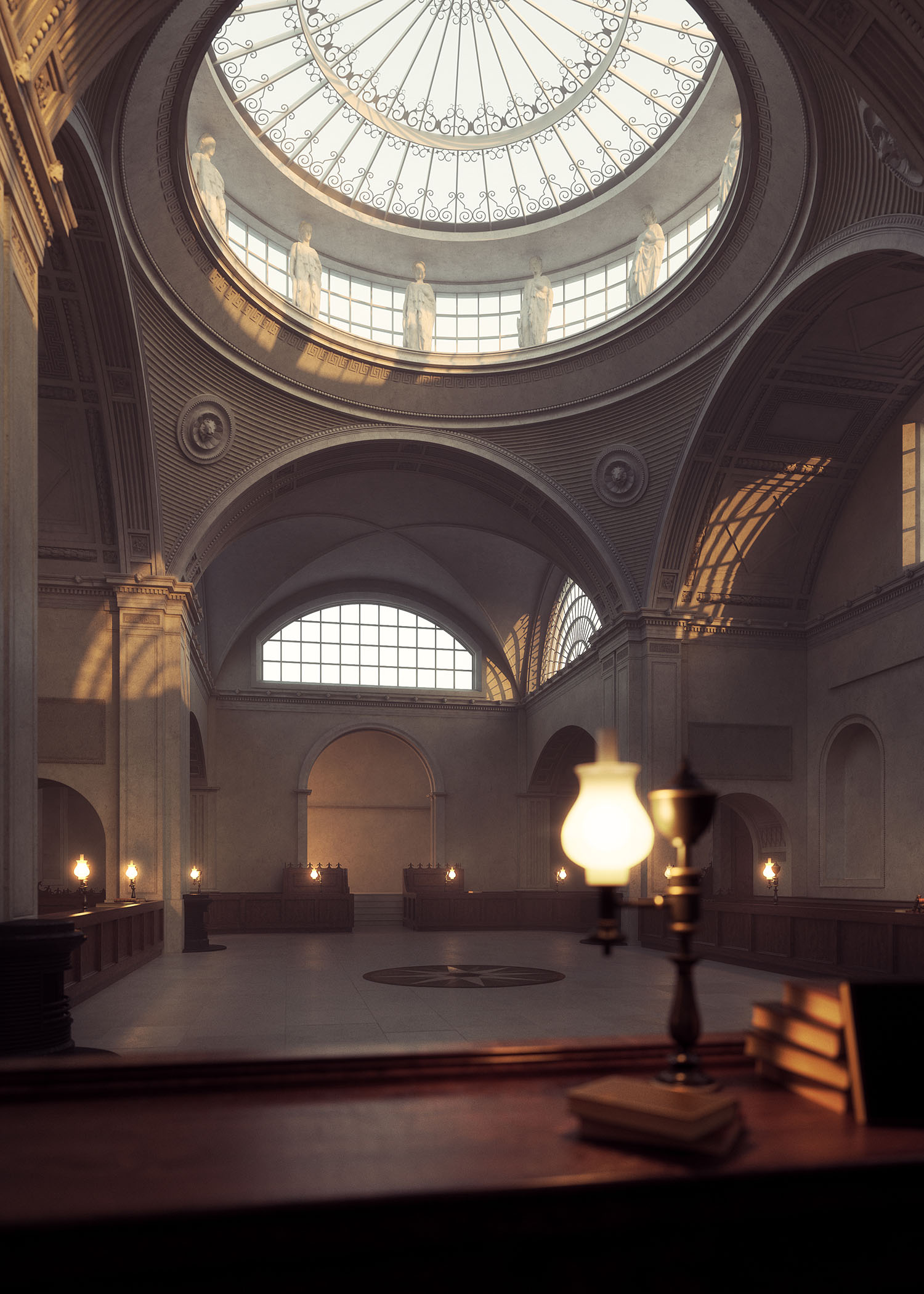
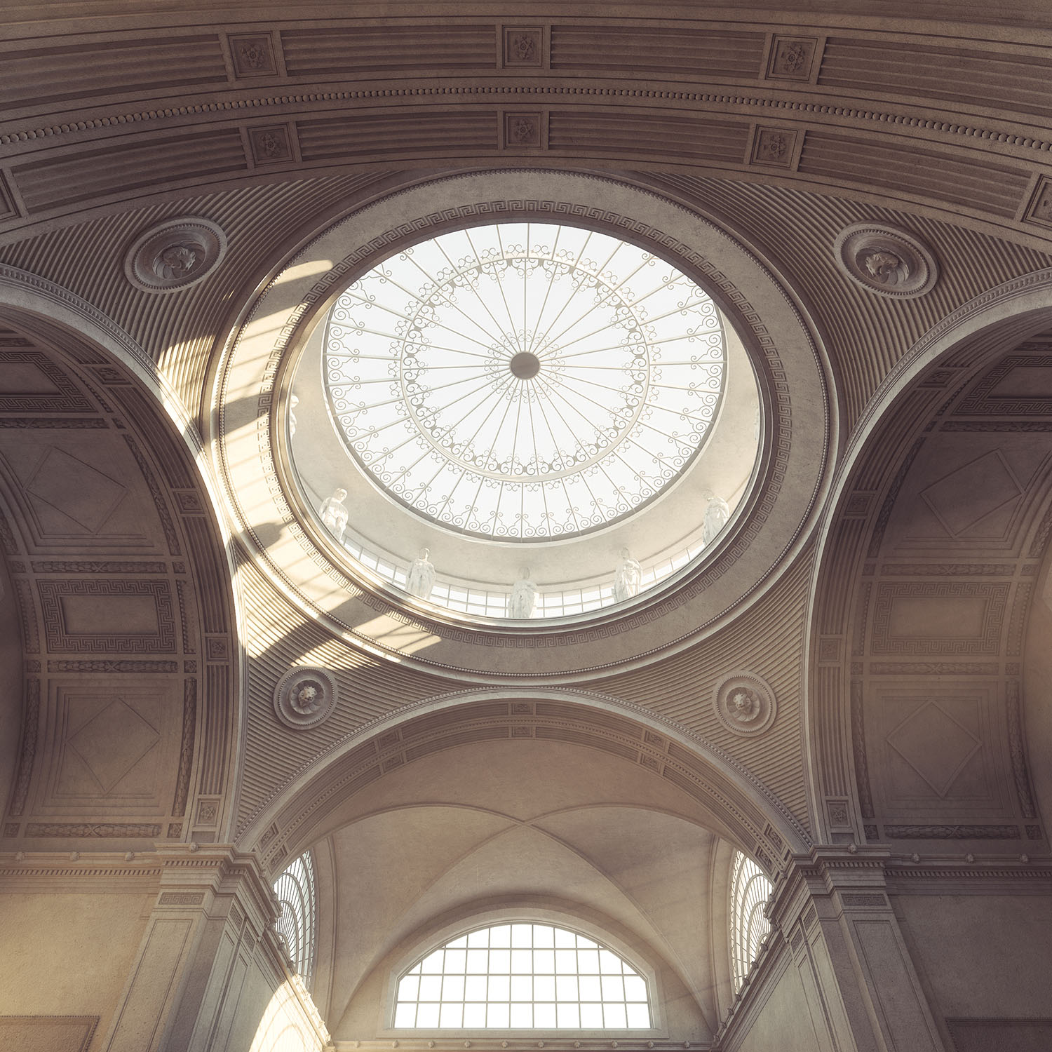
We decided to re-create the Consols Transfer Office at the Bank, with a series of images, each as authentic as possible in terms of architecture, materials and lighting, and then develop this into an interactive VR scene.
Our entries achieved the Runner-up spot in the Best Image category, while our VR simulation achieved an Honourable mention in the Best Real-Time category.
For more info see here: http://projectsoane.com/winners_2016
From Revit to 3ds Max
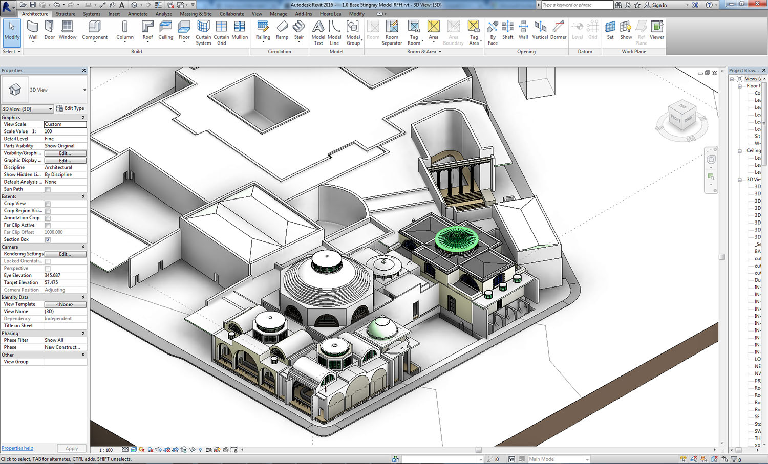
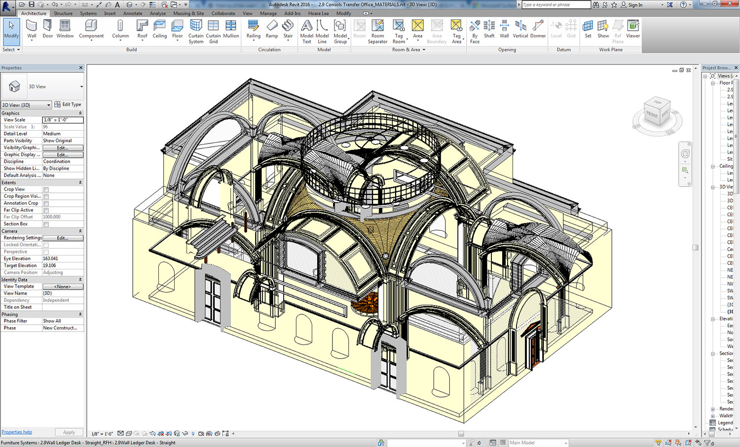
A Revit model was provided from the first phase of the competition. However, some details were missing or incorrect. We therefore decided to use the original drawings, photos and the supplied model as a base reference, modelling in the missing details ourselves.
Revit model as supplied by Project Soane.
The Consols Transfer Office was sectioned off and exported from Revit as an .FBX and linked into 3ds Max.
Research
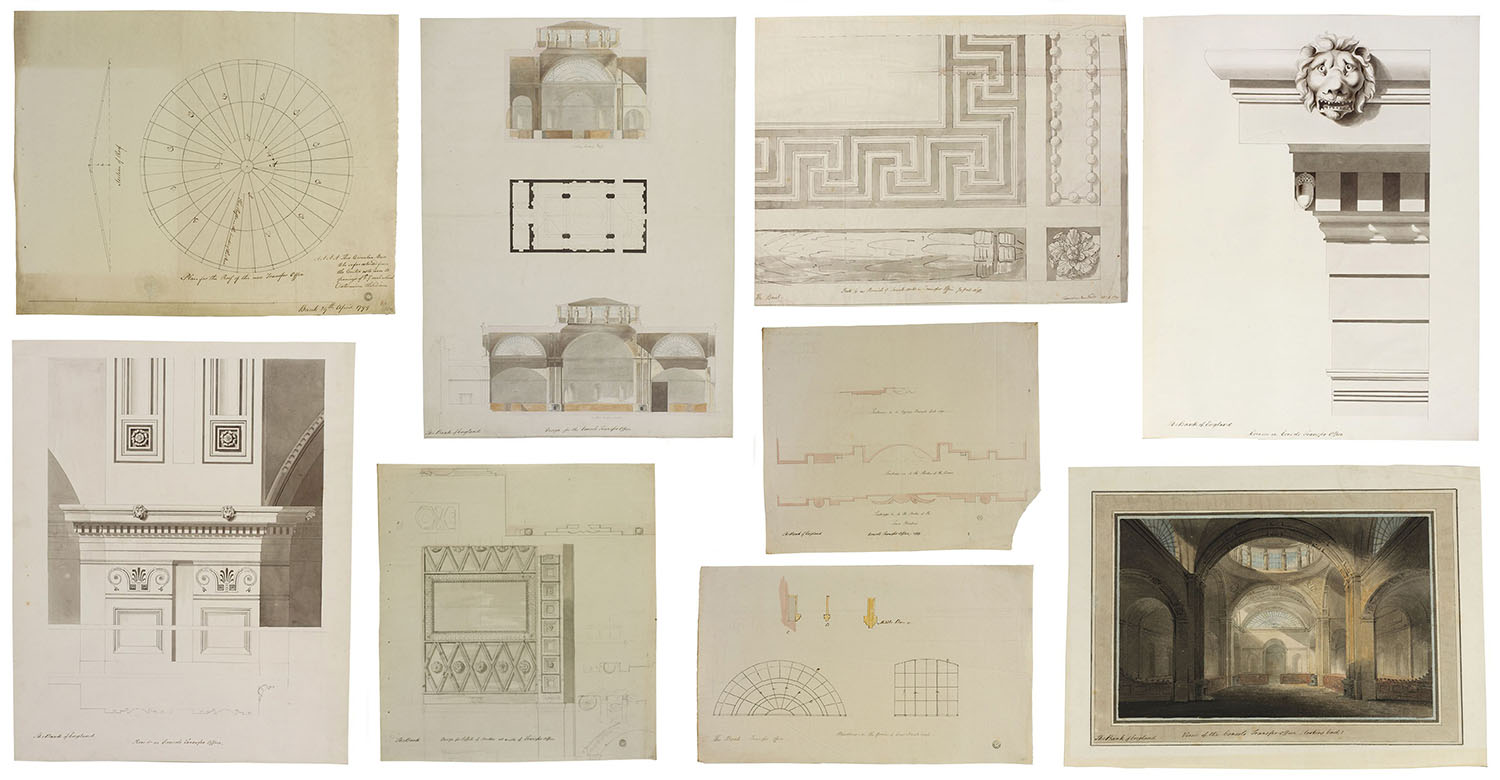
Hand drawings by Soane showed his detailed design work for the interior. Because Soane undertook many design iterations, the tricky part was making sure the correct details were included. We cross-checked using the old photographs, in conjunction with these drawings.
Detail drawings of the Consols Transfer Office by Sir John Soane (1880s)
Modelling
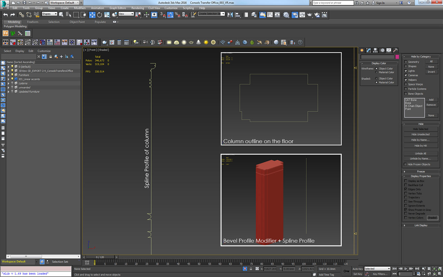
Many different techniques were used in this process. We found the sweep tool particularly useful; bevel profile modifiers and alignment tools were also used to model walls, and cornices for example, with the correct profiles.
Example of the process to create a column
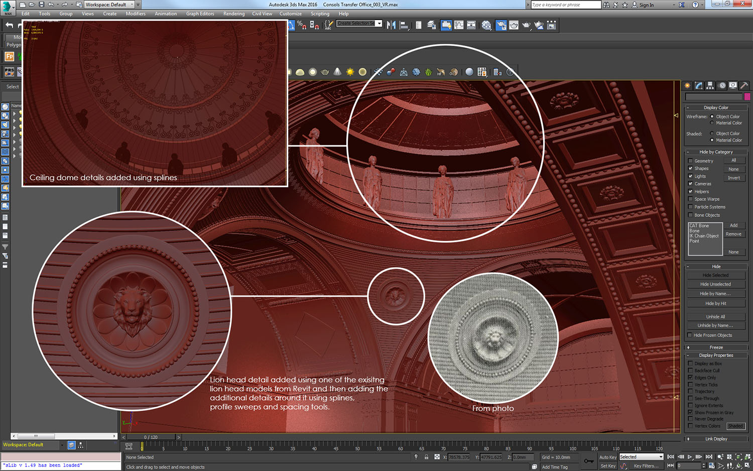
Ceiling details re-modelled to correspond with drawings and photographs.
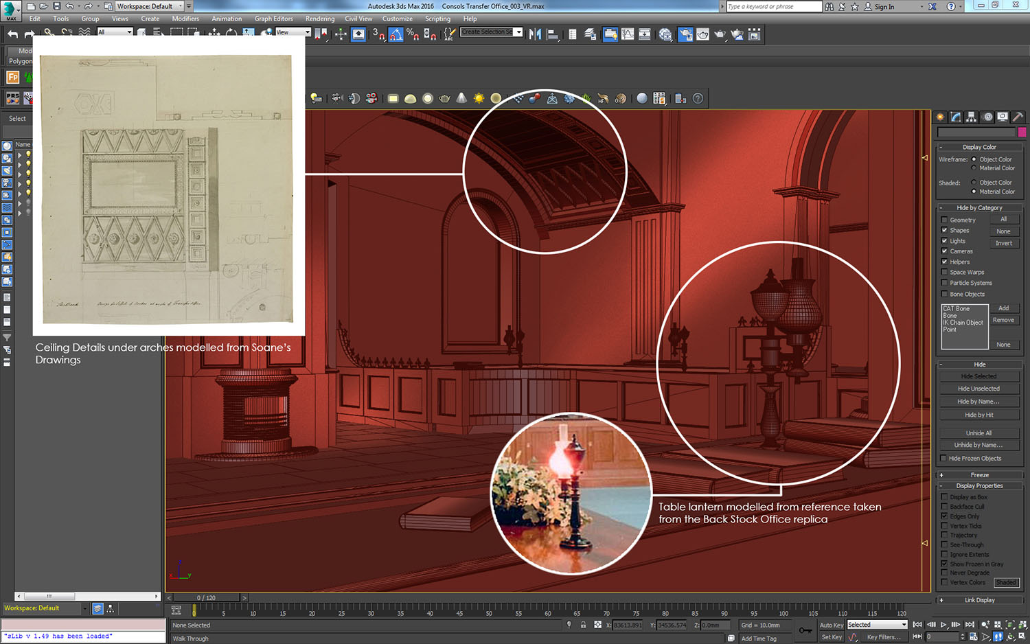
Lanterns modelled and books added to worktops. Ceiling details added to arches and fireplace modelled from Soane’s drawings.
Modelling of the lantern was undertaken using the Lathe modifier and a simple spline profile.
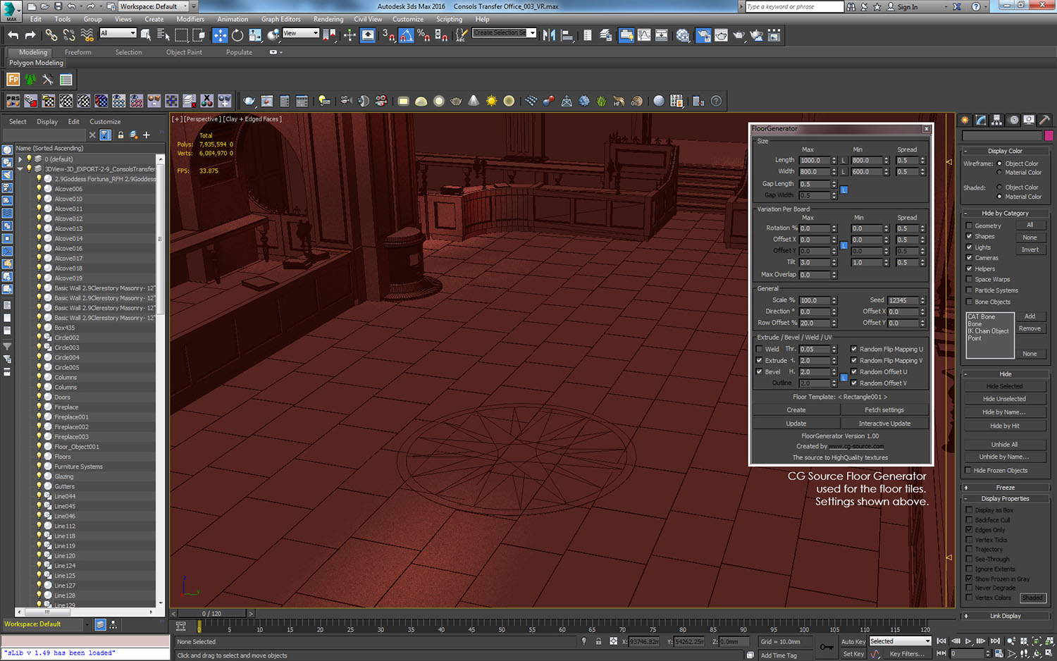
Floor Generator used to generate the floor – a slight tilt creates irregularity.
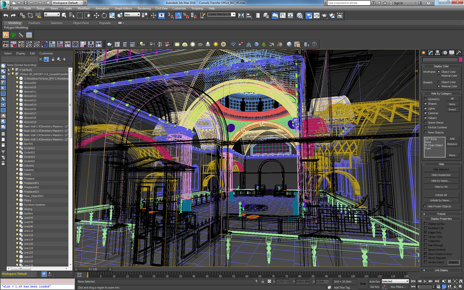
Once modelling was complete, we had replaced approximately 75% of the scene. The coloured wireframes indicate new geometry, with the black showing the original Revit model.
Setting up the Daylight System
When it came to designing architecture that would maximise daylight, Sir John Soane was a genius. He was building at a time when artificial electric lighting did not exist, and so daylight was the best source for lighting architectural interiors (and still is today).
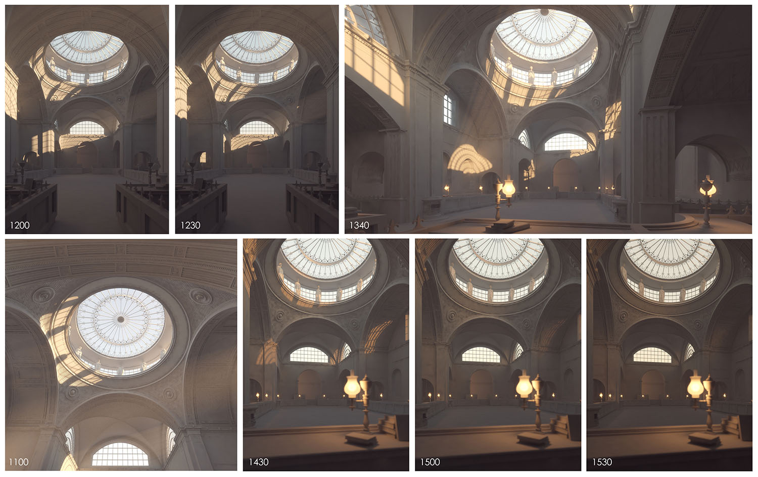
We chose to show the space on the 21st December – the winter solstice – as this is when the sun is at its lowest point in the UK, hence the shortest day. This would have caused a gorgeous change in the colour temperature of the light entering the building, where it is warm as the sun rises, shifting to a blue colour as we reach midday, and then back to warm hues as the dusk skies arrive in the late afternoon.
Draft render of daylight at 1340hrs
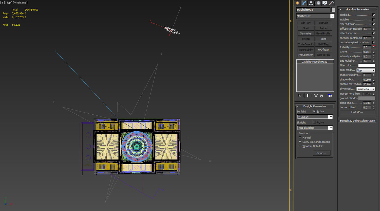
The setup up shown below is a standard daylight system with a Vray Sun & Sky (Hosek). The geo-location and orientation of the sun was established accurately with the Bank of England coordinates (latitude & longitude taken from google) and the correct north orientation.
We then animated the sun path, to simulate and show exactly how the light levels and colour temperature would change in the space though a winter solstice day. We also researched the sun’s Tyndall effect on the earth’s atmosphere to ensure that the colour temperature was correct for the time of year. Typically, with the sun so low in the sky, the sky would be very warm in the mornings and blue at mid-day. We tweaked this using the Turbidity setting - animating it over time.
Draft renders of the lighting were created with a material override (material set to 50% diffuse / grey) at different times of day.
Materials and Texturing
Creating materials for the scene required further analysis of the information available. A degree of artistic licence was taken, as we had no records of the finishes used. We therefore looked at the finishes of existing spaces in the Bank of England, Soane’s artistic impressions, and the black and white photographs taken before demolition.
We also ensured that the physical materials created had the correct reflectance values, so that the correct amount of light was absorbed and reflected for each material.
All textures in this scene have been mapped on using either standard box mapping, using different map channels, or using Soulburn’s blended box map script to seamlessly blend tiling textures.
STONE FLOOR
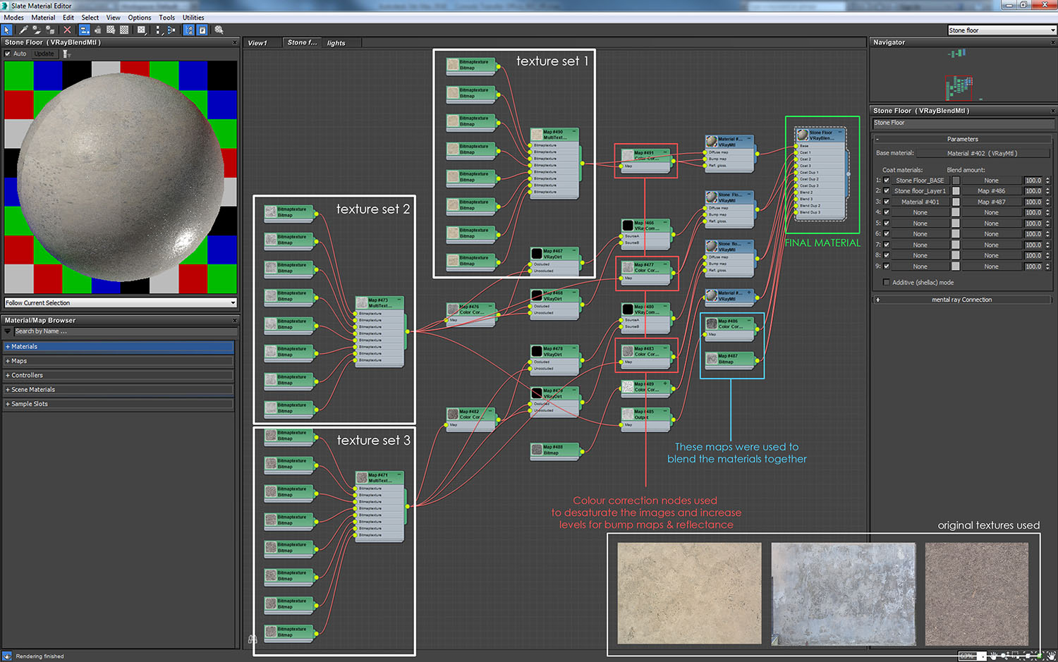
We used three large textures to create the floor material. This was cut into eight rectangular tiles in Photoshop. These were then plugged into CG Sources Multi Texture node which when applied to the floor generated tiles, allowing for a random distribution across the floor.
Colour correction nodes were used to desaturate and alter the colours of the tiles to create bump maps and reflectance maps. Reflections needed to be subtle and were therefore kept to a minimum and adjusted with the maps rollout in the material options. Vray Dirt maps were also used to accentuate gaps between tiles.
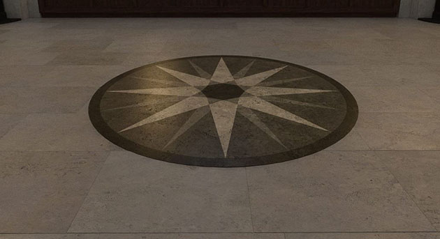
Stone floor created with a Vray blend material and three Vray standard materials.
STONE WALL
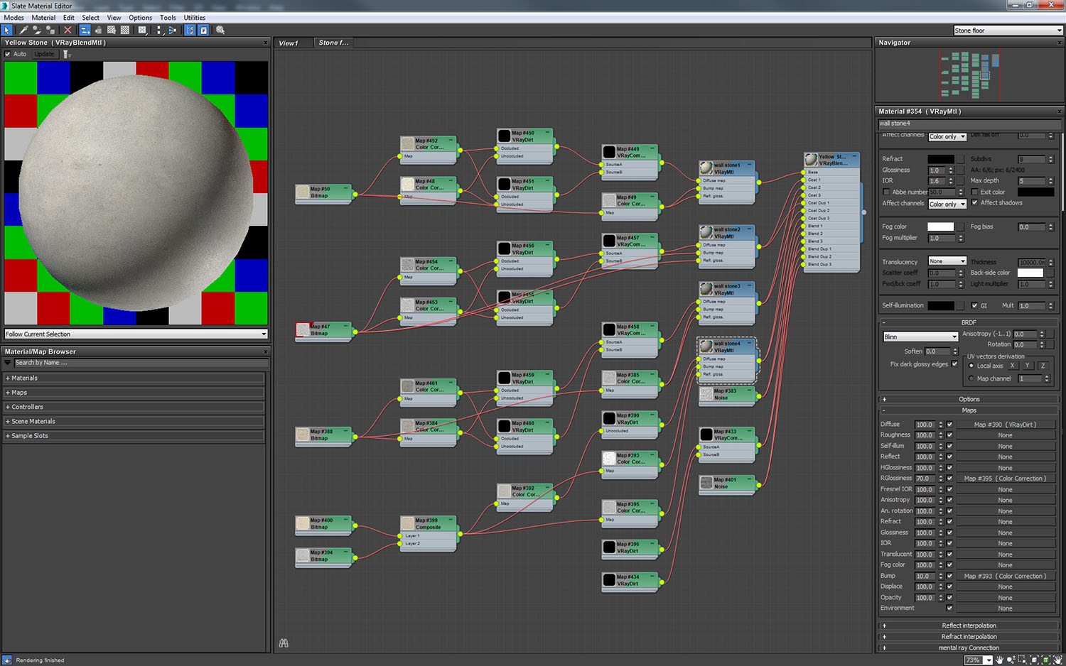
We wanted to make sure there was plenty of variation in the wall material, so that tiling was unnoticeable. This is also a blend material with a similar setup to the floor material shown above, but without the multi texture node.
Four different textures were used. These were colour corrected for diffuse, bump and reflectance, and then blended together using noise maps. Vray dirt was used to add some ambient occlusion at render time.
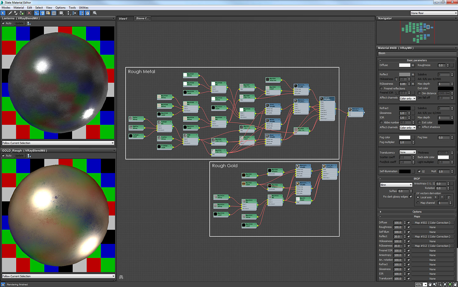
LANTERNS
Two materials were applied to the lanterns: a rough metal and a rough gold. Both materials were influenced by Bertrand Benoit’s method of materialism for rough metal, with some subtle changes to get the required result.
Scratches and general wear-and-tear were added using overlay maps plugged into the Reflection Glossiness rollout. These were mapped onto the lanterns using a Soulburn script called ‘blended box map maker’, which is particularly good at making textures appear seamless on round objects, without having to unwrap the UVWs.
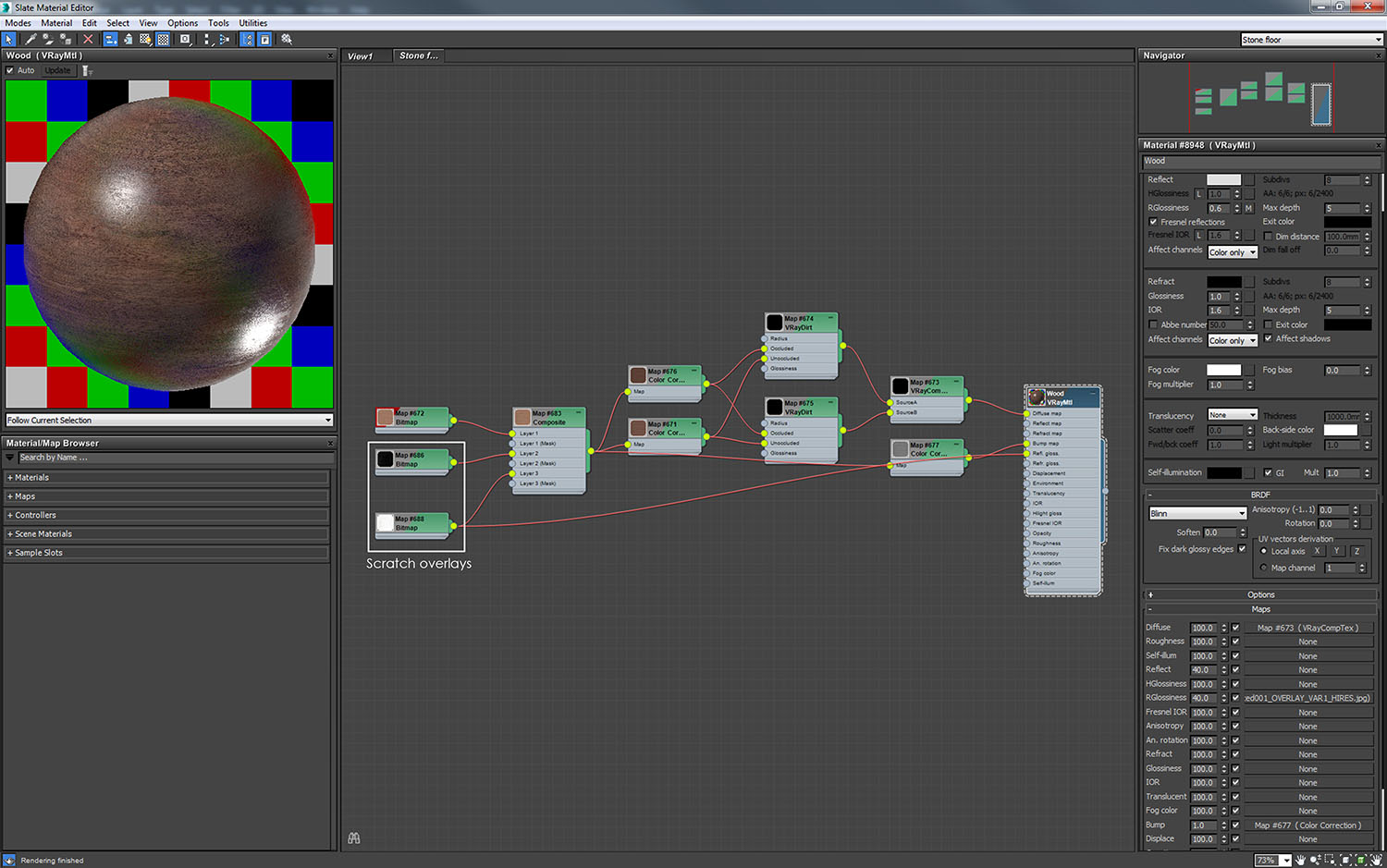
WOODEN WORKBENCHES
Wood is a much simpler material to model. We added age wear-and-tear to the texture with a combination of a composite node to add the ‘marks’ into the diffuse slot, and then plugging a black and white variant into the reflection glossiness rollout, adjusting its strength as necessary.
ARTIFICIAL LIGHTING
We visualised the space during the day and then at night to show how the Consols Transfer Office might have appeared with a contemporary lighting scheme. For the daytime stills we added period gas and oil lanterns, which would have been used in the early 1800s. Some fill light in the doorway was included to add life to that area of the corridor.
In total, three lighting treatments were created for the still daytime renders: the doorway, the lanterns and the sunlight.
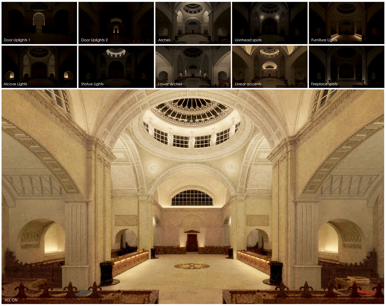
For the night-time lighting scheme we worked with our in-house specialist lighting group who designed a scheme which carefully considered the architectural sensitivity of the space. All the products selected had to be subtle and wherever possible concealed from view. It was also important that the lighting highlighted the wonderful details and architectural features.
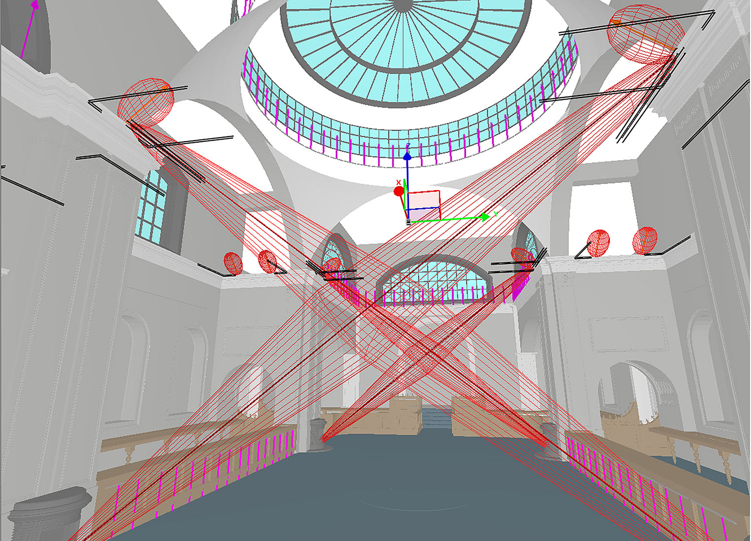
The initial lighting design was undertaken in Relux, which is the standard lighting design software used by Hoare Lea. This allowed us to work out the correct products, lighting levels and positions.
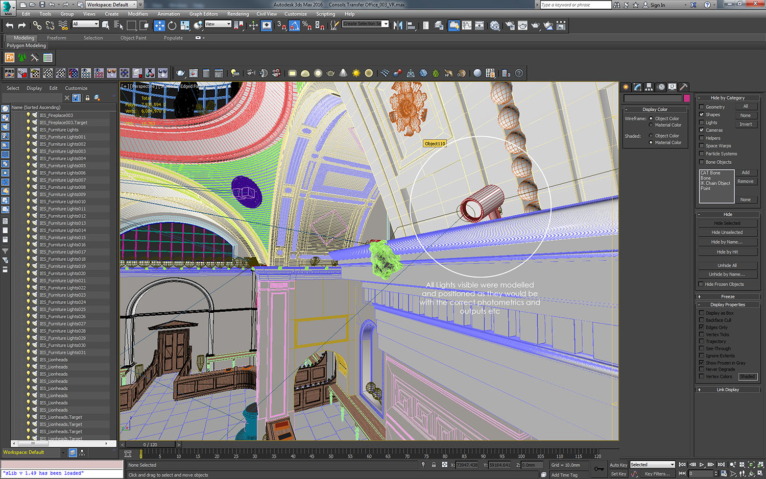
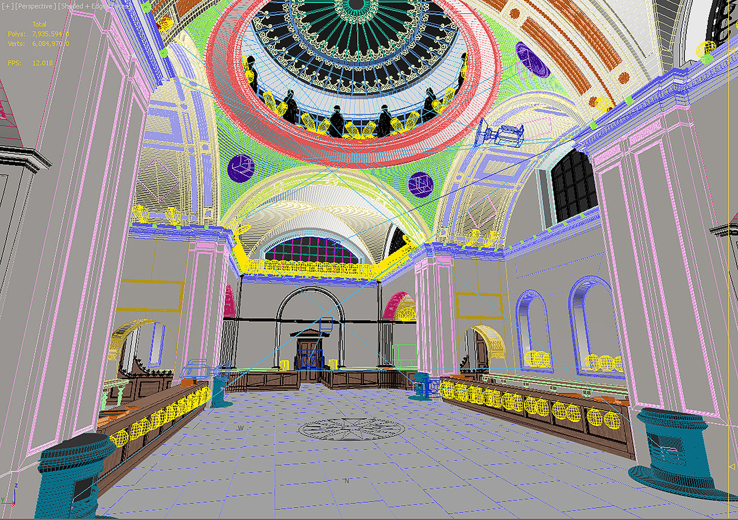
Once the lighting team was happy with the design, we translated it to our scene in 3ds max. The correct photometric files (IES) were used for each product and Vray IES lights ensured the outputs, colour temperatures, product positions and orientation were correct.
Image showing 3ds max scene with all IES files in place.
We rendered draft passes on low settings of each set of lighting treatments individually, so that we could quickly verify with our lighting team and make necessary adjustments to positions, outputs and colour temperature. Once we were happy with the lighting we rendered with all the combined lighting treatments.
ATMOSPHERIC EFFECTS AND CAMERA SETUP
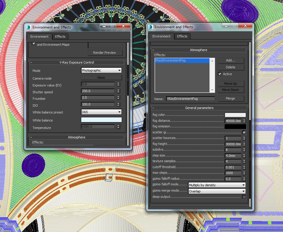
Vray environment fog was used to create the rays of sunlight entering through the glazing. We wanted to keep this subtle so as not to take over the image, and therefore ran several draft renders on low settings until we had achieved the desired effect.
Camera settings were the same for each camera. When we wanted certain items in the foreground to be out of focus, we used a wide aperture (F2.0) with a fairly high shutter speed to achieve the right exposure. See settings below.
RENDERING
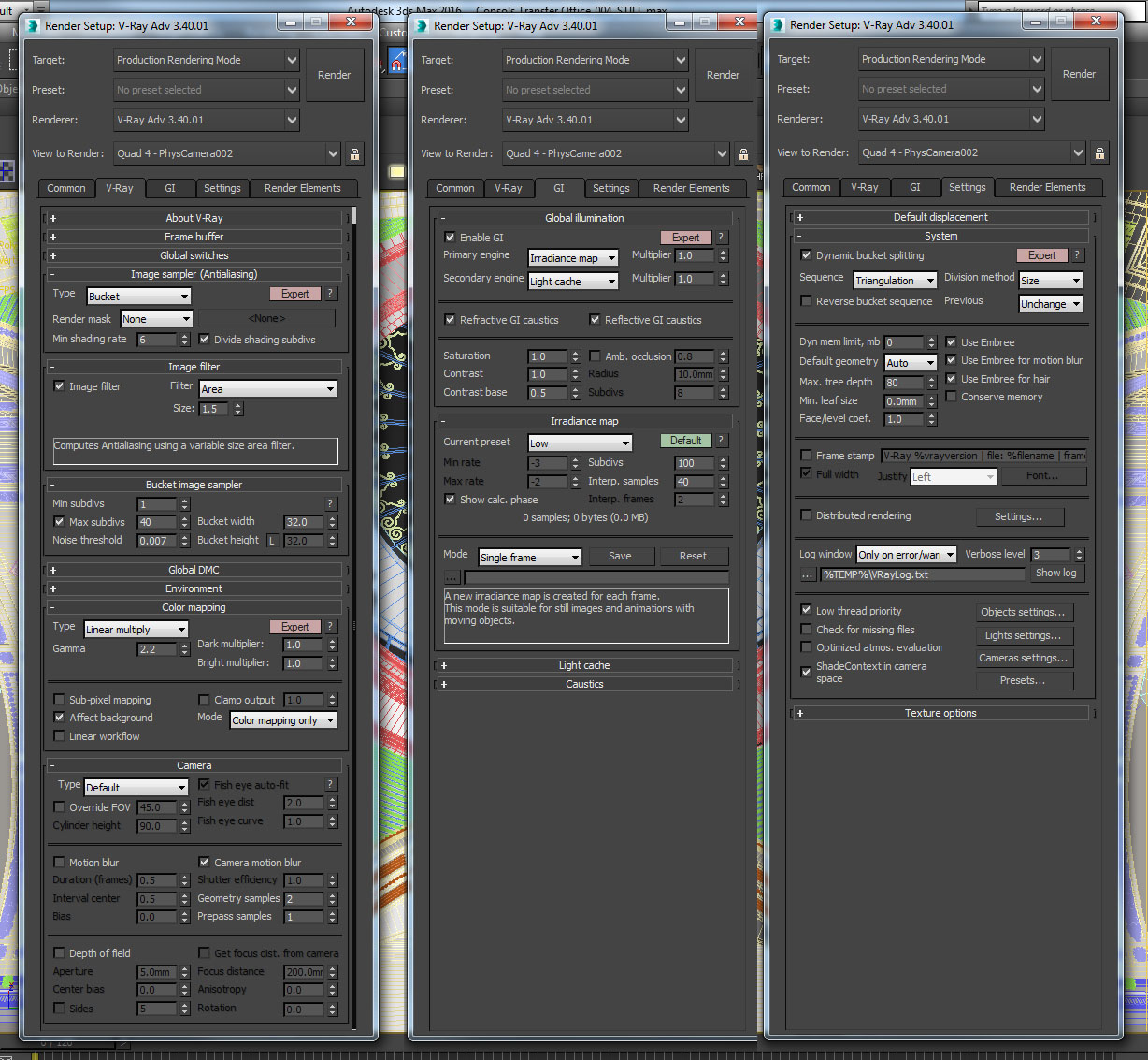
We rendered the final images on high settings at 4k high resolution and saved them as 32bit EXRs to allow some tweaking of the exposure controls in post-production. Render settings are shown below.
POST PRODUCTION
When producing accurate lighting visuals we carry out as much of the lighting setup and tweaking in drafts before the final render, to avoid affecting the lighting in post-production. In this case very little post production was necessary, because the renders came out as expected, in terms of accurate lighting representation. We simply made some minor level adjustments, sharpening up the images to make the contrast ‘pop’ a little.
FINAL IMAGES
ALL FINAL IMAGES HERE.
CONCLUSION
Though the modelling of bespoke detailing into the interior space took a lot of time to research and verify for accuracy against Soane’s drawings and the sketches made available by the Museum Foundation – the challenge created an incredibly rewarding experience, with a great learning curve and insight into building construction in the early 1800s and the materials used.
Once we had the model ready for the still images, we used it generate a VR simulation to showcase the daylighting and artificial lighting aspects.
Watch out for our follow- up piece ‘Project Soane – Consols Transfer Office – PART 2 – VR Simulation’. For a taster, please see the video below:


About this article
Making of: Project Soane - Consols Transfer Office


