Making Of
The Making Of By the Window
Malaysia's Husni Nawi breaks down his recent scene in this Making Of By the Window.
Introduction
Thank you to CGarchitect.com for giving me the opportunity to write this article. For years I have been inspired by the great artist featured here.
The image started as a personal project for me. The idea was to experiment with some sort of feeling that could be projected through the image.
Workflow
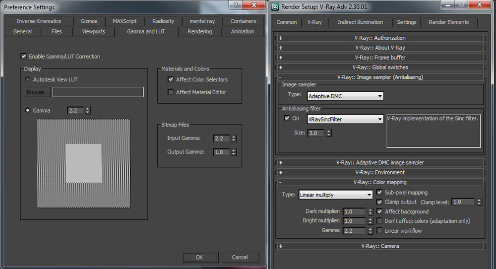
First step on preparation for the scene is to convert my workflow to Linear Workflow. I find it very useful to create a more realistic feeling to the final output. You can see the setup here.
Modelling and Texturing
I am not going to go through details on the modelling because there is nothing much to say about it.
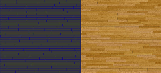
I used the plugin Floor generator to make the floor boards. As for the material I used Unwrap UVW to scatter the diifuse for the boards.
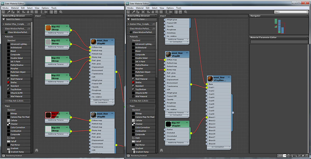
Here are the material settings.
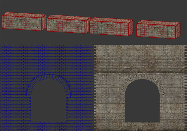
For the brick wall I started by modelling four different types of brick. I used a chamfer box, added segments to it and then applied a noise modifier with different settings for each brick to give it variety. After that I applied turbo smooth modifier and converted all my bricks to proxy.
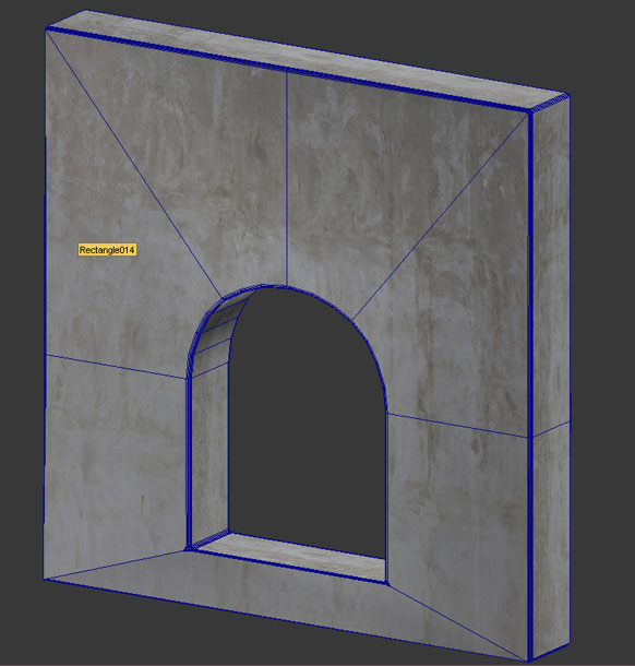
I modelled another wall to put behind the brick wall.
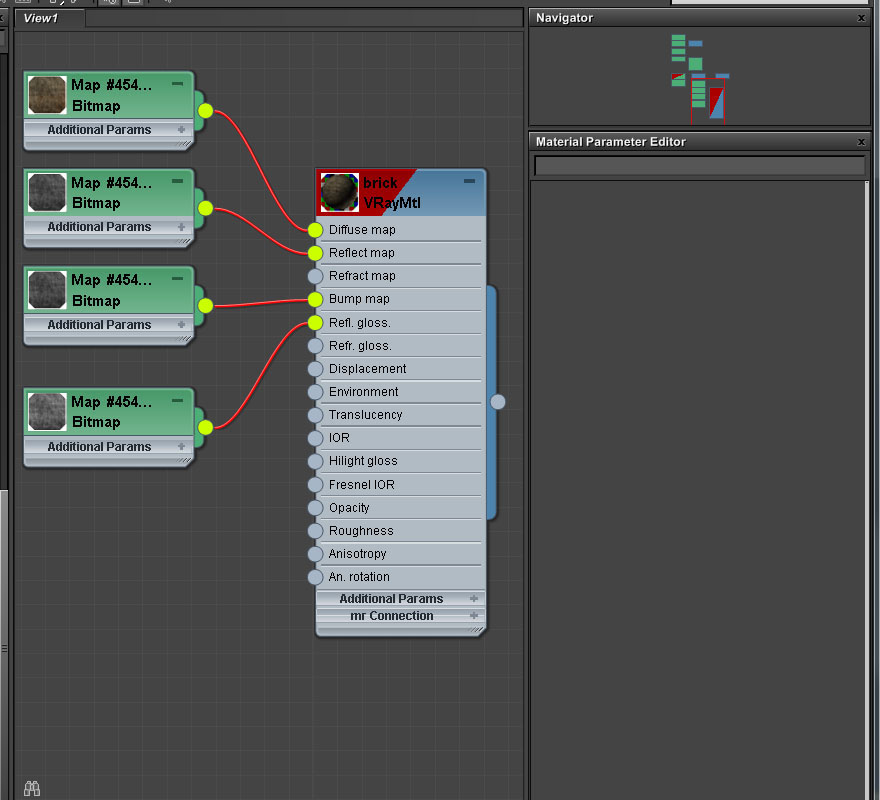
Material settings for the brick wall.
I guess the main subject in the scene is the window. So I spent quite sometime to study and look for good references for the window. Why did I chose this shape of window? Just to give a more dramatic feeling I guess.
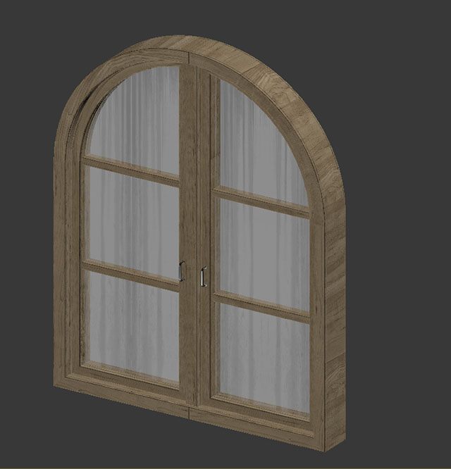
The mapping for the window is done by using Unwrap UVW.
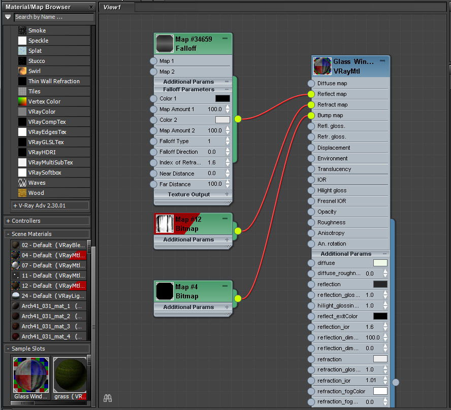
Here are the settings for the glass.
Lighting
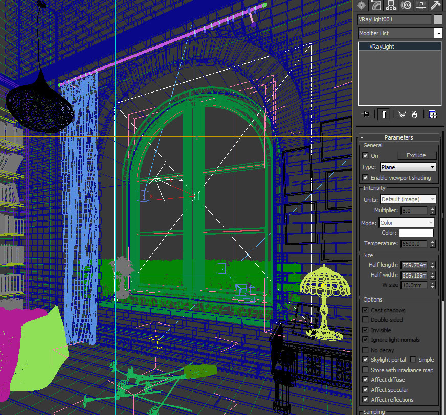
The lighting in the scene is pretty basic. I'm not using any HDRI in the scene since it's not going to contribute much to the overall feeling. I always believe less is more. For the outdoor lighting you can see the settings below.
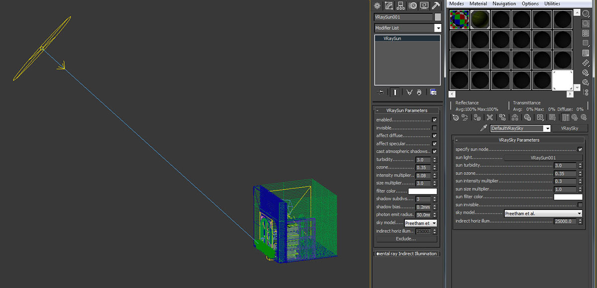
For the light in front of the window I set up a skylight portal so that it would gather the illumination from the V-Ray sky setting. From here I don't really need to put a value for the multiplier.
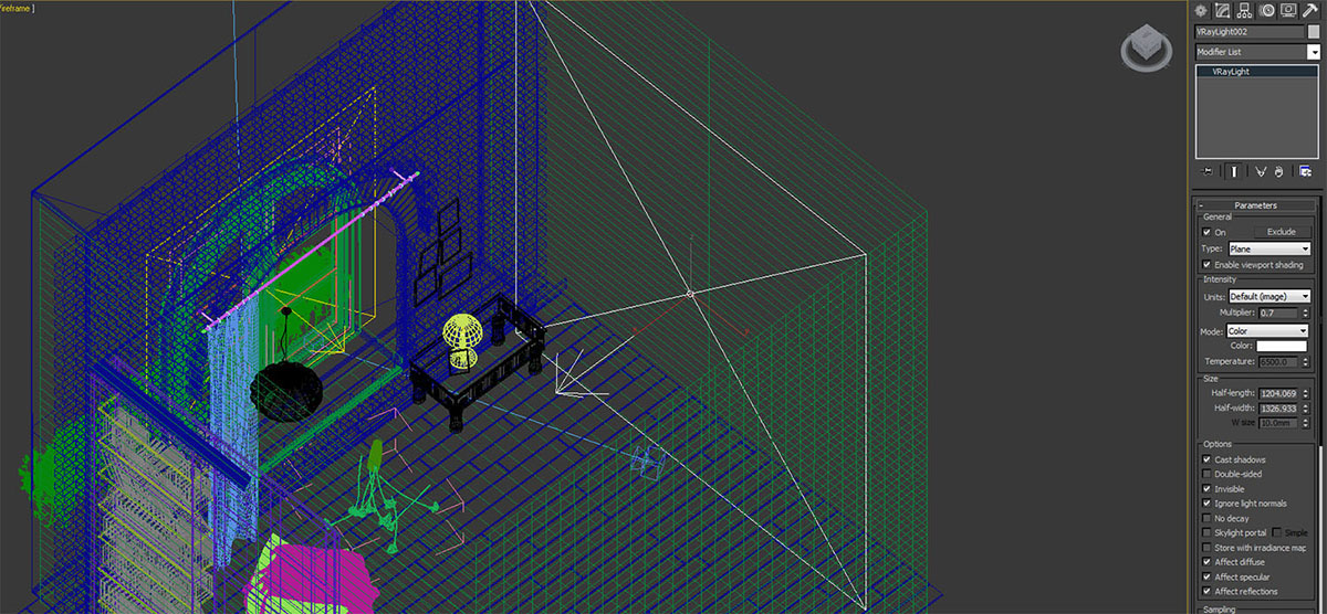
I put another vray light to the right side of the camera.
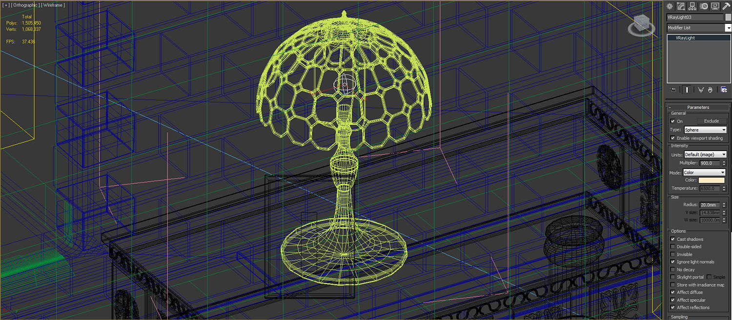
Last one is the light from the table lamp.
Render Setup
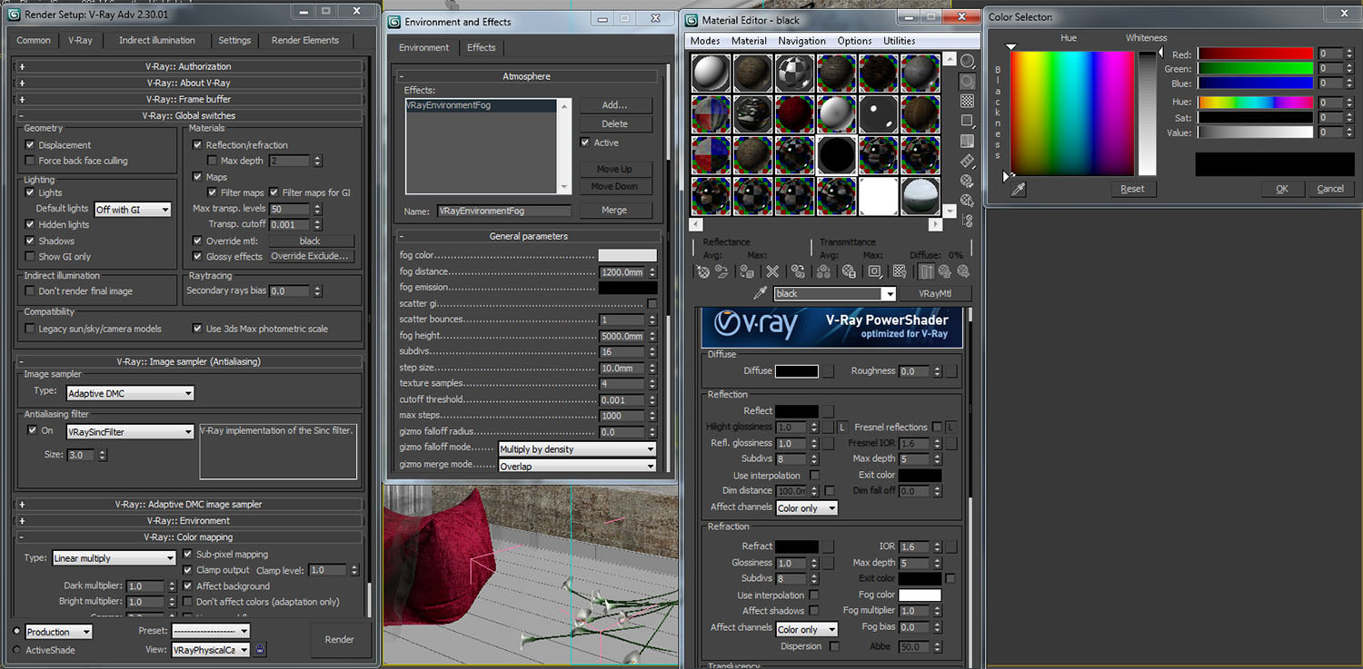
Here is my render setup.
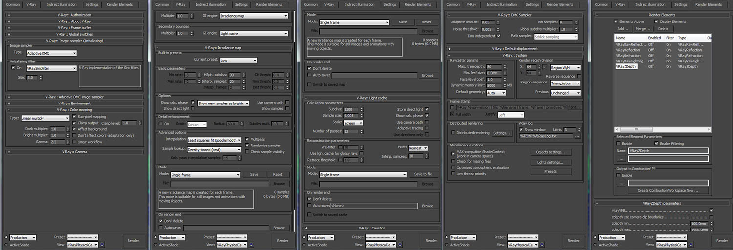
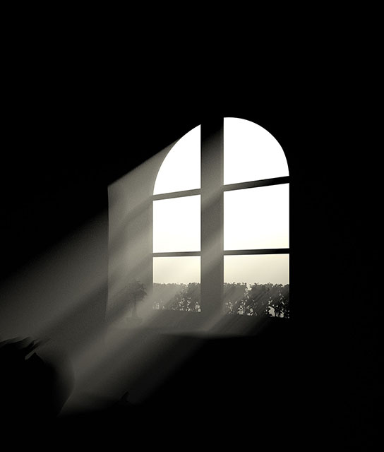
For the light rays I created one material that is almost black so it wouldn't affect the bounce light for the object. I don't need the G.I. I don't want to use the Atmosphere under render elements because it would affect my rendering time. Plus it would take me some time to test render and get the effect I want. I find it more time saving to using this method. I dragged the material to the render tab under the override material.
I rendered it separately from the original rendering. You can see the result of below. This rendering will be used in the post production along with other render elements.
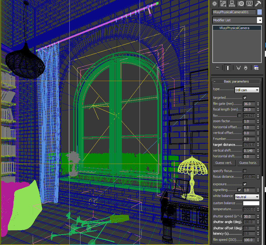
And finally the camera settings.
Post Production
Now, this is my favorite part since its going to determine the direction for the image. I did a lot of post work in the image to get my final result. I will try to breakdown the process in this article as simple as I can.
Raw render
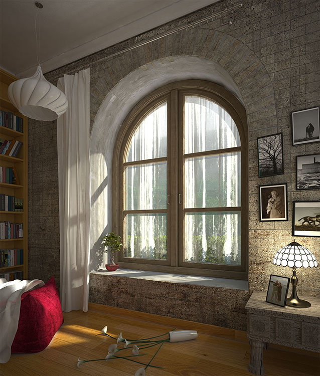
I combined my render elements to enhance the image. You can see the process below.
Raw reflection added. Layer blending in softlight, opacity 23%.
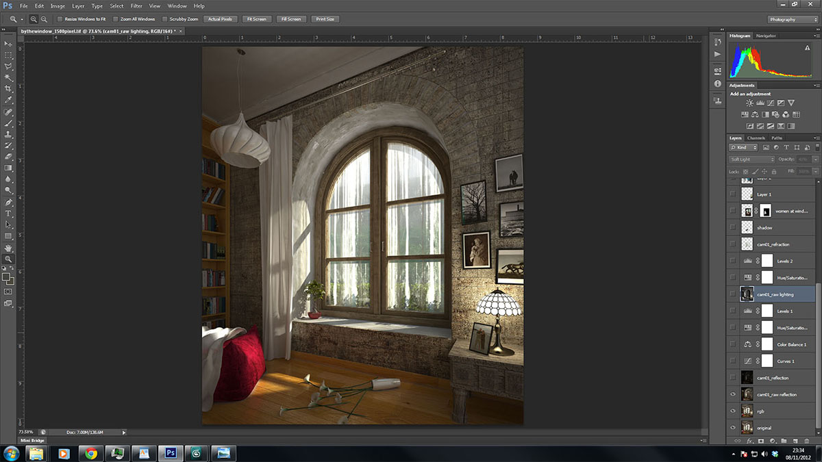
Reflection added. Layer mode in softlight, opacity 23%.
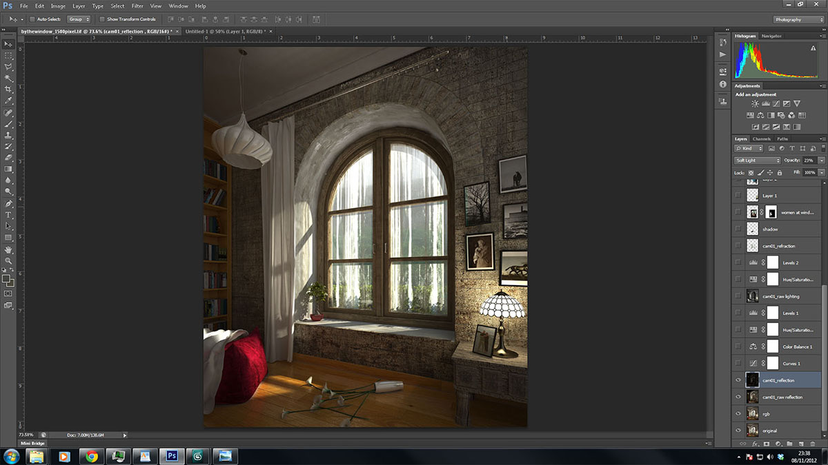
At this point, I added Curves, Color Balance, Hue/Saturation and Levels to the image.
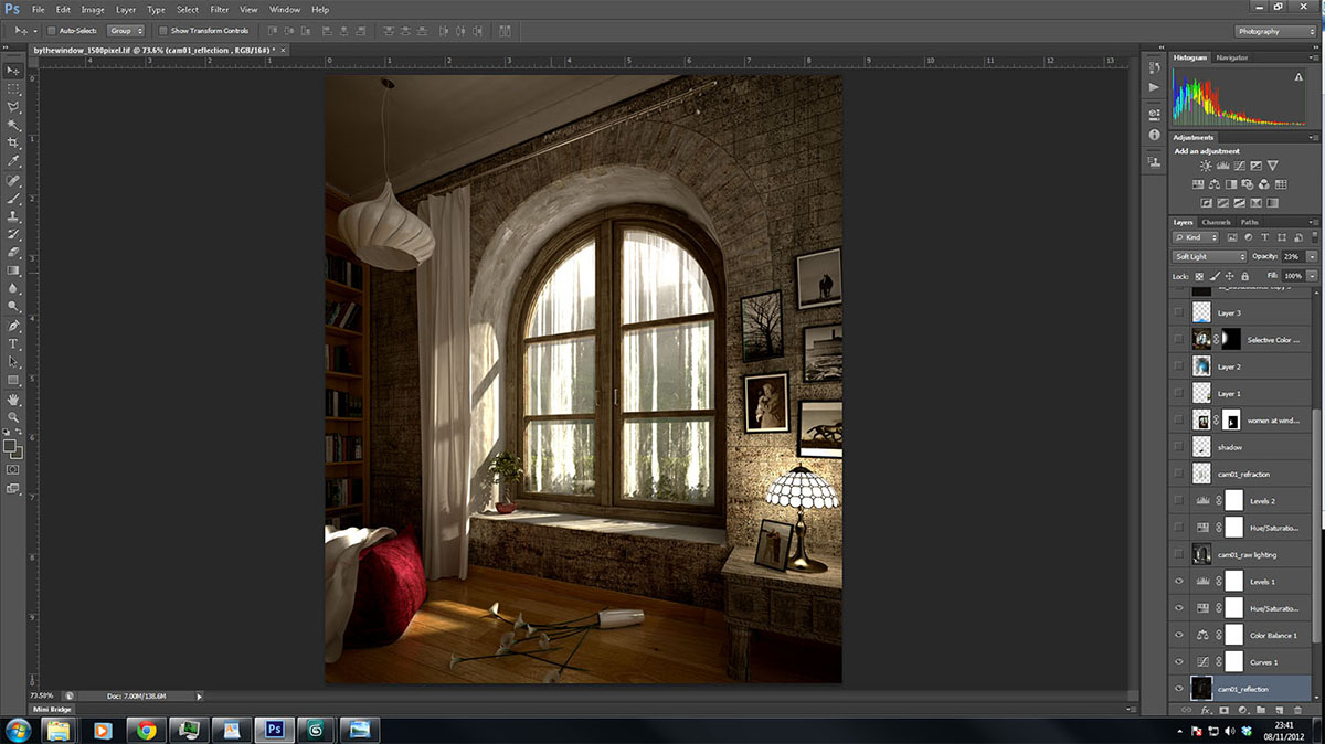
Raw lighting added, layer mode in soft light, opacity 43%.
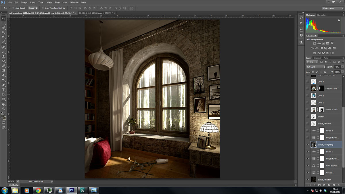
I added Hue/Saturation and Levels to the image.
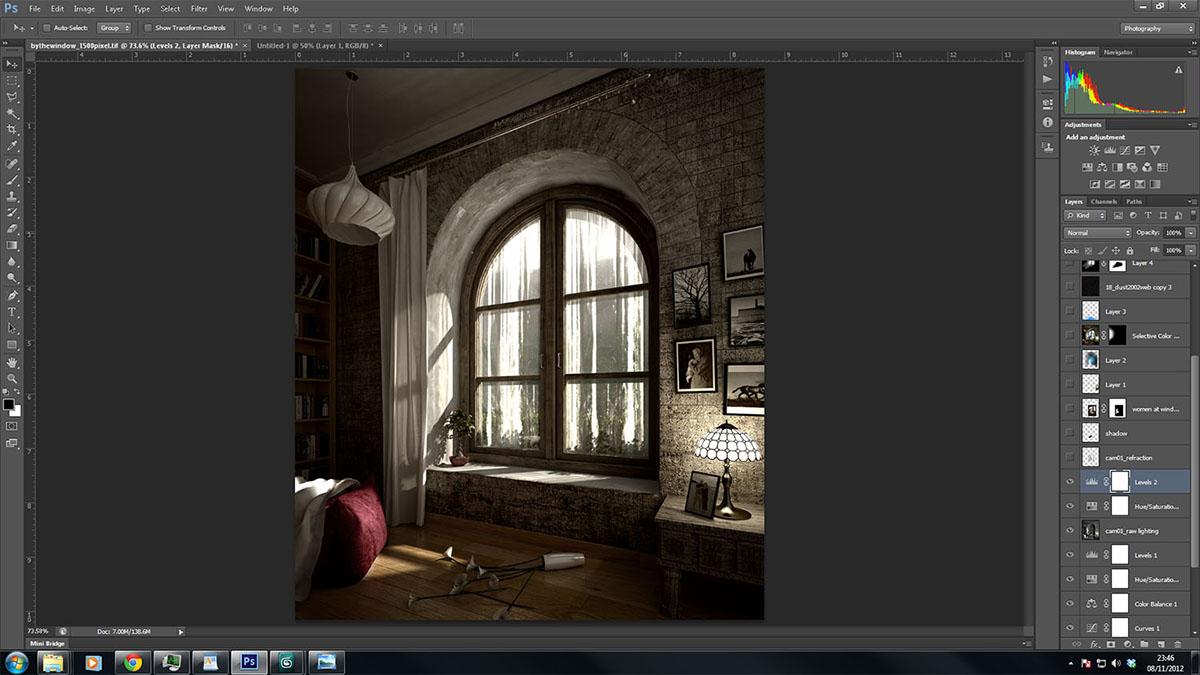
I added refraction element to the glass, so pay your attention to the window. Layer mode in multiply, opacity 28%.
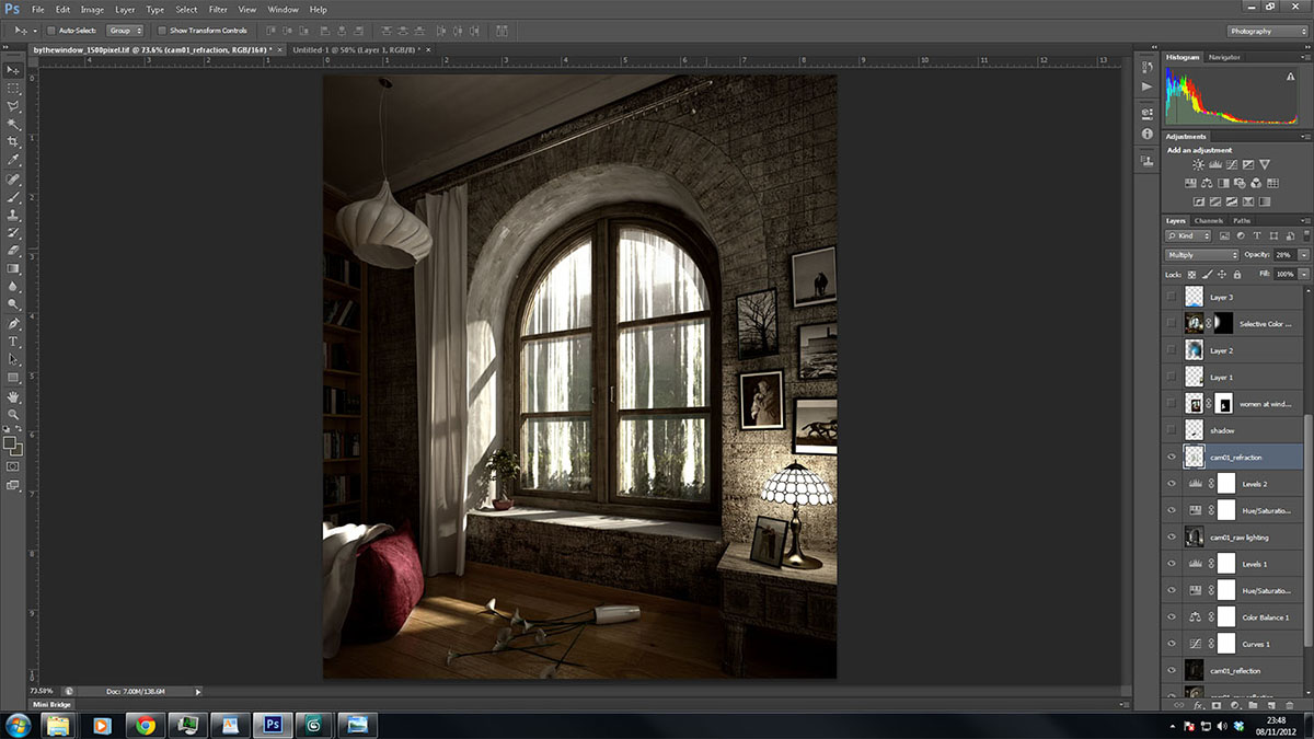
Now its time to add the figure of our main character to the image. I added some bloom to the table lamp and to the window to give a more dramatic feeling.
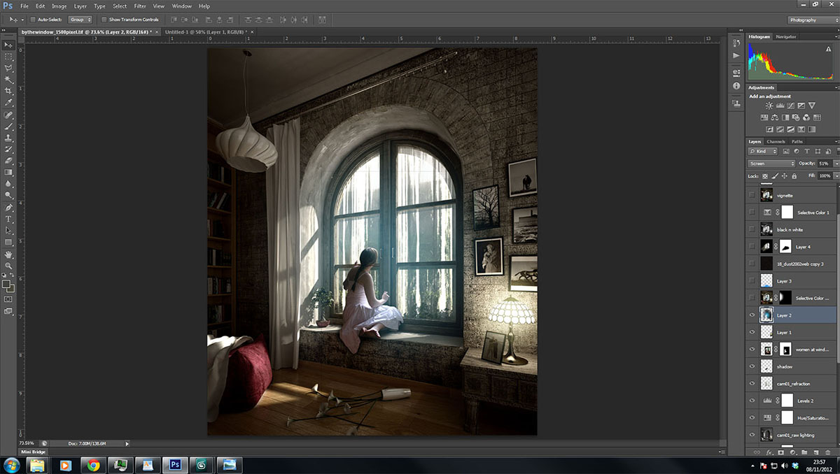
For the next process I select all of the layers and duplicated them. Renamed them with selective color, change the layer mode to screen and added masking to it. I filled in the masking with a black color which is to hide it. By using a brush I started to paint the dark area at the book shelf to give it some illumination.
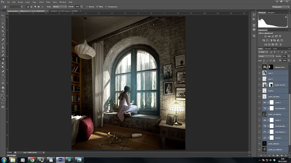
I added a new layer and painted the floor with light blue color. Changed the layer mode to overlay with opacity of 69%.
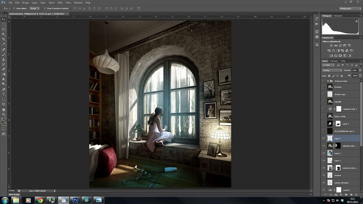
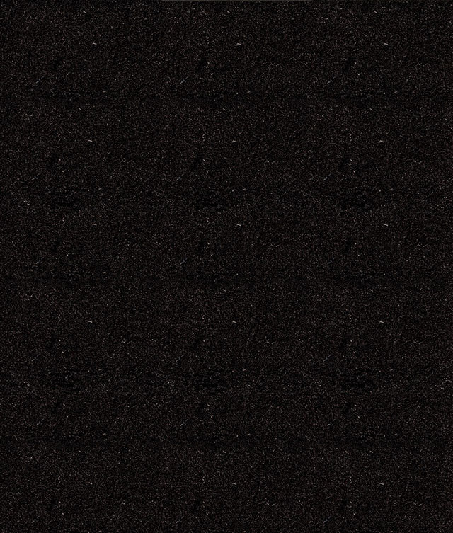
To simulate the dust particles in the air, i picked one image that you can see below. I put it on top of my image and changed the layer mode to screen with the opacity of 18%.
Dust particles image.
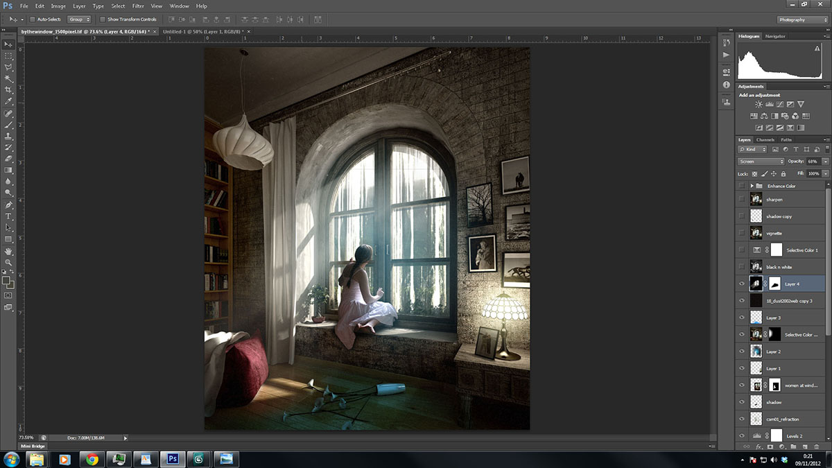
Our next process is to add the light rays that I rendered separately before. I placed it on top of the layers and changed the layer mode to screen with opacity of 68%.
Again, copy all of the layers and merge them. Go the Image tab, under Adjustment and pick the Black and White. I changed the layer mode to overlay and gave the opacity about 37%. It gives a contrast to your image and I use this technique a lot.
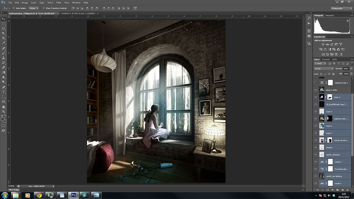
For the final process, I added Selective Color, some vignette to give more of a photography effect, sharpened the image a little bit and added some levels, and gradient map to give more contrast. You can see the final image below.
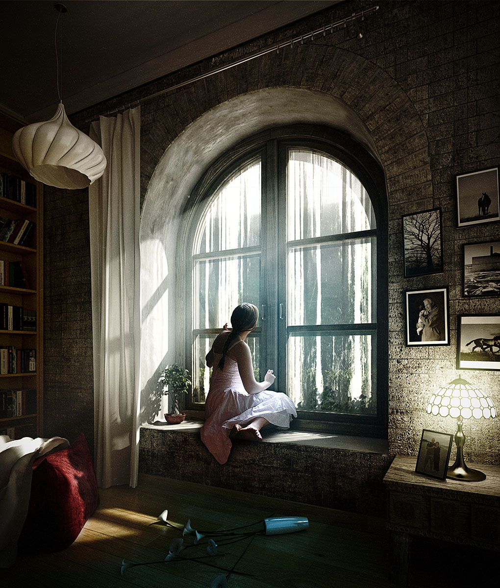
I hope you enjoyed the process of making this image as much as I did. Again, thank you for giving me this opportunity.







About this article
Malaysia's Husni Nawi breaks down his recent scene in this Making Of By the Window.


