Making Of
Storytelling: How to Evoke Emotions Through Architectural Visualization
Stories, narratives, and images are no longer restricted to the vocabulary of writers or artists. These words have become part and parcel of contemporary business-speak. Google “storytelling in business” — and you’ll find countless cases of how storytelling engages the target audience and humanizes your brand. You can apply it to any industry, and architecture is no exception.
In this article, you’ll learn how to use storytelling in architectural visualization and why it’s worth giving it a go.
How important is storytelling in architectural visualization?
A powerful image, photograph or painting always has a purpose. It makes us feel in a certain way — for instance, happy or disappointed, triggers some memories or tells a story. When it comes to architectural renderings, each design element should involve a viewer into a captivating narrative. The imagery should evoke emotions and create an extra layer of meaning.
Intrigued? Let’s have a look at the most common techniques for visual storytelling in architecture.
Context
Context is a combination of various elements that, when used together, form a coherent story. Without a context, an architectural visualization won’t engage your audience or call forth certain feelings. In other words, context lays a foundation for the narrative behind your design, bringing your visualization to life. Let’s see how it works with a real example.
Take a look at this detailed exterior. It depicts early autumn in a cozy neighborhood. The skyscrapers in the background tell you that downtown with its hectic life is not that far away. However, the neighborhood enjoys living in the slow lane.
The accent here is on the residential building amid a friendly, pleasant environment.
It’s a quiet and relaxed weekend afternoon. You can see people strolling along the street, peeking in shop windows, walking their dogs or cycling. A couple is on their way toward a romantic dinner at a neighborhood restaurant. Life is full of energy and good vibes.
To create a positive atmosphere, the architects built a connection between the internal and external space. The ground floor of the building will be used for commercial purposes. That’s why there’s the detailing of the shop front and people walking by. A designed interior is visible through the windows of the residential floors, and there’re people enjoying the warm weather on their balconies. All these details give the picture a realistic feel and tell a particular story. Can you relate to it?
Lighting
In this image, for example, a pedestrian street is lit by natural sunlight that visually draws a walking path around the building. The facade is in shadow, while the windows are lit up by late afternoon sun. Warm, soft lighting adds depth to the building, foregrounding it. The light spilling on certain objects creates a sense of motion and makes the viewer’s eye gaze diagonally across the picture.
Color
Interaction of colors in an architectural visualization can give your project a completely different feel. For example, warm colors instill a sense of calm and comfort, while cool colors add a feeling of mystery and sophistication.
Interaction of colors in an architectural visualization can give your project a completely different feel. For example, warm colors instill a sense of calm and comfort, while cool colors add a feeling of mystery and sophistication.
The visualization shown here depicts early autumn, so the basic color here is green. Red- and orange-leaved trees in the foreground add extra volume. Perfectly matching the brick facade of the building, they immediately catch the viewer’s eye.
Composition
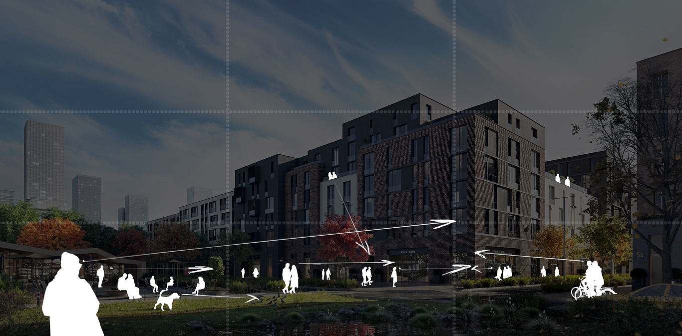
Usually, people can focus only on one thing at a time when looking at the image. However, the elements on it have the power to lead the viewer’s eyes from one point to another, creating a sense of movement. The architectural visualization can also direct our attention and “guide” our sight with the help of perspective, contrast, and focus.
Of course, our composition incorporates the basic rules such as a rule of the thirds. In addition, it includes the right details and emphasis. A man in the foreground is looking up at the building, directing our attention to it first. But that’s not all. He is also an element of scale. Placing people in renderings is a great way to show the building’s dimensions.
People and inanimate objects act as visual guides, drawing attention to the main object of visualization and alerting the viewers to a specific narrative or atmosphere you tried to create. Also, the right arrangement of shapes makes the image more dynamic and enhances the visual story.
Emotions
Imagine that visual storytelling is a game. If you did everything right, you’d get the most sought-after prize — the viewer’s emotions. What’s most important, these emotions will be associated with your architectural object.
Imagine that visual storytelling is a game. If you did everything right, you’d get the most sought-after prize — the viewer’s emotions. What’s most important, these emotions will be associated with your architectural object.
The golden rule for an effective architectural visualization is to trigger particular emotions. A well-crafted story behind your project is your best tool to reach this goal.
Conclusion
A good architectural visualization is an equation with three key elements. It evokes certain emotions, it builds connections, and it inspires your clients to take action. Telling a well-composed story where each item plays a particular role and contributes to a certain vibe might be your best instrument.
You must be logged in to post a comment. Login here.
About this article
A powerful image, photograph or painting always has a purpose. It makes us feel in a certain way — for instance, happy or disappointed, triggers some memories or tells a story. When it comes to architectural renderings, each design element should involve a viewer into a captivating narrative. The imagery should evoke emotions and create an extra layer of meaning.
visibility13
favorite_border0
mode_comment0


