Making Of
Making of the Kamppi Chapel
Alberto Germá – 37d Architecture Office - Spain
Hello everyone, and thanks to CGarchitect and to Jeff Mottle for giving us the opportunity to share our work with all of you.
This project has been nominated for the 2013 3D Awards in the “Non-Commissioned Film” category. We hope you like it and we would appreciate any comments or questions you might have about it. It is part of a bigger project in which we recreated a 3D a group of buildings with great architectonic characteristics; this is only a small “demo”!
In this specific case the project recreated is the Kamppi Chapel, from the architecture studio K2S Architects located in Helsinki, Finland.
Reference image 1
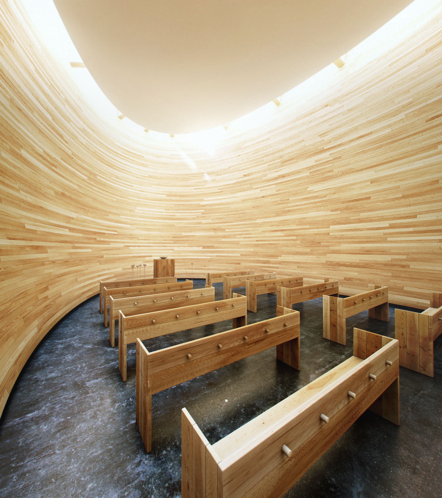
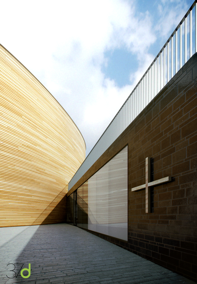
The Kamppi Chapel is located on the south side of the busy Narinkka square in central Helsinki. It offers a place to quiet down and compose oneself in one of Finland's most lively urban spaces. With its curved wood facade, the small sacral building flows into the cityscape. Simultaneously the chapel’s gently shaped interior space embraces visitors and shields them from the bustling city life outside.

Reference image 2
Only the actual chapel space is located in the wooden volume. Secondary spaces are located in a space opening up towards the square. The entrance space doubles as exhibition space, in which one also encounters clergymen and social workers.
Reference image 3
Reference image 4
The sacral space is a calm space, in which the lively neighbourhood seems distant. Light touching down on the curved surface and the feeling of warm materials define the space. The chapel’s inner walls are made of thick oiled alder planks. The furniture is also made of solid wood.
Text taken from K2S Architects (www.k2s.fi)
Our main goal was to represent as faithfully as possibly the chapel, its light and the sensations one feels inside it. We always kept in mind, as references, great artists in the field of info-architecture, such as Alex Román, whose subtlety when explaining his projects, for us, is the key to achieving a great result.
The software used is:
AutoCAD, 3ds Max 2012, V-Ray 2.0, Marvellous Designer, Photoshop and After Effect for the animation.
Ok, let´s begin!
Final images
Workflow
A good planning is essential in order to succeed when working on a project like this one. In this case, we had more than enough information on the building: plans, sections, constructive details… pretty much everything needed to create a very detailed 3D model.
We have used Linear Workflow for the gamma settings, normally at 2.2.
On this image you can appreciate the previous work done in AutoCAD, in order to make working on 3ds Max simpler.
Details of the furniture used in the scene, completely exploded.
Detail of the exterior area of the chapel, the access zone and lobby.
Modelling
Modelling this project was quite simple, because we had all the information needed.
Here you can see how we extruded the main volume and then we deformed it with the FDD 3x3x3 modifier.
The higher beams are rendered splines that have been later turned into editable polys.
We have modelled every possible detail to make the scene as realistic as possible, even the exit signs.
The benches were a key element, instead of making a single object and work on its texture, we created each of the boards that together composed the bench and gave each its own texture. We tried to eliminate any sharp edge creating a small bevel for each of the objects in the scene.
To give the scene even more details, we used Marvellous Designer to create the stole that will rest on one of the benches.
Once we found the ideal position for the stole, we exported it from Marvellous Designer back into 3ds Max, we texturized it and we increased its details with a “tursbosmooth”.
Here you can see the model corresponding to the lobby and access hall, the exterior area of the main camera.
Lighting
Lighting the scene was quite simple. We used a mixture of HDRI and VraySun. We always kept in mind the reference images to try to achieve a more realistic look.
On this image, you can see the VrayLight-Dome setup used which has the HDRI as its intensity, and will be in charge of generating most of the lighting of the scene.

The VraySun helped us create the shadows that enter the chapel for the higher part of the building. 3 subdv for testing.
As HDRI we used one of the Peter Guthrie HDRIs as an environmental lighting, it is the VraySun the one in charge of creating the hard shadows.
This is the scene with its final configuration for lighting and the values on the camera used.
Materials and textures
For us it was really important to get the materials right on this project, because we wanted to achieve the same sensations and warm feeling that the wood generated in the real chapel.
But before we get into the wood, let us show you the small detail of the exit signs.
The exit sign was also a material, in this case a lighted material, which gave a small tint of green light to the access areas.
For the wood we used the Multitexture plug-in from CG-Source in order to achieve different shades and work with a great quantity of different maps. This was done to give each single piece modeled its own texture and a greater level of realism.
On the image above you can see the details used on the floor material.
And this is the material used on the metallic baptismal font.
Rendering
When rendering, we decided to use BruteForce because we did not have a deadline, and we thought it was a good excuse to experiment with this method. We then found out it was much faster than we had originally thought.


This is the list of the different elements that we later used for the still images and the animation.
6. Post-Production
This was the result of rendering the different render elements mentioned above. We then treated each of them in Adobe Photoshop.
The first step we made was to adjust levels in a very basic way.
Right after we activated the VrayReflection channel in screen mode with opacity at 50%. We managed to increase the level of reflection of our floor.
Then, we turned the VraySpecular into screen mode with its opacity at 100%.
The next step was to increase the level of detail in the areas where we had different elements next to each other, using VrayExtraTex in multiply mode with opacity at 20%. In this case, we used a mask to be able to delete this effect on the higher area of the image.
VrayDiffuseFilter in overlay mode at 15%.
We then used the second VrayExtratext that we had created when rendering (each has a different radius in order to cover different types of details). Multiply mode at 30%.
Afterwards, we made some adjustments to the hue/saturation, colour balance, selective colours and finally we passed the image through Magic Bullet to give it its final look.
One of the last steps was to use the VrayZDepth in an inverted mode to generate volumetric lighting. We first inverted the map, and then put it in screen mode with its opacity at 15%.
To finish it, we added some vignetting and chromatic aberrations.
And this was the final result!
Animation
Once the still images were finished, we reviewed the project to create a small animation. Again, this was part of a larger project and is why we wanted to create only a small animation, of no more than 1 minute per project, in order to explain the most important aspects of each of the projects represented.
The first step was to create a small storyboard where we recreated the shootings we wanted to work on and the different movements of the camera. We tried to use only subtle and smooth movements.
We configured 3ds Max for an animation at 25 fps and about 280 frames. We finally only rendered around 200 frames, because we always leave some frames as a buffer in case there is an error or we have to extend the sequence.

To render the animation at 1280x720 we changed the setting to IM+LC because it takes up considerably less time and since we were going to treat it afterwards on After Effects, we wanted to work with the fewer amounts of files possible. We decided to render in EXR format, which is a format that includes all the rended elements in one single file and makes everything much simpler.

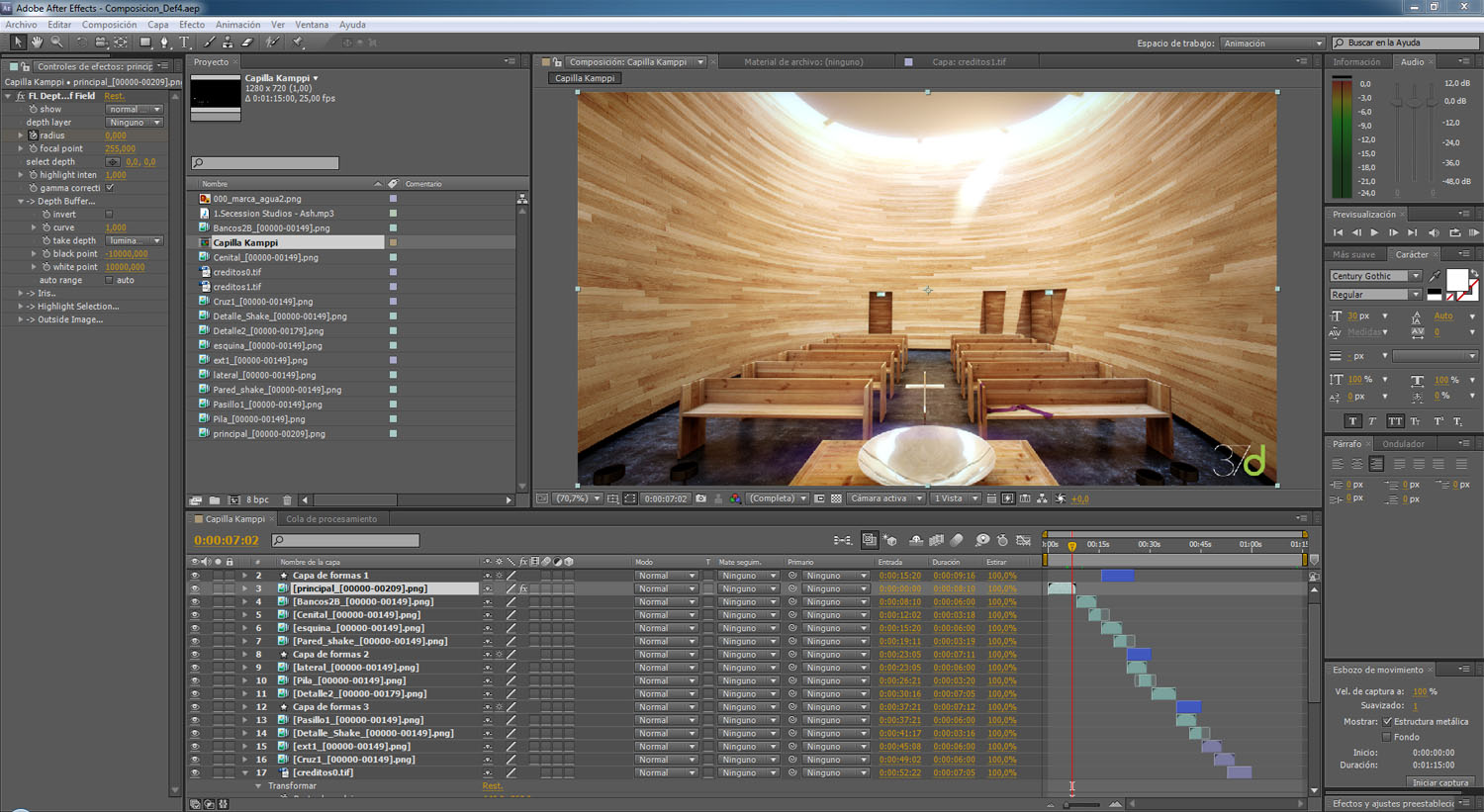
Once rendered, we uploaded our sequences of images in the EXR format on After Effects. Then we repeated the process used on the post-production in Photoshop with the render elements of the still images.
We then applied Magic Bullet Look to the different sequences of images in After Effects.
And finally we assembled the animation with all the rendered sequences and added the music. We then rendered once again the assembled project and the animation was finished!
Here is the final result:
That´s all folks! We hoped you enjoyed this tutorial and hopefully you will find it useful! Please feel free to ask if you have any questions!


About this article
Making of the Kamppi Chapel by Alberto Germá


