Business In Archviz
Business in Arch Viz. Vol. 10 - Finding Your Look

Finding your look by Juraj Talcik
An approach for conscious image creation and better use of tools in managing your personal creative vision
Ask the right questions
"So goes a proverb: Give a man a fish and you feed him for a day; teach a man to fish and he will never ask "What HDRi/LUT did you use?" ever again.
If there is one particular thing that visualizers have in common with photographers, it's that a lot of them are inadvertently asking the wrong questions, and that often leads to frustration on both sides. That is not just a trait of hobbyists or beginners, I am guilty of that myself after all these years! But I've learned to banish those thoughts, to better analyze what I am really interested in replicating, and then rely on my own skillset to realize it. This approach is something I would like to guide you through so that you can work with confidence yourself.
Why are there "wrong" questions? Because learning the answer to them wonít leave you in a more knowledgeable state in the true sense of the word. They're akin to asking "What camera did you use?" in day when even entry-level DSLR with a kit lens can make fantastic images. Heck, an iPhone photo can land you on the cover of glossy magazine or win you a photographic award!
Learning the name of the exact part of process or of a particular prop or tool will bring you as close to replicating the great image you admire as would buying the same chair and keyboard the artist used while sitting behind his workstation. The props or tools will merely show a potential, potential that the artists fulfilled themselves with their creative choices backed with experience.
The are no secrets to successful image
These questions will only set you up for failure and frustration. There is no elusive secret technique or hidden button to push (I've looked for them myself for way too long). Great creatives are almost never defined by such externalities as their choice of software, a particular technique such as HDRi, or which exact one or two buttons they push during post-production.
I am by no mean saying those aren't important. Great software that fits your preference, or high-quality HDRI domes that do their job correctly, are important parts of the creative workflow and their mastery can be crucial in executing your creative vision. You can't take a picture without having some sort of camera after all, but it's important to sort out the priorities and place the tools and techniques where they fit better - which is behind a conscious creative vision.
The role of the software
The tools of the trade for the architectural visualizer have greatly evolved to a point where they are as unobtrusive as possible. Long gone are the days of tweaking loads of technical values and searching for the right formula that will save you from the morning horror of seeing splotches all over your image. All tools can make great images now, so you can't make a wrong choice. Consequently, none of the tools will produce great images for you all by themselves. This is a fantastic state of affairs because we want to focus squarely on the creative part, without enduring any unnecessary burden from the technical part.
I personally use Corona Renderer for the ease of use, which comes both as great integration into the host application like 3ds Max, and as great simplicity in producing clean, technically-correct images. It's the closest to the one-button dream solution, and capable whether you are a beginner or seasoned professional.
The same applies to post-production software, whether you use it to paint the majority of your picture or just put some finishing tweaks to color and tones.
With all that said, I would love to show you how I try to find my vision for projects and how I use my tools to craft the images afterwards to fulfill that vision.
The rest is not important for the look of your image! It's great that we have the freedom to not think about it anymore.
Lost in the Workflow
There are many established common workflows when it comes to architectural visualization, and some of them harken back too much to the technical nature of it. The biggest offender in my book is to overly focus on breaking things up into particular building blocks, i.e: "Lighting"/"Texturing"/"Post-Production"/etc.
When you divide your work into blocks like this in the very beginning, the image process becomes a technical puzzle, where you can easily get the feeling that you might be missing a crucial block in order to solve the puzzle. It may also lead you to give preference to a particular block to the detriment of the final image. A fantastic texturing job will never be able to save poorly lit and composed image that doesnít elicit any emotion.
It may also lead you into a needlessly strict linear path when being more flexible would yield a better result. Stacking layers on top of each other relegates the workflow to that of a painter - except the kind who is renovating their kitchen rather than one who is creating a work of art. I would like to propose an alternative that puts a slight twist on this.
Enter (Pre)visualization
The great photography pioneer Ansel Adams defined "visualization" as "the ability to anticipate a finished image before making the exposure".
The complexity of early-age photography made visualizing your subject a crucial necessity. Knowing what composition and light you were going to capture was an important aspect of it, and while there is nothing wrong with simply capturing reality as it is with an unpremeditated push of a button, this concept of visualization is much closer to the work we do in CGI, and learning to harness its power can be very beneficial.
Cinematography took this purely psychological concept further, into the practical realm of prototyping, called "previs", experimenting with art direction such as lighting, composition, camera and placement in a looser more approximated set, before incurring the cost of full production. I like to utilize both of these concepts heavily in our work in architectural CGI. Here is how I apply it in our studio:
The harder the start, the easier the finish
I am not ashamed to say that we brainstorm and play around with the scene in our studio as much as we end up spending time polishing the result to its final quality. This has proved to be a successful formula for us to keep the creative spirit and motivation high while delivering unique and good-looking images that both us and our clients are proud of.
If you want to cry that this is a luxury you can't afford, I would love to clarify that this isn't about wasting time daydreaming before starting the tools, but more about equalizing the priorities during the full length of production. The creative gains during conceptualization and experimentation will smoothen and shorten the following production and may save you from spiraling production costs that can result from excessive back-n-forth with an unhappy client later in the process.
[Previsualization] -> [Scene mockup] -> [Applying the concept] -> [ Polishing up the successful concept]
Start with an Idea
Conceptualization isn't a set amount of stages or particular techniques. The process is individual for every artist and unique to every projectís needs. The main purpose is to think of the image. In our studio, Veronika and I consider what we want to achieve with the image first. Asking questions like: What are the strong elements of the project or the particular space to be portrayed? What sort of emotion should the image convey? What color palette and light would achieve that?
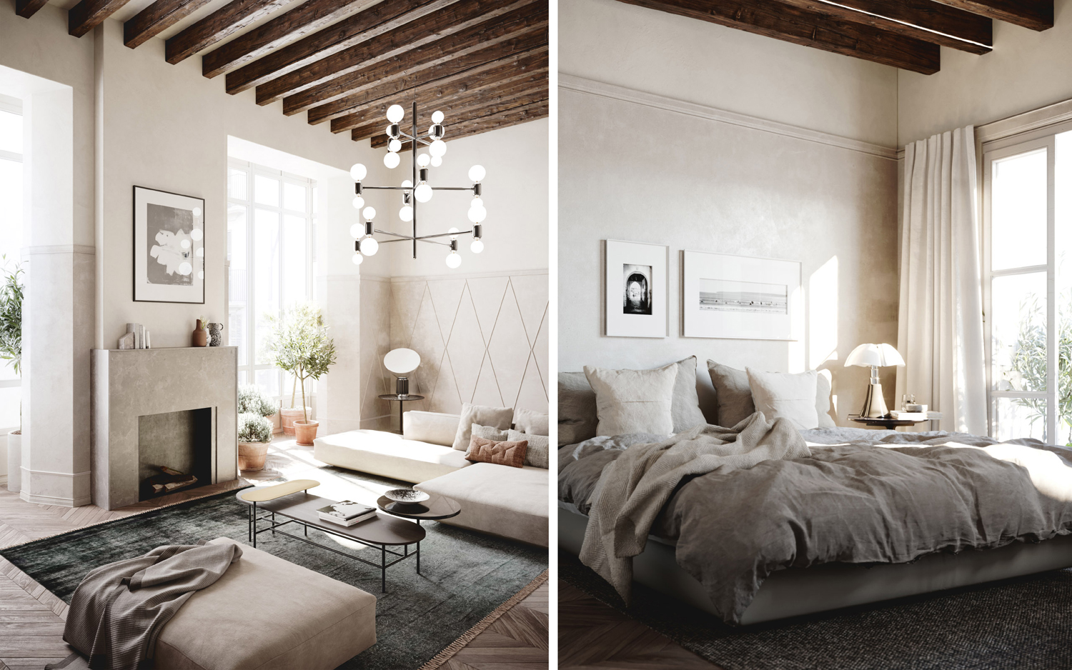
Lot of artists want the images to tell a story. I am not necessarily of the opinion that every image needs to strongly tell a story, and I feel this often leads to a forced narrative overtaking the image and overshadowing other qualities. But I do consider how each of the individual elements of the image contribute in meaningful ways. A hazy sunny morning light over a neatly unkempt bed can add a touch of life and a storytelling element to an otherwise sterile room. I imagine soft bright light washing over the room and a tamed palette of warm tones, and I get a mental image in my head of how I want to proceed with the image creation.
When building the vision for the image, I draw upon inspiration from a multitude of sources. There's a mental library of images in my head from personal experiences travelling and exploring, or a visual library of work from a multitude of media such as photography or cinematography, and so on. When drawing inspiration from the work of others, try not to just emulate them. Analyze and go deeper into why you love that particular inspiration.
Try to describe your vision. A bold composition, natural light, a focus on the XYZ element. It will remind you of the priorities during production and help you better communicate your ideas and your plan to your client.
Whether you merely keep this in your mind, or write it down, or create visual moodboards, all depends on you and the particular project. A strong moodboard can be a powerful weapon in winning over your clientís trust, granting you the much necessary creative freedom in executing your vision.
It's great to look for references elsewhere. Just aim broadly and look outside the field - photography, movies, paintings, etc. Perhaps subjects outside of architecture can give you ideas for your work (moody landscapes, colorful portraits...)
A small moodboard from a presentation to a client. If our ideas for mood, light, material and color palette, furniture and details fit together at this stage, making it fit together in a CGI scene will simply be a matter of craftsmanship!
A more agile approach
Armed with a vision, the next step is to quickly test it. It may live up to or even surpass its imagined potential - or it may fall like house of cards! It's therefore important not to focus on the details of the work yet.
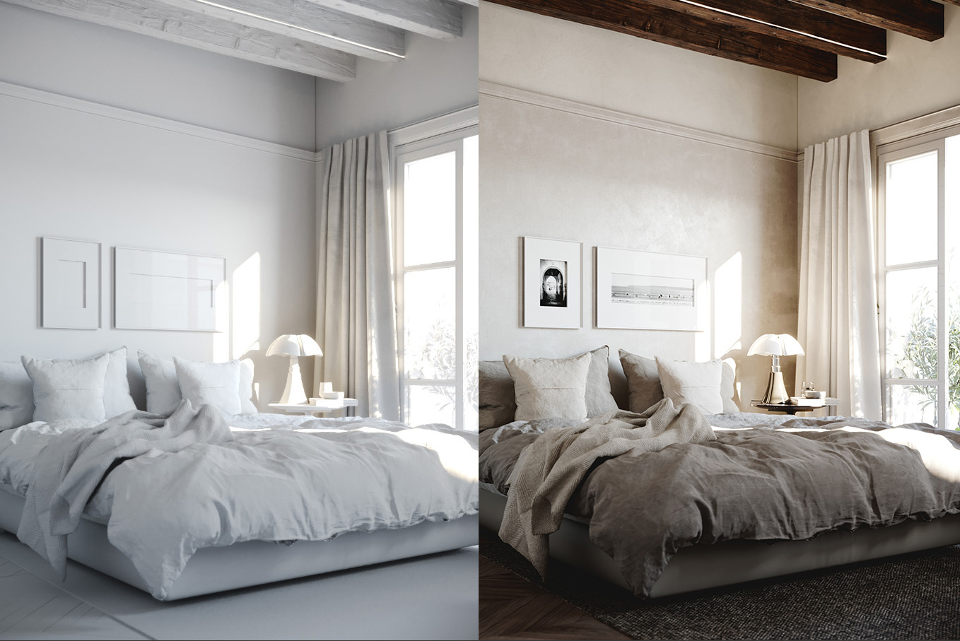
To quickly build up a playground, we use premade content from our in-house asset library when possible, and creating a simple approximation when not. I donít believe in testing in isolation. A "Clay" stage, which is the "naked" model of a scene with a white/grey material, is used at best for early composition or architecture sign-off, but not to test lighting, due to its very inaccurate portrayal of light; dark painted walls, overly rich colored props or reflective flooring can drastically alter the interaction of the light in the scene, and a clay render will not capture any of that.
With the help of physically correct shaders, this situation can be easily amended. Without wasting time on complex shaders and gathering high-resolution texture sources (which at this point wouldnít contribute much), I use a simple color or diffuse texture and approximate the specular reflection (just "matte"/"semi"/ or "polished"), giving me a preview close to how the final scene will look. Those are two clicks that can make all the difference.
The faster I build the set, the sooner I can walk through it as virtual photographer!
Both the clay and final image above use the same light setup. I created the light with the materials in place, since the one on the left isn't very useful in judging how the result will look. Don't fall in love with an unfinished result!
Take the opportunity to explore deeply
One of the reasons so many creatives search for a holy-grail of a particular way of doing things (like some special HDRI) is that they donít explore fully the tools at their disposal or learn deep enough to understand them.
Light is one of the most fantastic aspects of an image. To abandon the opportunity to shape it to your liking and instead follow the preference of some template is robbing yourself of the most satisfying part of this work, in my opinion.
Don't think of "Light" as a building block in your puzzle. I don't associate it with a particular technique such as Sun/Sky system, HDRI dome, IES spotlight - instead I think of light as a transformational force that reveals the built form, the shape of elements, the texture of every surface; of its influence over the mood and spirit of the space. It is a creative medium to be mastered and used to mold our vision into our final image.
I am a great fan of natural light. Daylight can take so many forms and interact with architecture in so many ways. It can be diffused or directed; reveal patterns or shapes; put focus onto the space or onto the light itself alone. As CGI artists, we have power to sculpt it in way a photographer canít imagine, invoking sunrise or blue hour at will, amplifying a golden ambiance with atmospheric effects like fog to separate our subject and underline the magical mood.
For architects, the light is at the very centre of their designs. They look at how to shape it by form and texture, and in return, the mood and spirit of the space. As a CGI visualizer, it's good to give it the same depth and importance! It requires thought and consideration, not a cookie-cutter approach. Image credit: SIOBHAN ROCKCASTLE & MARILYNE ANDERSEN
Use simple means to achieve spectacular results
"The best camera is the one you have with you"
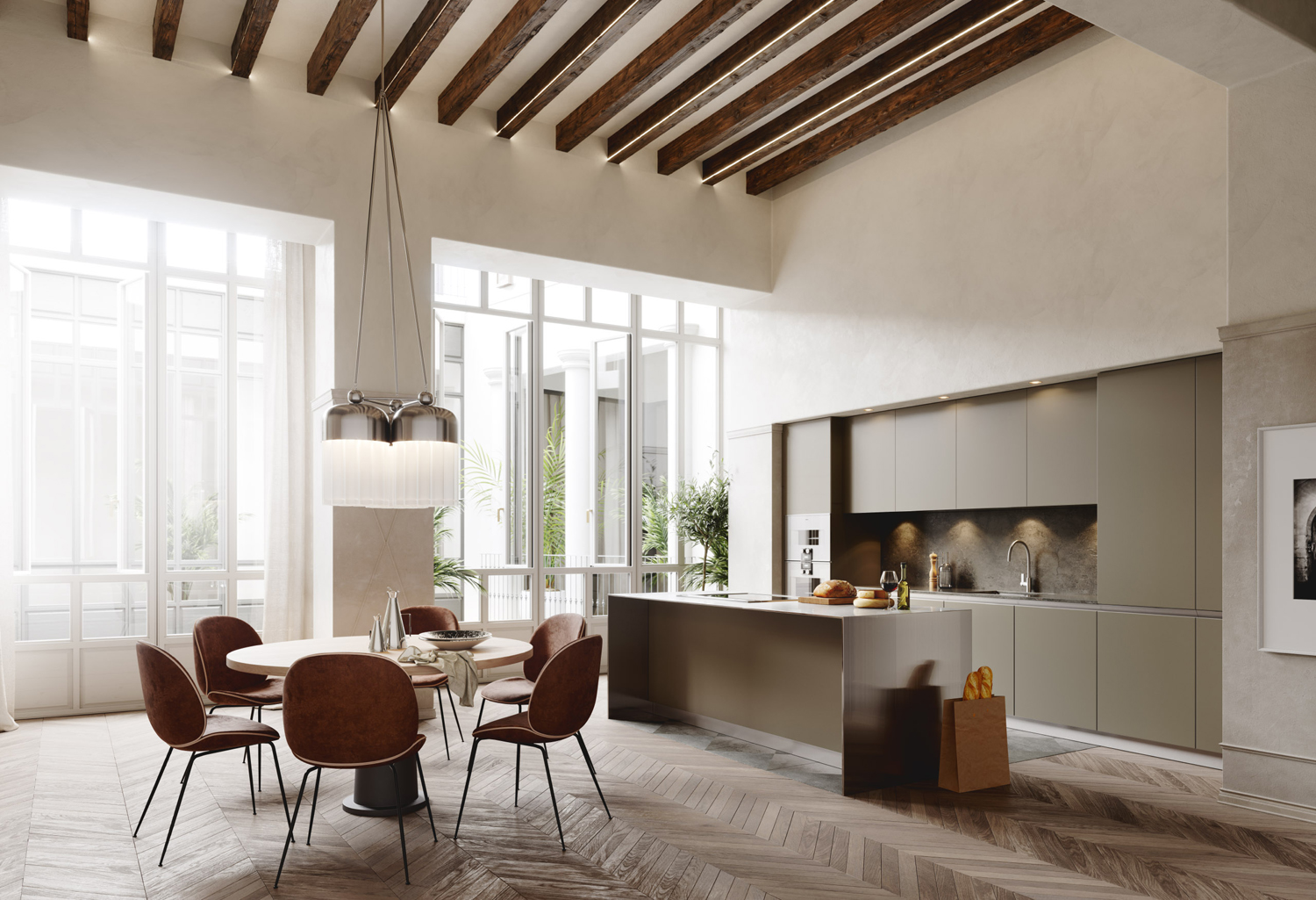
Once I know what I want to achieve, executing it is a simple matter of craftsmanship. Intimate knowledge of tools and thinking outside of the box can help, though. To the surprise of many, 80 percent of our work is lit using the age old Sun & Sky system. It gives you a breadth of options you might not be aware of!
You can affect the size of the sun to make softer shadows, make the sun much weaker to put more dominance into the diffused light, desaturate the sky to simulate an overcast Nordic sky, or desaturate the sun to simulate it being diffused behind clouds. From a warm Mediterranean afternoon, to an intense Alpinic sun with strong sharp shadows, or a bright neutral white light in Scandinavia, itís all within reach with few clicks and tweaks of the system.
A few of our images from a recent award-winning project used nothing more than a simple white-colored plane, positioned with adjusted intensity and directionality.
Do you prefer HDRI domes? Perhaps there is this sky with an incredible sun behind clouds, but it's midday in Summer and you would like the same light just lower? Simply open the texture in Photoshop, apply warp or repaint the position through other means and you have the same nice light with longer shadows. Or perhaps you just want to keep the clouds and affect both the height and intensity of the sun? Then separate them into two textures that are combined back together in a flexible manner inside your 3D app, or combine the systems (a sun from the 3D app, and a sky with the separated HDRI texture).
The options are endless. Don't let the tools command your work, direct them to your goals.
You can freely modify HDRI maps to suit your needs. Here I quickly (and dirtily!) warped the hotspot to make longer shadows. I also painted below the horizon to bounce some light and color from the "ground". Don't LOOK for the best one - MAKE your best one!
Find your signature style
Through time and practice, following your own vision and relying on your skills will reveal the most satisfying "by-product" - the emergence of a signature style, a look to your work that is unique to you. Your images will be consistent with the goals you set in advance, creating a cohesive body of work, a memorable portfolio attractive to clients.
Your work will feel unique, while everyone else will be focused on using the "same settings" as one famous image or another.
Best,
Juraj Talcik
Links
Talcik&Demovicova: http://talcikdemovicova.com/
Corona Renderer: https://corona-renderer.com/


About this article
Juraj Talcik from Talcik&Demovicova speaks about finding your look.


