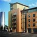
Phototower
You must be logged in to post a comment. Login here.
H
Henk Groeneveld
Report Abuse
Not that good yet. Lacks reality and good atmosphere

Andrew Walker
Report Abuse
I can see this could be a very attractive image I can just see a lot of things that can be changed. I dont have a chance now but if you want my full opinion direct message me.
A
Alyosha Cebokli
Report Abuse
Hey, yeah they are all in the same angle only the shinier ones are at a steeper angle + some bliss added in post, the thing is that often how panels on reference photos would look, since not all panels are 100% the same angle or something, the original has actually been done with a gradient effect reflection which did look kinda cool but also kinda....monotonous^^ i just wanted to really point this aspect of the building out so i experimented a little
i'm not as much worried with how i set things up but more on the side of does the render present them correctly
i've seen worse stuff in portfolios tho, don't think it's that terrible:-) the main issue i have here is with the stuff that think3d pointed out and i'm glad i'm getting comments on it, kinda silly when people on forums sometimes ignore the less attractive works which need c&c the most:-)

Andrew Walker
Report Abuse
If you want to add the highlights on the panels you need to do it more consistently, they are random and if they are all at same angle (which they look like they are) the reflections would be more consistent. If you adjust the lighting so you get a gradient of highlight light over the panels it would look pretty cool.
If you agree with these comments it shouldn't be a portfolio piece.
A
Alyosha Cebokli
Report Abuse
thanks for the comment, but the client actually wanted that kind of a focal distortion...can't say i don't like it either tbh

neil poppleton
Report Abuse
Correct the verticals.
A
Alyosha Cebokli
Report Abuse
hello, i agree with most of your comments, but there is no glass shining, those are photopanels which i purposely exaggarated a bit in order to show their relationship with the sun

Athanasios Karampitsakos
Report Abuse
Hello Alyosha.
The scene needs improvement to the people. The shining of the some glass is too much.
The plants are too green...and finally my heart bleeds when I saw that you make the Scirocco like an egg....(I own one).
That's for now.
A
Alyosha Cebokli
Report Abuse
*bump* oh come on, not one comment?
oh...because it's so good, you dare not intrude on it's awesomeness, right?:-)
anyway, this was one of my first exterior competition projects and i'd just love some response from you guys, even if you think it sucks^^

