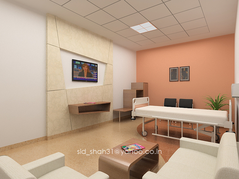
VIP In-Patient Room
You must be logged in to post a comment. Login here.
B
Brad Norton
Report Abuse
+1 about the lights. Not real sure about the ceiling in general - is it supposed to be a drop down with some cove lighting? The TV screen should pop a little more and the teeny pictures on the far wall don't really fit the scale of the room. Try throwing some glass on those so that you get some more specular and reflections. Minor things that can help bring the rendering up a level - good start though!

Stephen Thomas
Report Abuse
My first comment would be you should look again at the ceiling and light fixtures. I doubt that one fixture would give you the level of even illumination that you have shown. Also I would think there would still be a requirement for some kind of curtain for privacy between the bed and seating areas. Perhaps the curve on the floor could mirror the line of the curtain track above with a change in colour between the areas. Just some suggestions!

