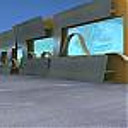
A Living on the beach...
You must be logged in to post a comment. Login here.
e
edo mundaca
Report Abuse
I see myself on that beach fishing ... great job, congratulations. Regards from Chile.
G
George Friml
Report Abuse
very nice lightning

Tom Livings
Report Abuse
schematically this is very strange. In a beautiful location such as this, the emphasis should be 'extrospective' (is that a word) rather than introspective. Here we have a couch turning its back on the world and facing a TV. Lots of glass in the roof, but not panorama from eye level out.
It looks like a hexagonal floor plan. I designed a house based on a hexagon before, its not an easy geometry to work with:
http://www.cocoshambhala.com/villas-goa/bharani.htm

Fred Baldez
Report Abuse
Thank Saturn. I will revise the community comments. Thanks again.

Fred Baldez
Report Abuse
Comon, Dude! :D I guess the my client like the star wars too, don't You think? lol

Fred Baldez
Report Abuse
Thank Iceman! :D

Fred Baldez
Report Abuse
Thank You.

Fred Baldez
Report Abuse
Thank Crazy H Guy. I am totaly agree with you. But the client want to see the water in this angle. :D

Fred Baldez
Report Abuse
Thanks. I like your work too. :)

Fred Baldez
Report Abuse
Thanks for your comments I will revise my angles.

Fred Baldez
Report Abuse
Thanks Pechara. About the horizon, I checked and my horizon is correct, but my camera is with too distortion, so this is just an optical illusion. About the blue sky fx, I will revise it, thks

Fred Baldez
Report Abuse
Thank Wrender. I agree with You this work need more shots to be understandable, this is the why I took so much time to reply your comment. I was waiting the client decide some details. So I should be good to render a bunch of shots, but I'm still waiting here the client. Soon I get their reply I will add more angles. These are two module mirrored, and yes I have a bedroom there. This is a concept. This don't work really , i.m.o.

Fred Baldez
Report Abuse
Thank You. I like your work too.

Fred Baldez
Report Abuse
Thank You All for yours comments. And I really sorry for my delay to reply You. But I will do this now.

Jason Matthews
Report Abuse
Ditto here. I think the render quality is superb but camera angle, context, etc. needs a bit of direction. Very surreal though. Good job.
E
Elamos
Report Abuse
Nice render! Keep on.
My Master, this is a Jedi House in the beach???

Marlon Giron
Report Abuse
beautiful design and render!

Adam McPartland
Report Abuse
I agree with the other comments, I think for me maybe the horizon seems a little too high. Great render and mood however and an interesting scheme.

Travis Schmiesing
Report Abuse
I am not found of the layout, I have real issues with the position of what looks to be a cloth couch about 1.5 ft from a shower, but I here you when you are saying it is not your design. ...but it would appear that it is positioned on the beach in a way that the largest windows open inland, and the more closed off portions of the design face the water. That seems counterintuitive.
T
Tempest1295
Report Abuse
I have a agree with Ryan with the camera angle being a little confusing, but I like the render.

