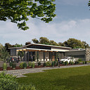
Exterior image, I need tips for photshop postprodution!!
You must be logged in to post a comment. Login here.
R
Rex Perlado
Report Abuse
Rendering is impressive! Zoom in a little and don't cover too much trees on the facade of the building.
C
Conor Clancy
Report Abuse
In addition to Johns comment about the sky, I would say fine tune the masking on those trees in the centre of the image, those white outlines are hurting my feelings.

4eAteliers Studio
Report Abuse
Thanks to all! I will post the final image soon.
Maybe next week.
Fede

John Dollus
Report Abuse
i would only recommend looking into changing the background. right now, the scene is lit as though the sunlight is behind and to the left of the viewer but the sky seems to indicate it is in front and to the left so the contrast between the face of the bldgs and the sky is a bit odd and I would expect the glazing on the facade to be picking up more of the direct light.

TheAllusionisst
Report Abuse
I agree. Put a fork in it, it's done! ;)

Sketchrender Ltd
Report Abuse
Nothing wrong with it , it's very good.
Well done.
Don't be so critical of your work.

