fourways Office
You must be logged in to post a comment. Login here.

A sarkinshanu
Report Abuse
nice one

Adam Hockley
Report Abuse
Awesome! The concrete textures really stand out!

Rendering.no
Report Abuse
Verry good work. I like more the first image, the second I also think the building it`s too bright.
First one, verry good mood.
Keep up the good work!
Greetings
M
Micael Dillner
Report Abuse
Great work man !Love the mood in your scene. Thumbs up!
/DIA

Antoine Desjardins
Report Abuse
I like the dusk image. Nice work
D
Daniel Kolawole
Report Abuse
Lovely work, I like it.

neil poppleton
Report Abuse
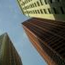
The night shot works well, but the day shot somehow doesnt work for me the lighting looks at odds with the sky.

Rahat Amin Chowdhury
Report Abuse
Excellent work.....i like the night scene most.......:D

Nicolas Bischoff (www.burn.co.za)
Report Abuse
Thats his name! :) What is it with arch vis guys and complex names. Wow, I'm sure Mir is going to produce some wonderful 3D with him on board.

jms.lwly
Report Abuse
"This guy" - Viktor Fretyán, has recently joined MIR, they mentioned it on their Facebook page
A pretty good addition to their team!
Sorry for going off track, two great iamges there Nicolas.

Gary Ledgerwood
Report Abuse
I love both images. Great work!

Nicolas Bischoff (www.burn.co.za)
Report Abuse
Thanks Arnold. Thanasis, this was the style we were aiming at. Similar to this guys work (but a nit less grungy and no snow!): http://www.burnstudio.co.za/blog/kumu-art-museum-evermotion-org/

Athanasios Karampitsakos
Report Abuse
I agree with Arnold. The second image is a bit overlighted but it's ok.

Arnold Sher
Report Abuse
Nice job Nick.. Looking good, nice mood..

