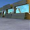
Postcard from "St. Stephen" #2
You must be logged in to post a comment. Login here.

Tomislav Lalic
Report Abuse
Gallery image has been updated.
Older version you can see in attachment.

Tomislav Lalic
Report Abuse
Ok, ok ... I will fix it :) thanks Muck.

muck mews
Report Abuse
maybe u can make the glass a bit transparent. that should fix the things. the rest is flawless! haha.good job!

Tomislav Lalic
Report Abuse
Hi Marlon, many thanks for your comments.
The right type of effect... I don't know... the purpose of applying motion blur effects is to provide more focus to the building and main purpose is to make this image a bit more dinamic. :)

Marlon Giron
Report Abuse
wow this is an amazing render very beautiful! the only thing i didn't like was the blurry effect on the edges? doesnt seem like the right type of effect

Tomislav Lalic
Report Abuse
Thanks Barbara for your comment.

Barbara Griffin
Report Abuse
great trees! nice image.

Tomislav Lalic
Report Abuse
Hi Muck, thanks for your comment.
Reflection is too sharp, perhaps because there no light source behind the glass panels, and on the front of the glass is too bright morning sky.

muck mews
Report Abuse
great scene!
but the reflection in the glass seems awkward, too sharp as if it was a mirror..

Ali Haddad
Report Abuse
welcome dear ;) , may you see me works .. and make notes about'em

Tomislav Lalic
Report Abuse
Hi Ali and Nelson,
Thank you for your kind words and helpful suggestions, observations and advices.

Tomislav Lalic
Report Abuse
Hi Phil, thanks for your reply.
Multi scatter (Multi Painter) is a great plugin, maybe the best, but there are two main reasons for the use of Adv. Painter in this project:
1. It is a free script, that works the same things as a multi painter
2. I use it a long time and I have good control over the placement of objects in the scene. One by one, it's acceptable for a small terrain like this.

nelson fernandes
Report Abuse
Hello. Loved the scene, really nice.
I´d say only two things. The grass is lacking of depth; it looks like just a texture. The stone wall lacks a displacement or a little bit more of it. Overall, it´s a terrific image. Great work :)

Ali Haddad
Report Abuse
Great work man ... great work ..
but i think it's too much lens correction there in corners ?

Sketchrender Ltd
Report Abuse
Lovely image well done.
Any reason you are using advanced painter over other plugins like multi scatter for example?
Phil

