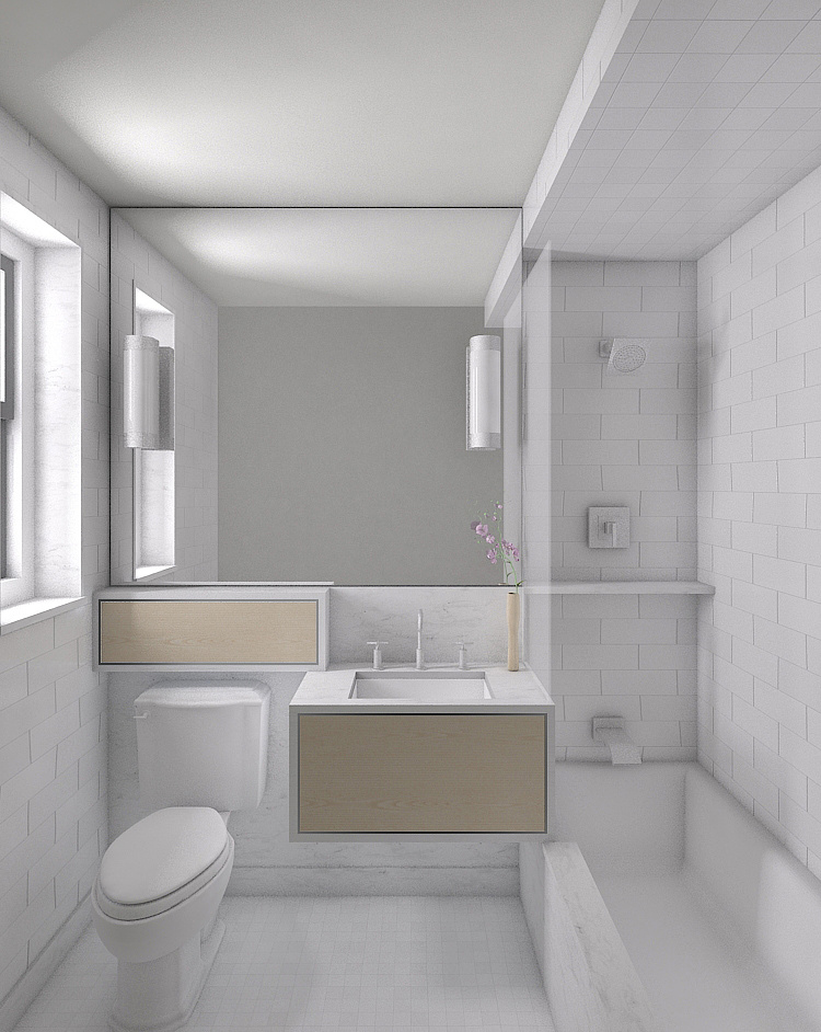
Client F: Bathroom
You must be logged in to post a comment. Login here.
C
Chad Wulleman
Report Abuse
I used light cache and irradiance map. I think the edges being too dark is from having on ambient occlusion. I worked on reducing the noise a bit so hopefully with a few setting changes a bit of the noise will go away.

Abdullah
Report Abuse
the lighter one is better. but you should turn the lights off as the source of light seems other than those two lights. may be any window. BTW, noise in corners are visible.
hope that helps. the entire image lack reflections. well I may be wrong.
C
Chad Wulleman
Report Abuse
Yes it should have, my apologies I will do that for future works. Here is the revised which will end up as a final since I need to spend time in other works. All additional comments and suggestion will be most helpful for future works.
Thanks,
Chad
[IMG]http://www.chadwulleman.dphoto.com/#/album/201c6n/photo/6119990[/IMG]
or
[IMG]http://www.chadwulleman.dphoto.com/#/album/201c6n/photo/6119827[/IMG]
C
Chad Wulleman
Report Abuse
Yes it should have, my apologies I will do that for future works. Here is the revised which will end up as a final since I need to spend time in other works. All additional comments and suggestion will be most helpful for future works. I've attached 2 images with varied levels, one more light and clean, the other a bit darker but with a warmer feel.
Thanks,
Chad
[ATTACH=CONFIG]45129[/ATTACH][ATTACH=CONFIG]45128[/ATTACH]

Masoud Nasiri
Report Abuse
what's your indirect illumination engine? did you use brute force or photon mapping?
the render is a little noisy and the edges is too darker than around area is the same real situation. i think it is because of brute force and photon mapping or VrayDirtMtl if you used.

Abdullah
Report Abuse
i think this post should be in ,;job in progress; section. No?
C
Chad Wulleman
Report Abuse
Thank you so much for the comments I am slowly working on this outside of work. Everything suggested is very helpful as it is always nice to have a fresh perspective for things that are easy to miss by yourself. I will be uploading an updated rendering soon.
thanks again

Michael J. Brown
Report Abuse
Chad, how in the world did you manage to snap this photograph without showing up in the mirror's reflection?!? Incredible!
All kidding aside though, I'm a bit concerned about a few things here - none but one of them related to the quality of the render. I believe you've done a good job on that end.
First, I'm thinking that is a sheet of frosted glass bordering the sink and tub. If so, why does it not show any thickness? Does it intentionally not meet with the soffit above the tub?
Second, Unless the new trend in bathtubs is the matt look (much like matt black paint is the next trend in automotive paint among tuners), there should be some gloss showing up on that bad boy. I think you'd better get in there with some Ajax and knock off that soap scum brother.
Third, And this one I'll admit may be more of a fetish thing of mine than anyone elses, but... That whole bathtub area is looking quite claustrophobic and the end on the sink wall very hard to reach with a cleaning sponge - without climbing into the tub to finish the job.
Those 90-degree corners on that leading edge of the tub scare the bejeebers outta me too. A loop just keeps playing in my head of my shin getting cracked against that marble corner - doh! I'm getting the shivers now just thinking about it.
I think it's a fine looking render, but I really would like to have seen more warmth introduced via those two mirror lights being switched on to provide ever so soft an incandescent glow. It definately needs warmth.

Adrien Binet
Report Abuse
The perspective seems a little forced, perhaps it's the toilet giving me that impression. It looks stretched into the camera's direction. You need to add some materials to the faucets and shower heads and such. Also the lights need to emit light and why are there dark boxes around the mirror and the drawers? The tiles look pretty good although I don't personnaly like the running bond look all around the bathroom. What is that semi-transluscent glass thing between the tub and the sink? You can also maybe add a shower curtain and a drain in the tub. Overall I think it's a great start, good job.
C
Chad Wulleman
Report Abuse
Well I suppose that means there are so many areas that need improvement no one is quite sure where to begin so I will use that and just work on everything.

