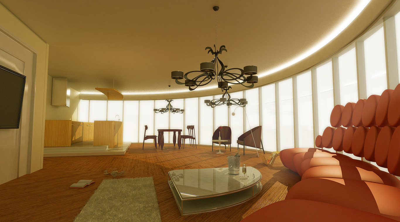
interior
You must be logged in to post a comment. Login here.
t
taka hashi
Report Abuse
thanks mur~

murtaza simari
Report Abuse
I have a few point...
1 first of all lighting is not correct.
2 rug is looking odd.
3 flooring texture.
4 wood texture on chairs.
5 outside lighting is very bright.
6 ceiling is having lots of noise.
7 On the wall its a painting or Plasma ???
t
taka hashi
Report Abuse
thanks your reply amadoR~

MikeDugenio
Report Abuse
Designwise i think that long light-arc in the ceiling is great.
I was wondering maybe you should play with some other colors than the ones in the Orange-to-Yellow spectrum. The outside Blue Sky is a potential color that you might could have brought into the picture. And, if it's that bright outside, perhaps bring some more volume light/fog in, than the little amount over the sofa.
Besides that. I think it's great. It requires full-size.

