house m
You must be logged in to post a comment. Login here.

sandhu kadri
Report Abuse
thank you............

Jaco Swanepoel
Report Abuse
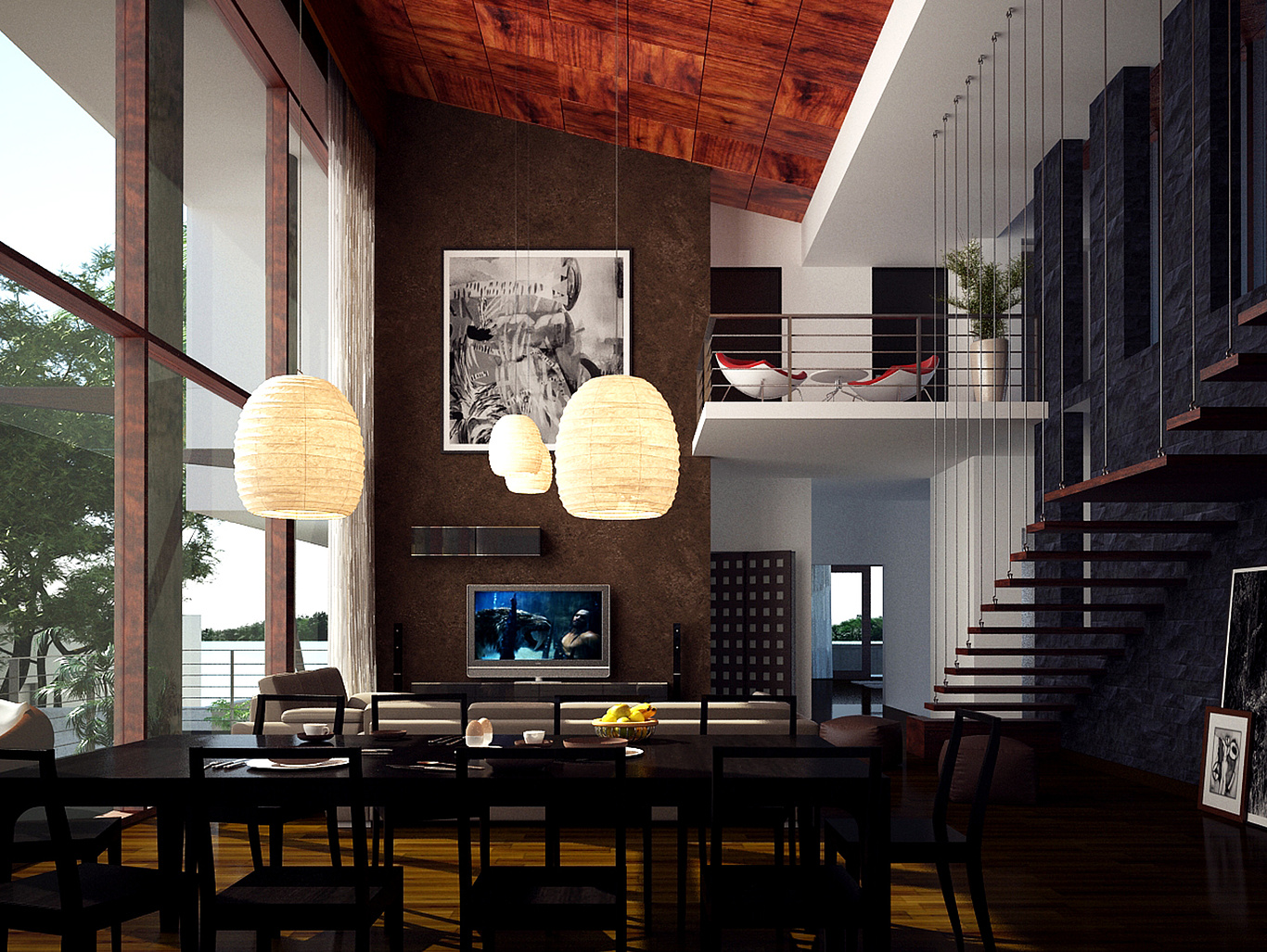
I like that you dare to go very dark areas. The ceiling is too saturated compared to the rest of the immage and you have no much noise. This image have potential

Shamsu dheen
Report Abuse
design is nice

Sabahath Khan
Report Abuse
depth i too much, else nice

