Restaurant with Liverti
You must be logged in to post a comment. Login here.
g
george sandoval
Report Abuse
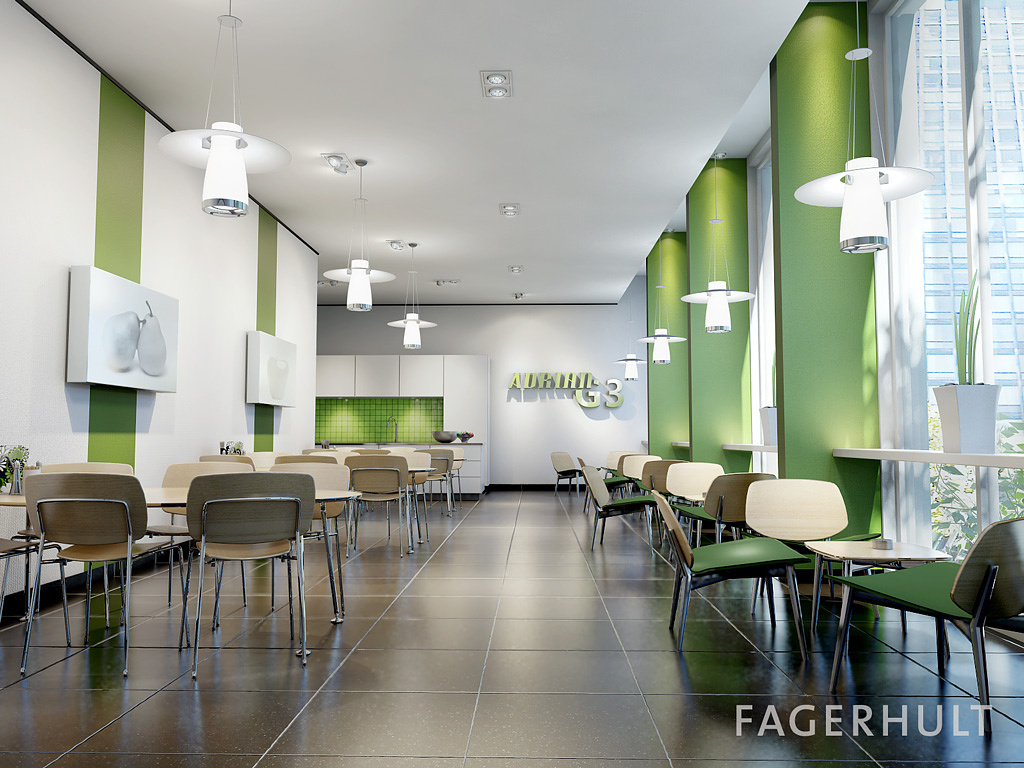
Hey Johan, The only thing that is distracting now is the chair in the foreground. I would just go ahead and shrink it down in the
camera axis. Sometimes you have to adjust things to serve your image even if it isn't what exists in reality. I think now it has a little too much color contrast. Maybe somewhere between the 1st image and this guy might be just right. I think you can play with
"adjust levels" in Photoshop to fine tune without having to re-render.
J
Johan Billing
Report Abuse
Thanks for the feedback George!
I did a some fast changes based on all the comments I got. In this new rendering I have reduced the amount of skylight and raised the output of the sports to get better contrasts in the image. I also added GI, but I don't think it made much of a difference.
But maybe the contrasts made it a bit more interesting!
Thanks anyway for the comments, everyone!
g
george sandoval
Report Abuse
Looks great. The chairs in the foreground are getting too distorted. The sign at the back wall isn't working! The letters aren't legible. As a designer you want your logo text to be clear and easy to read. The lighting is not accomplishing this. The graphics on the left look washed out.
J
Johan Billing
Report Abuse
Thanks a lot for the feedback!
I used final gather for the indirect illumination, no GI. The rendering time for an image of 1600x1200 on my double quad core, 2.4 GHz, was around 7 hours. I think it's quiet slow, but not all of it should be blamed on MR. I haven't done much for optimizing the scene. Then I have rendered out some passes for the lighting, so for the final image it's hard to say.
That's true Rustee. The sun light should be even more intense and blue coloured. The light form the pendant luminaires has a compact florescent lamp, normally of 4000K. In this rendering I have changed it to around 4500K to not get so big difference between the daylight and the indoor lighting. But I can agree, the difference is too small.
R
Rustam Isanchurin
Report Abuse
I like it, but I think the light is unbalanced... Those lamps are brighter then the building at the background which is frontally lit by the midday sun. I don't know what kind of light source do those lamps use; if they're LED, then their color is probably OK, if they're not, you'd want to change it to more orange or red.
R
Riad Abi Chahla
Report Abuse
Great result with mental ray...U used daylight with sky portals final gather and GI right?
How much time did it take to render?
T
Tempest1295
Report Abuse
Nice render and lighting. Those are so interesting looking chairs too.

Stephane Vanaubel
Report Abuse
Really nice work...
I would not change anything.

Antoine Desjardins
Report Abuse
Nice image.. hard to find faults. What method did you use to calculate the indirect illumination?

