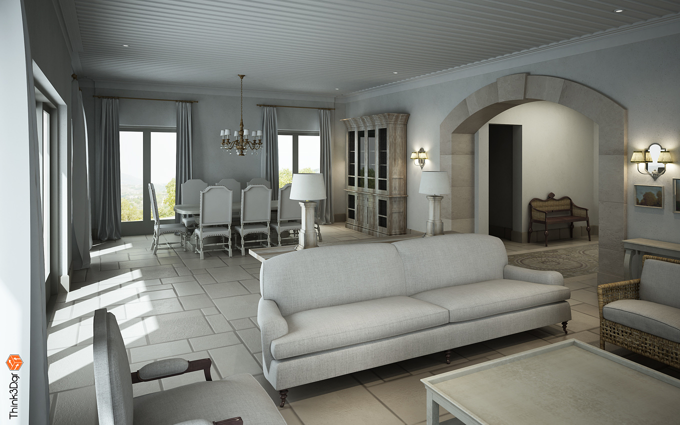
Country House's Living-Dining Room
You must be logged in to post a comment. Login here.

Athanasios Karampitsakos
Report Abuse
mmr thank you for your comment, I will keep these in mind.
m
marwan s
Report Abuse
the first pics look good, altho u said that lighting was made from an actual photo of this room, it s a bit dark even darker in the second pic. and imo it needs to be sharpened a bit, as for adjusting the contrast i guess we all agree on it. but the general result is good, altho a bit dark, yet it looks fresh. nice work.

Athanasios Karampitsakos
Report Abuse
VrayGuide: The stones are a grey with litlle beige and yes it is a large floor bump (it is called here in Greece: Byzantine Floor). I agree that the images needs some details and objects in order to bring a real life view, but unfortunately the specific decorator doesn't want anything besides the objects she presents to the client...(As you can understand clients are a bit strangely "creatures" :-) that sometimes behave weird....especially here in Greece...)
Thank very much for your time and comments!

Athanasios Karampitsakos
Report Abuse
abmitalia: Thank you for your comment! But lighting was made from reference photos that were taken in the actual real room. And it had to be so lazy in order to contrast a little bit the spot topical lighting above sofa (Decorator wanted that).
But I will have in mind your comments for future projects. Thanks buddy!

VRayGuide
Report Abuse
Hey mate!
White is cool, but in harmony, you need to spot color a bit, I know Greece made from white stone :)
Any way the floor bump looks too wide, like 5 inch or something, must be really thin.
Some nice objects on the foreground could bring more life to an image...like coffee with magazine...or a book with grasses..
Anyway I would fill it with more details, dishes in closet, on table, some pillows on sofa...may be some bag or a shoes near the far chair (on the entrance)...something that will give more life to an image...
Some tree shadows from the window could softer the sun light...
Other wise nice !
Alex
r
ralf kirsch
Report Abuse
It's alittle bit that what I mean. RK
[ATTACH=CONFIG]37837[/ATTACH]
r
ralf kirsch
Report Abuse
It's not easy to tell what doesn't work out. It's a great modeling. There, where there ar colored maps the material convinces. But the whole room seams to be blended down with a dirt map so at the begining I thought you posted an AO path. Some more reflections , some more bump some more depth. Anyway I like the scene , hope you got me right. RK

Athanasios Karampitsakos
Report Abuse
VenetaStoyanova thank you for your comment!
V
Veneta Stoyanova
Report Abuse
Mnogo krasivo!

Athanasios Karampitsakos
Report Abuse
Nobody?

Athanasios Karampitsakos
Report Abuse
Pls feel free to leave comments....!

