the development of al waha school
You must be logged in to post a comment. Login here.

AHMED SHAHEEN
Report Abuse
tron : thanks for your advice .. i did not know much about ao pass before your comment .. so i have done a search about it , and i will try it later
thanks again

Antoine Desjardins
Report Abuse
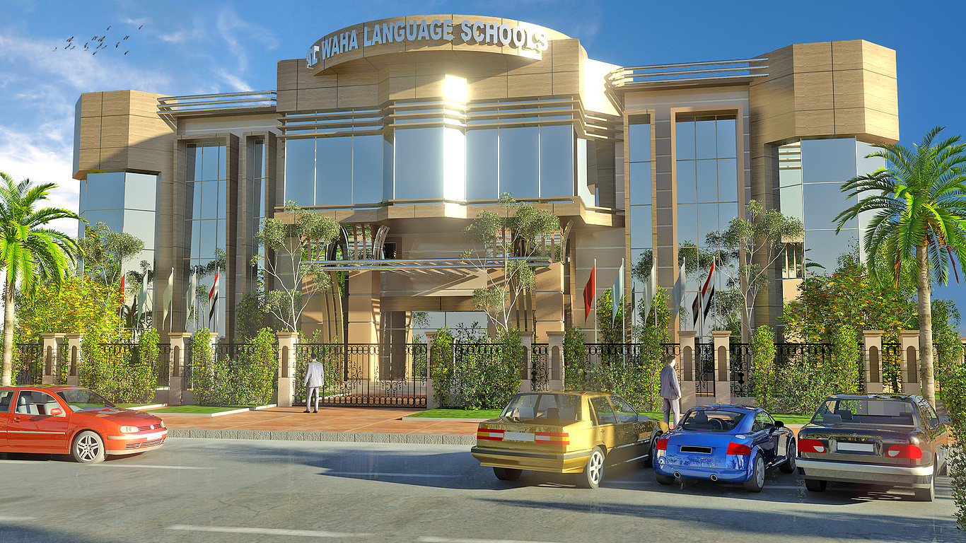
I like it man. I think these images could benefit from an AO pass. Concrete's a little bit too reflective as well. Use daylight system.

AHMED SHAHEEN
Report Abuse
,
g
george sandoval
Report Abuse
Everything looks good; great sunshine. I feel the palms are too much of a yellow green and too saturated. The people are too stiff - they look like zombies; but I guess that's appropriate with Halloween right around the corner. For the cars, I would just buy an inexpensive collection that were consistent in style, size and coloring so that they all fit together. If something is too bright; like the blue and yellow cars you should just get rid of them IMMEDIATELY. The foreground is the first thing you see so you don't want some that's too distracting that will take away from the building you are trying to showcase.
H
Henk Groeneveld
Report Abuse
Nice images. But why is the gate closed? And where are the children? I mean that the images miss life.

AHMED SHAHEEN
Report Abuse
This is 3 other shots , what is the matter of attaching!!?
[attach=config]39820[/attach][attach=config]39821[/attach][attach=config]39822[/attach]

