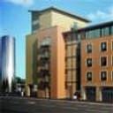
Low- income housing
You must be logged in to post a comment. Login here.

murad zeid
Report Abuse
thanx.......

Stephen Leworthy
Report Abuse
i've ammended the post as the image is way too big to post in the forums.
also, even though the lighting is much nicer you still need to equal those dark areas out where the building meets the ground - there's completely black areas in there that wouldn't look like that in real life. and you've completely gone over-board on the lens abberation.

murad zeid
Report Abuse
wath do u think about new modify
i hop this time u like:)...

Stephen Leworthy
Report Abuse
doesnt matter, you still need light. you cant sell it in this state, the agent and customer wont buy it. even if it's subtle, it still needs light.

murad zeid
Report Abuse
[COLOR=#000000][FONT=Times New Roman][FONT=arial]Thank u all very much for your comments and advice
[/FONT][/FONT][/COLOR]

Antoine Desjardins
Report Abuse
Took me exactly 4 seconds to tweak the curves on this image to make a huge improvement. Lots of potential here.. just some small adjustments needed.[ATTACH=CONFIG]40065[/ATTACH]

Jonathan Sanchez
Report Abuse
the lighting conditions and the uncared for ivy's make this image look more like one of an abandoned building... definitely needs more light.

Andrew Walker
Report Abuse
are there a variety of materials on there, it nearlly looks like a clay rendering. Surely at least the handles and balcony railings are metal. Remove the plants on the right on the first floor, look ugly (in my opinion)
AND
Defo Re-light, or play with exposure.

murad zeid
Report Abuse
[COLOR=#000000][FONT=Times New Roman][FONT=arial]yes the sun light are behind and time is after noon about[/FONT][/FONT][/COLOR][COLOR=#000000][FONT=Times New Roman][FONT=arial][/FONT][/FONT][/COLOR] 4:30PM
[COLOR=#000000][FONT=Times New Roman][FONT=arial]thanx for comment Yama....
[/FONT][/FONT][/COLOR]

Yama Yama
Report Abuse
I think it's ok if you have the sun from behind, if this is how it would be in reality then I would not cheat.
BUT as in photography you can always edit a picture, meaning take it into Photoshop and try to experiment with contrast and brightness there. You got lots of options.
There are lots of tutorials too about post work.....

murad zeid
Report Abuse
thank u all for ur comment.....

Tom Livings
Report Abuse
Should be much higher exposure (brighter). And the chromatic aberration is too pronounced, esp on the trees.

Travis Schmiesing
Report Abuse
+1
+1
t
tristan basco
Report Abuse
archvis is about 'selling' the design. more and more people seems to just go for photo realism.

Antoine Desjardins
Report Abuse
Making the assumption that the client wants an afternoon shot and the building is oriented as shown, you could up the exposure sensitivity (at the cost of blowing out the sky) to get the whole image's brightness up. I actually really like this shot and think it has lots of potential.

Rahat Amin Chowdhury
Report Abuse
Need some light......low income doesn't mean it will be dark like this right?......;-)

Matt Bowers
Report Abuse
Hmmm (clearing my throat) The front of tbe building needs to be lit. Period. I think the modeling is just fine but the mood and the colors, textures and overall presentation lack in a big way.
Your presenting this to us as a rendering for low-income housing, if that's the case, id rather live under a bridge where i can see bright natural light and the surroundings in a much happier and colorful manner. Turn the sun around and repost, that will help us give you better feed back. HTH.
r
ralf kirsch
Report Abuse
Only thing that bothers are the curtains. Everything else is realy very well done. RK

murad zeid
Report Abuse
[COLOR=#000000][FONT=Times New Roman][FONT=arial]because the direction of light from behind and time is after noon
thanx for comment Kippu....
[/FONT][/FONT][/COLOR]

maria prem
Report Abuse
wont it be better to have some light in the front?

