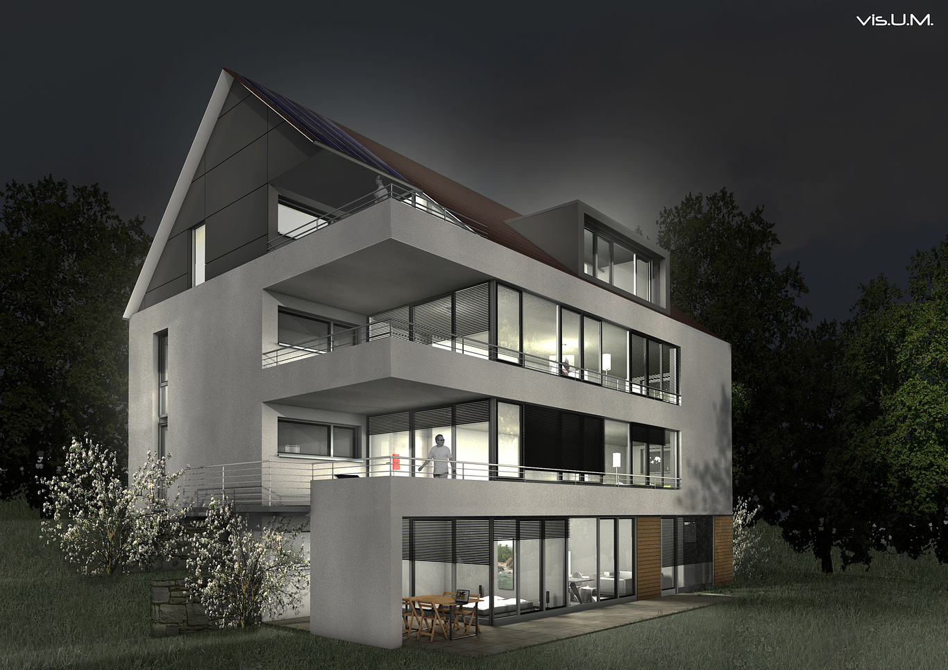
Night 2
You must be logged in to post a comment. Login here.
J
JosephAHaddad
Report Abuse
interesting architecture, i agree with all comments listed above, make it more dramatic, this improves the presentation of your work.
U
Ulrich Mueller
Report Abuse
.....I hope you can use my comments to improve the image and hope to see a update from you.
Thank you very much!! I´ll try it.
Greetings Uli
M
Matt Furedy
Report Abuse
Try putting in a different sky too, that might help things. If you render with a skydome, you can catch reflections of the environment in your windows. That can add a whole lot to your image.
H
HVB .
Report Abuse
Hi Ulrich,
I think the model looks ok but you really need to work on the lighting and the vegetation.
Try to use some warmer colors for the lights instead of white and not sure whats happening at the top of the building but the building seems to be glowing. The trees on the right are really dark compared to the grass and look to much like a flat image, that also counts for the 2 white trees on the left but these also seem to be not really matching the scene with the ligthing.
I would also use 2 different persons in your image because now looks to be the same person, also not make him black and white, and lose the shades, a bit weird to have shades on when it's night.
I hope you can use my comments to improve the image and hope to see a update from you.
Han
U
Ulrich Mueller
Report Abuse
no reply??? no tip???

