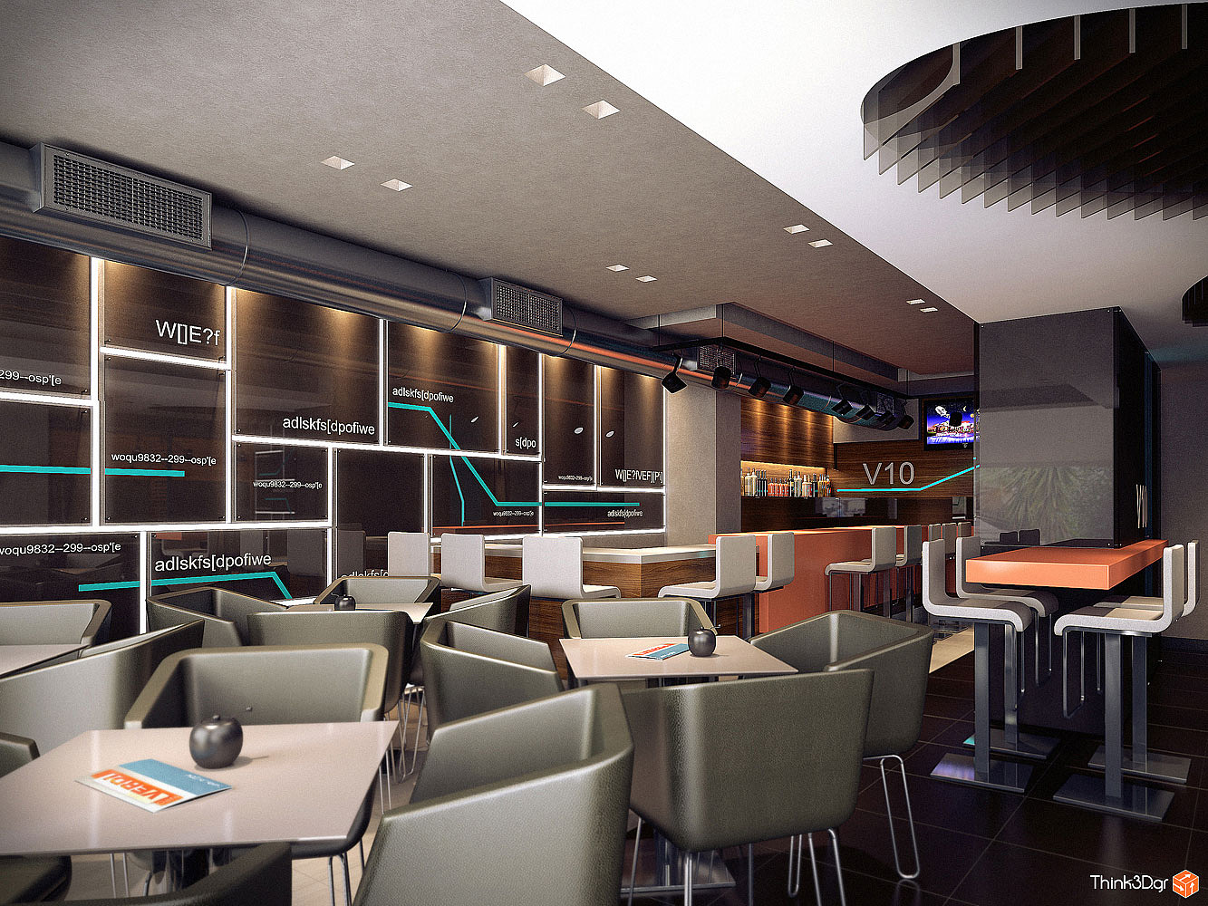
Cafe
You must be logged in to post a comment. Login here.

Athanasios Karampitsakos
Report Abuse
Thank you Rahat!

Rahat Amin Chowdhury
Report Abuse
i agree with ralf - but yet the entire theme is really nice.....modern and smart.....and awesome render......:)

Athanasios Karampitsakos
Report Abuse
Indeed the chairs and tables are crowded...but the decorator wanted and studied these like that. So he wanted the image to present the reality.
Thank you Ralf. I appreciate.
r
ralf kirsch
Report Abuse
Very realistic and nothing to say to the rendertecnique. For me the first image is too crouded and full of chairs and tables. 1 table would have been enough and would open the space a little. RK

