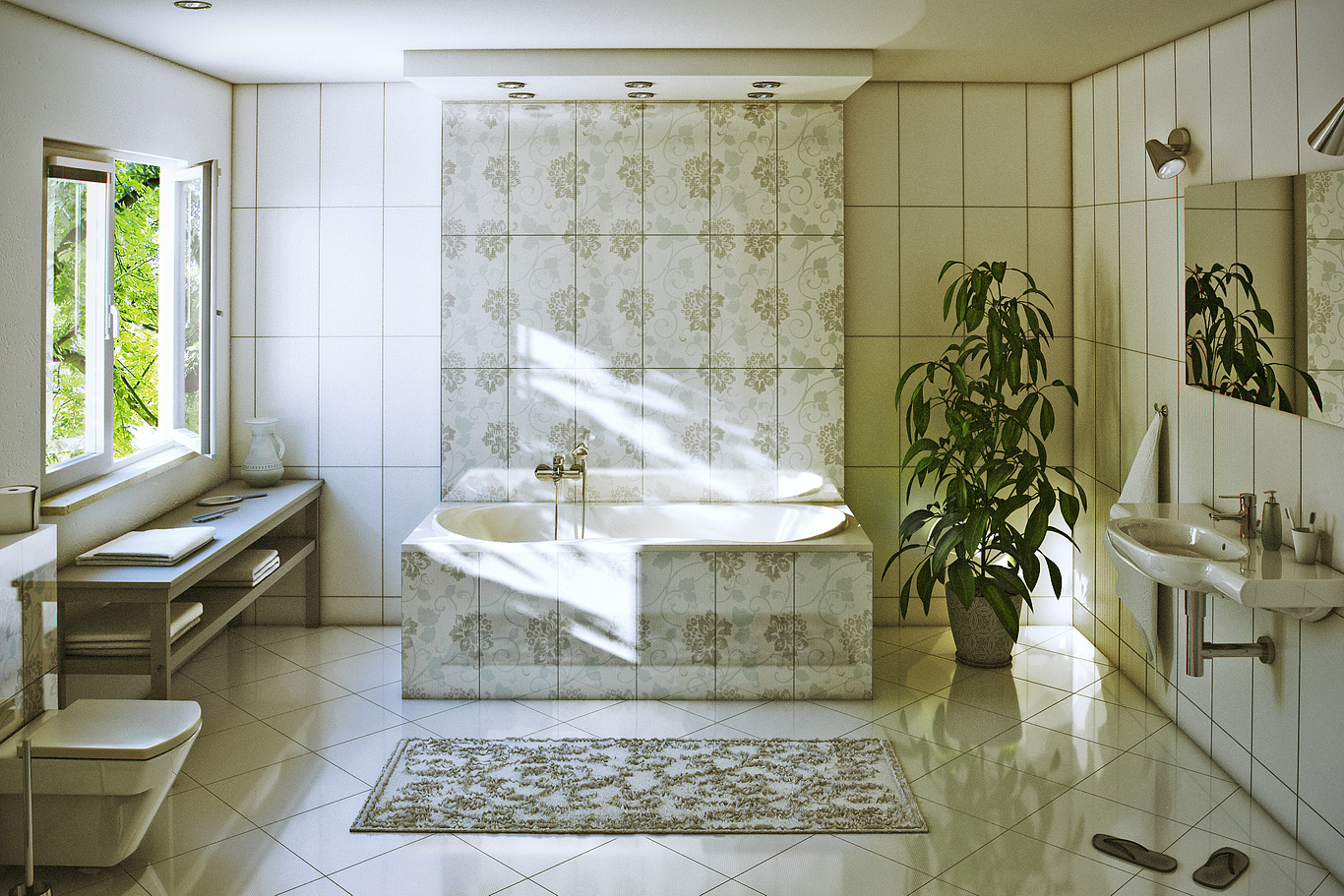
Bathroom
You must be logged in to post a comment. Login here.
M
Malgorzata Koltys
Report Abuse
Hi Juraj! :),
Scary design? well...it has got a "special" climate... ;-)
Yes you are right about AO - it's to much of it but I am not agree with you to not use it at all in interiors...
...yes I had DE unticked...
I used exponential and all image was much brighter but I just wanted to achieve a good contrast in photoshop and I probably go to much of it...
You have also right with camera - it was at about 170 cm height...
Thank you very much for your attention :)
I appreciate that you shared with me what you think!
Best Regards
Małgorzata

Juraj Talcik
Report Abuse
That is very scary design ;- ).
But I'll give you some technical pointers rather.
Very nice direct light.
Ambient Occlussion is killing your render, I suggest to never use it in interiors, and if must be (for speed reason), then small radius (less than 2-4cm) and very small value ! 0.15 max.
Better solution is to use DE (Detail enhancement) in Irradiance cache property.
Use exponential mapping, or Reinhard with very low value (0.1) to brighten your interior as much as possible.
Your horizon is at weird place, try to place camera at 160cm height from floor and only go lower. This suits best interior visualizations.
Good luck ;- )

