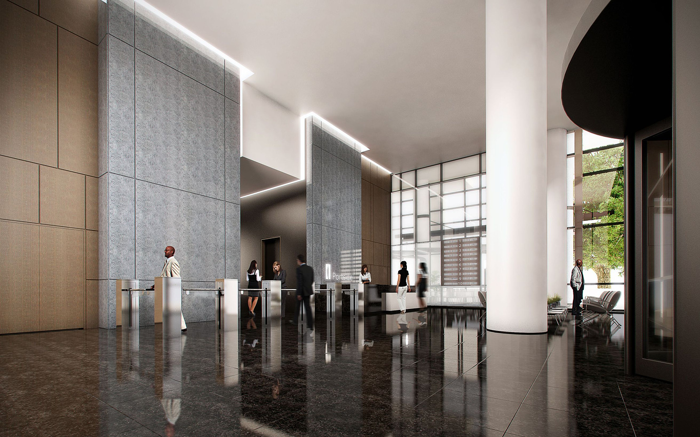
Grand foyer.
You must be logged in to post a comment. Login here.

Adrien Binet
Report Abuse
Very nice rendering. Like Arnold said, too many repeating textures, but I don't mind the people that much except for the variations in blur added to them. I'm guessing you are trying to achieve 'motion' by adding blur but the guy walking through the turnstile on the left doesn't have any blur... That being said, it's a nice angled shot, it captures a good feel of the space and I really like the way the tile grout on the right side turned out.

Arnold Sher
Report Abuse
Hi Ian,
I think if you were to improve your floor tile, which repeats as well as i find it little to reflective try using "fall off", you;ll see that it will improve dramatically.. Also i would try and get better quality people as "image real" are so outdated and over used. I also find they are difficult to blend in nicely and they were not great quality to start off with.. Better photographing your own.. Otherwise all good..

