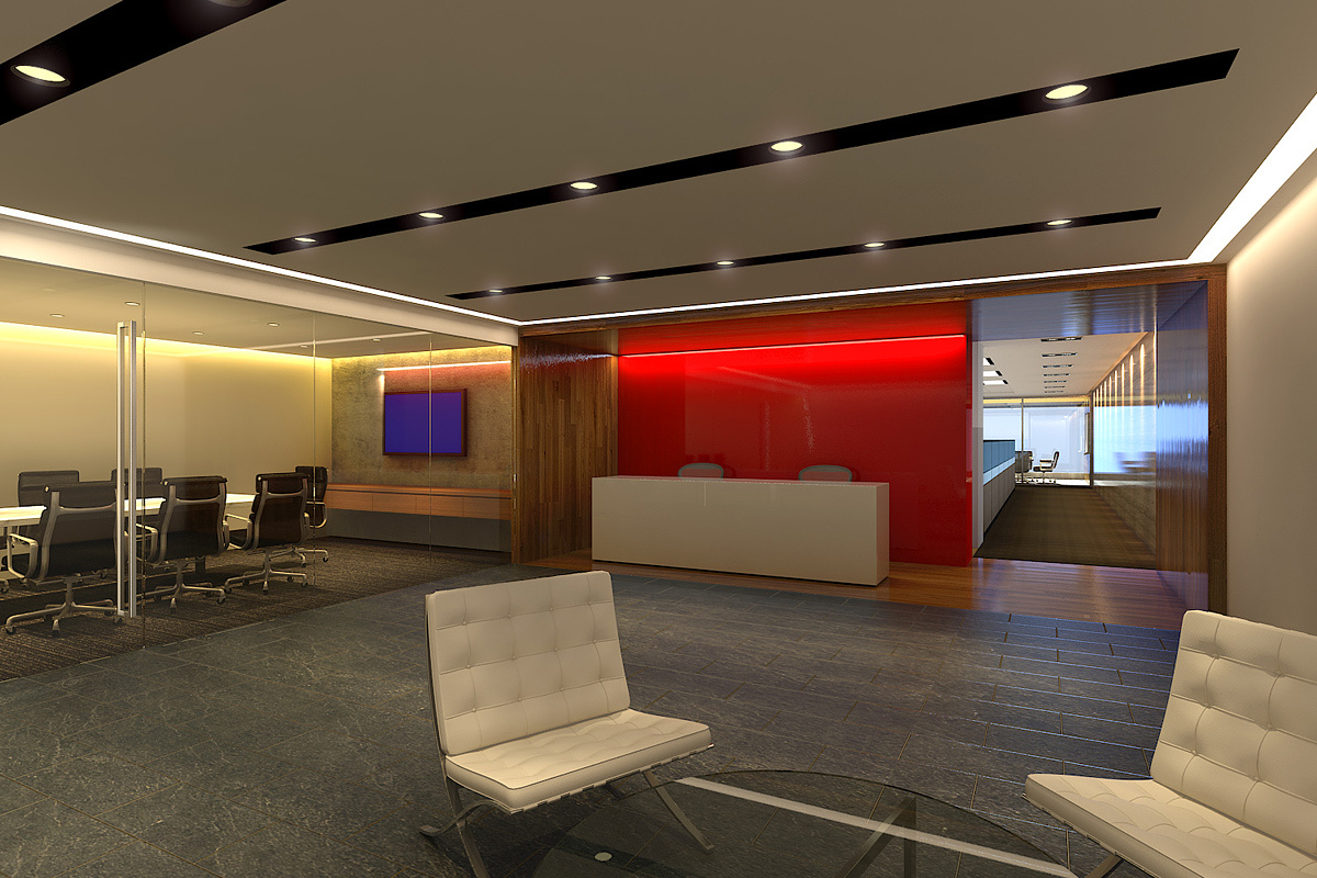
office view01
You must be logged in to post a comment. Login here.
s
sqd render
Report Abuse
Adrien,
Thanks for the comment. And its very helpful for me to improve the rendering in future.
Thank you.

Adrien Binet
Report Abuse
And either make the TV in the conference room display black with a low reflectance or have a some sort of presentation being displayed on it.

Adrien Binet
Report Abuse
I think this is good but it lacks a certain amount of realism. Some things I would change:
Cove lights in conference room are too yellow, and the ultra bright red behind the reception are both distracting to me. The chairs in the conference room look like they were copied and pasted (which of course they were), you can rotate the bottoms of them and the tops and change theirs heights so that they are not all exactly the same. Adding some people might help bring this to life. I understand the space very well from the composition, a sort of waiting area for an office space with conference room and reception and more office area down the hall I'm guessing. I do wonder where the entrance to this space is, my mind wants it to be on the wood wall on the right...
I think your textures are very good, and the reflection on the wall on the right is nice too, maybe add some buildings in the back that get reflected in as well.
Also think about doing some post production in photoshop. Mess with the levels and add some vignetting to help make the image pop a bit.

