Bathroom interior_any and all help wanted
You must be logged in to post a comment. Login here.

Nick Harvey
Report Abuse
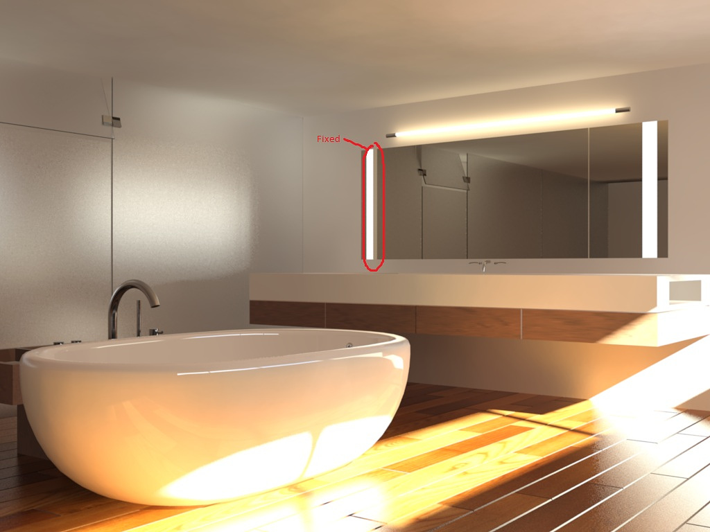
Here is the latest rendering, Still a little splotchy and dark, but I can crank the interior light i added up a bit more and see what happens. Also reduced blurry samples on most of my materials, as well as fixed the floor.

Erich zumBrunnen
Report Abuse
Take your diffused bounce down to 3. Check the blurriness samples on your material reflections. Reduce to min acceptable.
The bump map on the hard wood floor seems a bit excessive.
Have you thought about adding any more interior lights the scene? They could even be out of view. But it would reduce the need for such strong light coming through the window.

Nick Harvey
Report Abuse
Render settings are as follows:
FG multiplier: 3.0
Precision: High (because of the frosted glass in the backround)
Inital FG Point Density: 1.5
Rays per FG point: 500
interpolate Over Num. FG Points: 30
Diffuse Bounces: 6 Weight: 1.0
If GI was enabled it would be:
GI multiplier: 1
Max num. photons per sample 500
Exposure
Preset is Physically based lighting, Indoor Daylight
exposure value: 10
Highlights 0.1
Midtones: 1
Shadows: 0.2
Color Saturation: 1.0
Whitepoint: 6500
Vignetting: 0.0
Gamma: 2.2

Gary Ledgerwood
Report Abuse
Can you post your render settings? I always use GI for interior scenes and never have a problem with materials being washed out. You would then just adjust your exposure settings.

Nick Harvey
Report Abuse
Alright Gentlemen...
Here is the latest render. I took all of your suggestions except two things are still in progress. I am working on a orchid to put near the tub and reworking the material for the faucets. The only thing now is that I had to tun the sky-portals to 2.0 and final gather to 3 to get the light bright enough to fill the room. However two things are a problem, Rendering took like 8-10 hours on a dual quad core machine and as you can see the scene is all blotchy. I know GI will smooth it out however, it washes out the materials and I don't want to do that. Any ideas?

Wim Clissen
Report Abuse
i have learned that for me the best results for interior scenes so far are the following settings:
- Final Gather standard set to medium
- Diffuse bounces set to 2
- no Global illumination
- mr daylight system and mr skyportals on all openings
- mr photographic exposure control set to physically based lighting, indoor daylight, highlights (burn) lowered a bit to 0,1.
Kind regards,

Nick Harvey
Report Abuse
Thanks guys, I will be updating soon with your suggestions, however I need to fill the room with a bit more light without washing out any current materials. Is that something I should worry about in post-production. Or do you have any suggestions to Scene/FG/GI settings that might help this?

Stan Zaslavsky
Report Abuse
hi coolhand,
nice start ... i think in your image so far the total focus is on the bathtub - so you've got to do a lot more work on that item to make it stand out. maybe even play with some DOF to blur out the background ...
i would also consider placing a plant or something contrasting on the vanity so create some interest in the scene.
your material for the faucet needs some work - it should be much more reflective if its made from stainless steel ...
good luck and look forward to your next update

Wim Clissen
Report Abuse
Hello Coolhand,
I think certain things are out of proportion. The bathtub and the faucet are way to thick, and the gaps between the wooden planks are to deep.
Also designwise i would place a bathtub made out of a white composite material like corian. This gives a softer, less harsh look compared to a ceramic material.
Hope this can help you.
Kind regards.

