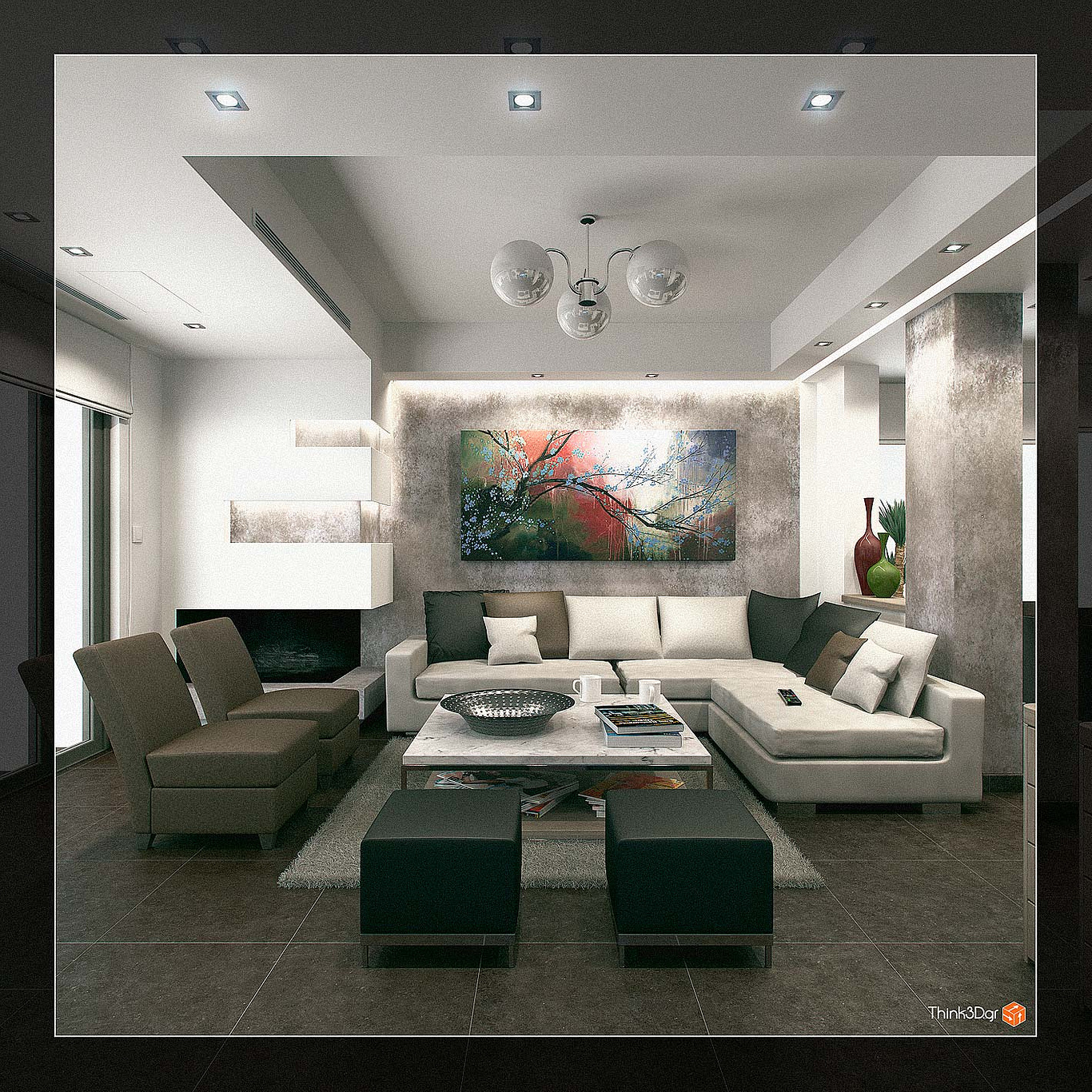
Residence
You must be logged in to post a comment. Login here.

Athanasios Karampitsakos
Report Abuse
[U]Tinaossia:[/U] Thanks!
[U]Saulman:[/U] You are right about the pillows...Thanks!

Saul Caldwell
Report Abuse
Great set of images. The cushions let them down a little.

tina ossia
Report Abuse
Although images are a bit noisy, they're still perfectly realistic.
Nice job!

Athanasios Karampitsakos
Report Abuse
Rogelio I put the noise in purpose of make give more artistic feeling on the images. About the carpet, is a thick carpet with thin lines....I attach a detail image.
m
mario jokoli
Report Abuse
I think the images is too noisy and the carpet looks unreal.. but lighting is a ok..
regards
nat

Athanasios Karampitsakos
Report Abuse
[U]Ryan[/U] I agree about the pillows but the time deadline was too short to change these...! Thank you!

Ryan Watson
Report Abuse
Agree with the above posters - would also comment on the pillows for that extra bit of realism. The pillows in the living space share 1 really hard wrinkle - dead giveaway that it's the same pillow copied multiple times. Also, the plants in the kitchen shot could use a little extra lovin'.
Overall, nice work though!

Athanasios Karampitsakos
Report Abuse
[U]Meher:[/U] Thanks for your comments! You are right about the over exposed lighting on some of the images, but I've done in purpose in order to give a more live with mistakes feeling cause the camera shutter was quite open...
[U]Steve: [/U]Thank you too about your comments! You are right about the noise that is a bit crispy here (I don't usually use it) but I think it suits on these images in order to give a more low film quality.
S
Steve Mai
Report Abuse
Very nice set of images. The only thing that bothers me is the noises everywhere on the ceiling. They would be great without those noises.
M
Meher Thakker
Report Abuse
first of all I must say thats some nice modeling, lighting and texturing....the overall renders are very nice...just a little crit from me is that you need to lower your exposure on some of the images..meaning burn the highlights a bit..they look over exposed in some images....but overall great work..
Meher

Athanasios Karampitsakos
Report Abuse
Last 4 images.

Athanasios Karampitsakos
Report Abuse
5 more images.

