Night
You must be logged in to post a comment. Login here.

Jane Namenye
Report Abuse
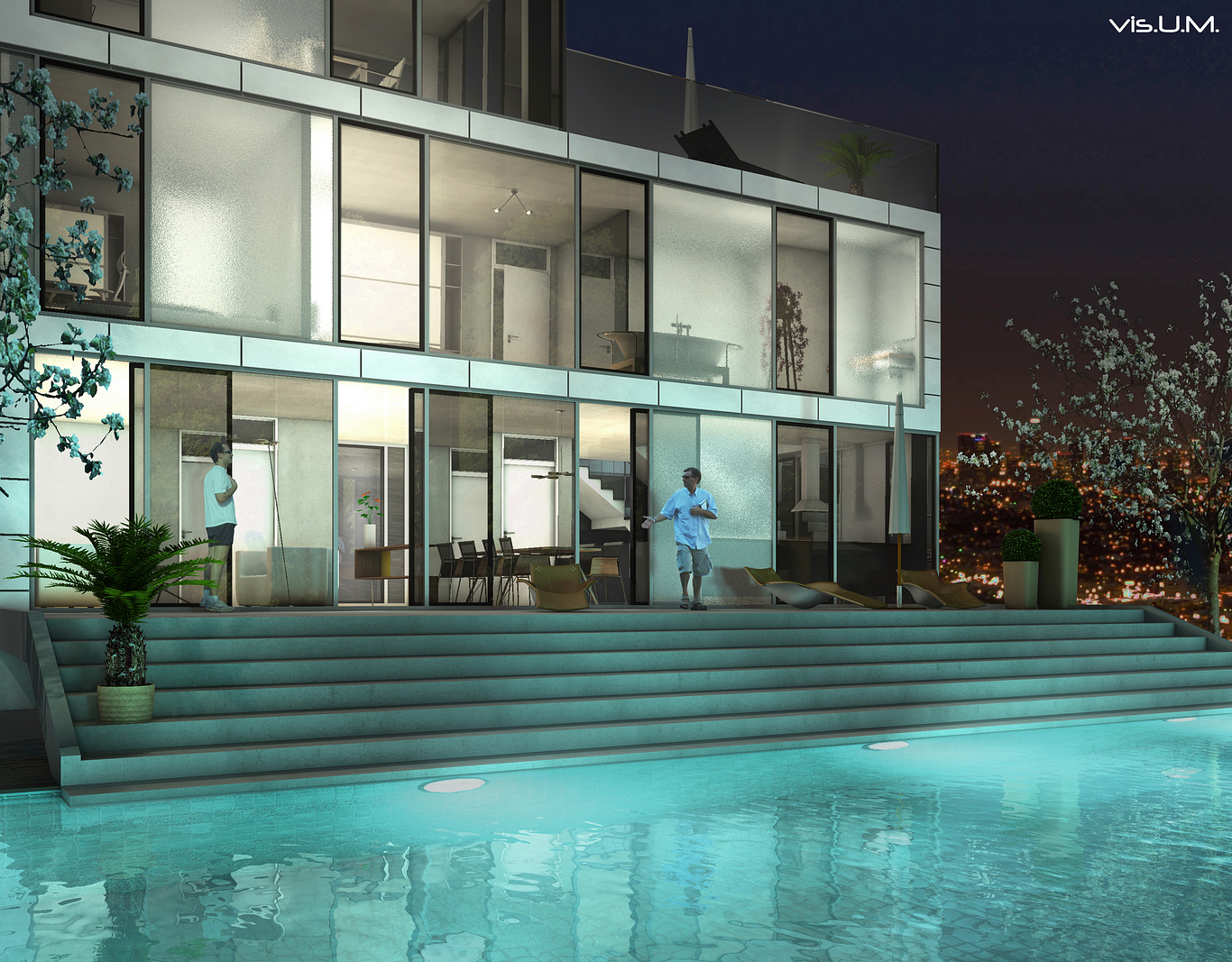
What I see is the back plate (the sky image) has an area on the right side with warm colors and small bright spots. These sort of jump forward and take attention from the important part of the image - the pool and house. Try to look at this rendering as if you haven't seen it before and notice what your eye goes to first.
U
Ulrich Mueller
Report Abuse
thank you very much guys.....
Needs a different back plate..... Can you give me an example please?
Thank you

neil poppleton
Report Abuse
Needs a different back plate
E
Elamos
Report Abuse
Nice! I like the colors...
U
Ulrich Mueller
Report Abuse
looks like the guy on the left is singing the national anthem, and the guy on the right is doing a waltz.......
Hahahaha... thats what they are really doing..... no you´re so right.... nice comment thank you...

marius erasmus
Report Abuse
Its nice, but the shot feels a bit squeezed in. And the people arent doin it justice, looks like the guy on the left is singing the national anthem, and the guy on the right is doing a waltz.
T
Tempest1295
Report Abuse
I do agree with Tron about warming up the interior more, but overall I like it.
John
.

Athanasios Karampitsakos
Report Abuse
Nice image Ulrich. I like it.

Antoine Desjardins
Report Abuse
I like the materials. Things to improve:
- I think it might make the composition more interesting if you take the interior lights to somewhere between 3,000-3,500K to warm up the interior slightly. It would also create some contrast to the very blue exterior environment (caused by the very realistically rendered pool and associated lights).
-Could try a slight desaturate in post as well as it looks slightly oversaturated.
-Lose the obscured tree on the left and use different characters as they are too low resolution and look blatently photoshopped.
-Also, increase the AA samples... lots of jagged edges here.

