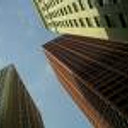
Medical Tower
You must be logged in to post a comment. Login here.

Rahat Amin Chowdhury
Report Abuse
100% agree with Jonathan and Neil.....look at the street....it's pretty well lit......but the building itself is getting bogged down only because it's missing the life of light.......try to upload the larger version of the render.......this will help us understand the details much more easily......:)
Again....i must say - it's a great light apart from the lighting issue!

neil poppleton
Report Abuse
Looks like a great shot, but too dark for my viewing.

Jonathan Sanchez
Report Abuse
Devin, from what I could tell, the image looks real nice man!!! I have to agree with Brian though, if you light up the bldg some from the inside, it would bring more attention to it.
Wish you'd post a bigger version.. this one is so small in my 1080p resolution

Brian Campbell
Report Abuse
While I enjoy using color lens to envoke a mood in renderings, I think you could really take advantage of the exterior being a cool color by developing the interior lighting being warm. Inviting and lively. You could high light the entry way of the building (at this moment its really hard to tell where it located) plus it really help draw the users eye via color theory (drawing the eye from cool to warm colors) and draw the eye by contrast levels.

Dmitry Golikov
Report Abuse
[COLOR=#000]Very interesting picture but very [COLOR=#000]gloomy[/COLOR][/COLOR]

sudheer sreedharan
Report Abuse
Very nice... view

