House design 1600m2 - The Second floor
You must be logged in to post a comment. Login here.
T
Tempest1295
Report Abuse
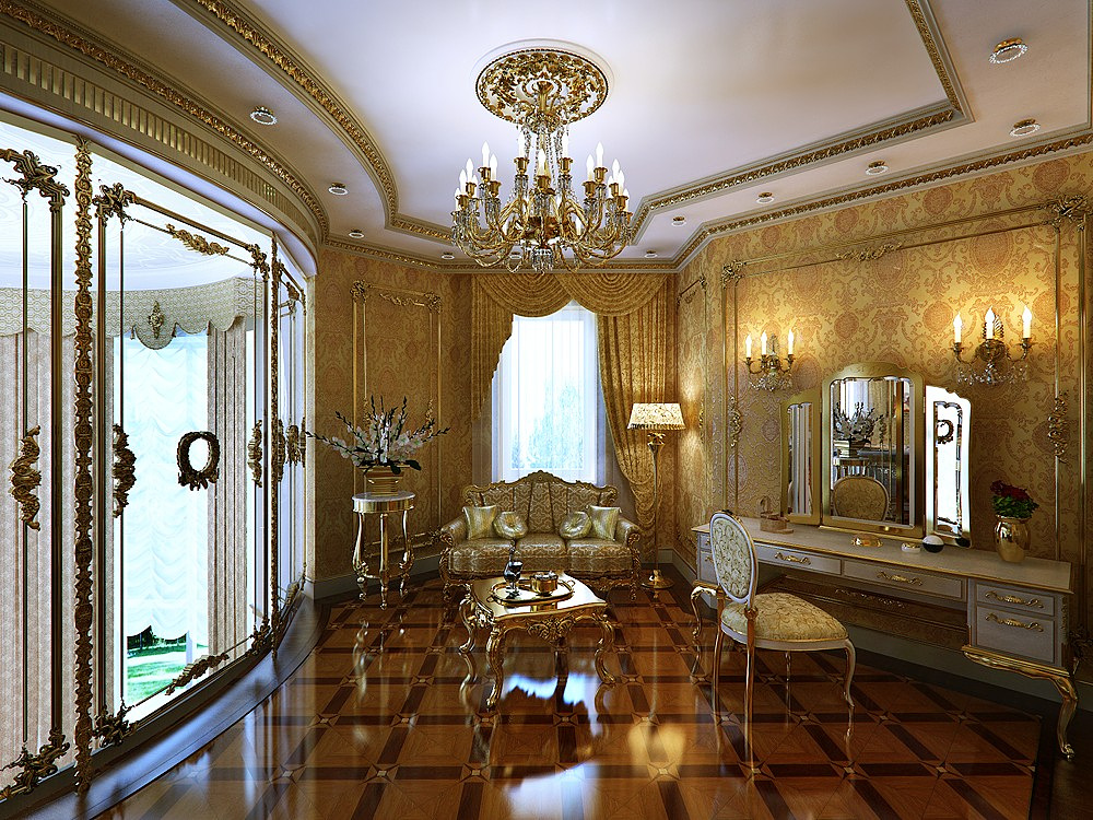
Love the details and the textures. For me, my eye wasn't drawn to window in the background, but to the window like area to the left. Of the attached Thumbnails, I like the middle one the most. Found my eyes wandering all around that scene after first looking at the plant.

Tyson Junkers
Report Abuse
Agree. The details everywhere are beautiful but it's too much of the same color and style. Everything seems to blend together and my eye is drawn to the window in the middle rather than any piece of furniture. I'd try changing the outer pillows on the couch's color to something like white as well as add something on the vanity stand like a fancy coffee cup in possible a white with gold trim so they stand out and draw your eye around the room

Arnold Sher
Report Abuse
Great detail although interiors are distasteful in my opinion. Russian oligarchs pretending to czars..:)) From technical point of view the timber floors are little bit too polished for my liking and therefore looking plastic but i guess that would be nitpicking. Well done on the detailing side!

