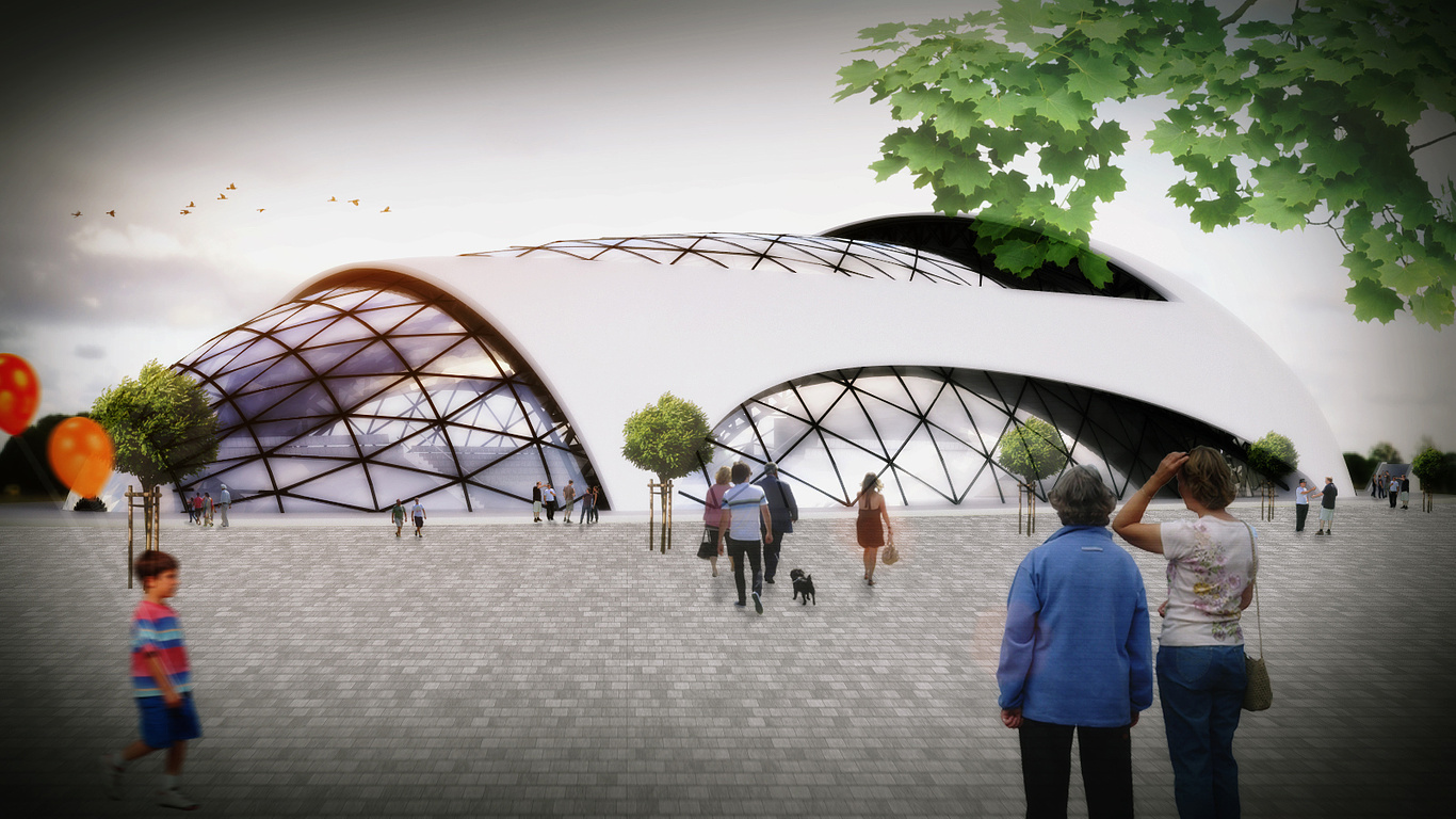
Sports hall and leisure centre
You must be logged in to post a comment. Login here.

Elijah B.
Report Abuse
The modeling is beautiful. I think the two trees in the middle should be less transparent or just remove them all together. They make the building look less real. Vignetting is okay but I think it looks better with the evening shot. The sky should be more blue if you are going to do this because my eye is drawn to the dark edges with the sky being so pale. Overall nice composition though.
l
lubo antol
Report Abuse
I appreciate it THX bro, one qestion , what should i do to make it more dramatic, or better look of the image.

