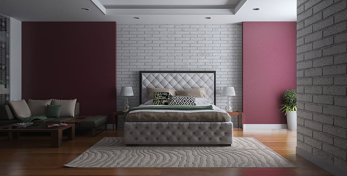
Small Apartment-Visualization
You must be logged in to post a comment. Login here.

Gaurav 3d
Report Abuse
Thnks S.GRu :)
S
S. Gru.
Report Abuse
i really like the image's contrast, especially in the corner with the white pillows. contrast as opposed to being washed out or flat. also like the sharpness of the image. good presentation.
i don't know if i like the brick/block. they seem large and the bumps on the bricks are similar too the bumps on the grout.
the rug is great also, again in the sharpness and in the contrast showing the linear pattern and the well defined raised areas. good job!

