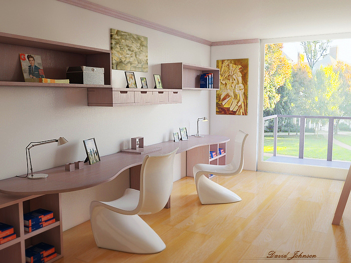
Dorm Room
You must be logged in to post a comment. Login here.
E
Edwin Jordan
Report Abuse
I would add some variety to the book cover and size. Since they are all the same my eye goes straight to them. The books on the far top shelf have a size variety but are also the same cover and everyone else
D
David Johnson
Report Abuse
I can ser what u mean by the orange being too saturated. I did that in photoshop to help it look more like its sunrise. On my next day of ill work on varying the book textures and post an updated render!
A
Arshad Khan
Report Abuse
Its pretty cool as it is..but maybe some directional sunlight pouring in,some use of DOF will make it more realistic.

Justin Hunt
Report Abuse
The pink and orange colour scheme isn't doing it for me, the orange it too saturated and the pink too muddy.
had a little play, hope you dont mind
jhv
A
Abel Vargas
Report Abuse
Hey, nice render. The direct sun light made it even better. Two things caught my eyes, the image on the background looks a little too low res and the books with the blue and orange texture looks a little repetitive, in texture and position. But maybe it's what you're looking for, so I'm not sure if that's something to change.
I think your window is looking very nice and the textures a right on! Great work!
D
David Johnson
Report Abuse
I took your suggestion and added the sun!
I do think it looks better, and I also made a few minor additions you might notice.
Let me know how it looks and anything else I can work on!
Thanks again!
S
Satish Jogi
Report Abuse
I think it looks quite good as it is, but for the sake of getting better renders, maybe you can try adding direct sunlight? I think it might help connect the exterior to interior, the shadows from the balcony railings...

