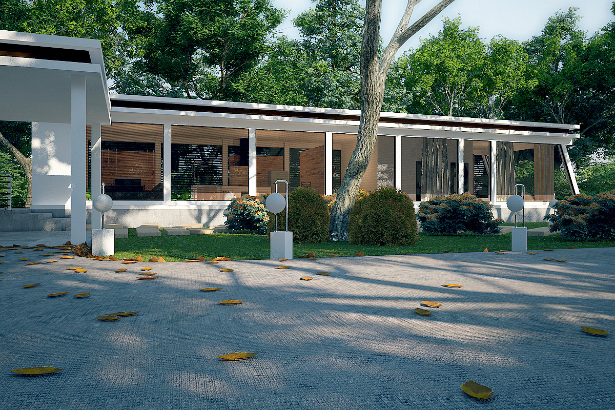
My first Exterior need advices
You must be logged in to post a comment. Login here.
K
Ko Thu
Report Abuse
Thank for all of your helps friends. i will render with some dof next time.

Abdullah
Report Abuse
Looks like you worked on passes too much. I see pixllation in the corner of almost each elements. This is what happen when you work on Object ID passes. :)
D
David Johnson
Report Abuse
This looks killer!
I think the leaves look great as they are; the radial blur or whatever you did helps keep the center of the image focused and the leaves not so much. With that said, it makes it easier to tell the tree in the front yard is an image and the house doesn't blend in toooo well with the background. I really wouldn't know how to improve that though. But awesome job!!
K
Ko Thu
Report Abuse
thanks bro. i will be careful next time.
K
Ko Thu
Report Abuse
Thanks bro, next time i will be careful.

Bruce Hart
Report Abuse
Hi Kothu,
it's a nice image - but the first thing my eye is drawn to is the leaves in the foreground. They seem too large and uniformly shaped. Good work on the background foliage. You could possibly crop the image or raise the camera target slightly so there is not as much emphasis on the driveway.

