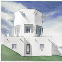
Nursing Home competition rendering
You must be logged in to post a comment. Login here.

bartek stanczak
Report Abuse
stunning work ! all renders should be like this. thumbs up!
D
David Arbogast
Report Abuse
Wow, this is great!

Pesquet Matthieu
Report Abuse
steyin>> thanks, well wich kind of sky would you switch with ? i m quite happy with this one..simple, light...with lines that contrast with the "organic" shapes of the whole vegetation surrounding the project..
John Dollus>> thank you, it seems this guy walking is kind of disturbing yes, anyway, he is no really walking at the top of the hill, but further the camera, following the red stones wall that goes on the left..
unfortunately thats not a typical nursing home, but this one is particularly well designed..good work from the architects !!

John Dollus
Report Abuse
i like this one a lot though i agree about the man on the left at the top of the hill. It just looks as though he should be pushed back a bit from the top and the lady in black along the base disappears in the dark glass somewhat. Very nice image overall.
on another note, if that's a typical nursing home in france, I'll be changing my citizenship. I've visited a few here in the US and there's no comparison.

Paul Sebastian
Report Abuse
I'd switch out the chem/contrail sky with another. Other than that it looks really nice.

Abdullah
Report Abuse
Quite fast. ;)

Pesquet Matthieu
Report Abuse
thank you all for your kind words!
about the environment, i was supposed to composite the rendering with backplate from photos of the real site, but it turned out complicated as the site is still totally populated by trees and rough vegetation actually. On the other side, the site has a quite important slope where the building sites in, and it would be hard/impossible to composite rendering on random landscape photo...at least without spending hours or days looking for photos that could fit the environment supposed to be surrounding this project (even not talking about flexibility given by 3d/multimatte techniques for playing with color variation of the foliage).
Inxa>> rendered on i7 950 @3.5Ghz, it took less than 4hours 4000pixel wide.
G
Girish D Joshi
Report Abuse
Nice render - the humans :P really. What machine you rendering on. Those trees would have taken a lot of time.

muck mews
Report Abuse
thank you for sharing another breathtaking scene!
~cheers mate!

Aubrey Millard
Report Abuse
Nice renders!
Love the landscaping.
R
Robert Shelton
Report Abuse
Very Nice love the colors.

Michael J. Brown
Report Abuse
Your command of environment really helps the architecture stand out in this piece. Great work.
J
Joseph Skowron
Report Abuse
Really nice images. The trees turned out great.

marius erasmus
Report Abuse
great atmosphere with colour.

Abdullah
Report Abuse
The people in the most left image looks as if he is about to fall down. he should be removed. rendering was awesome. grade A render.

