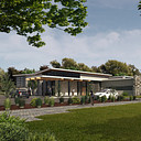
Small Admin Office Building
You must be logged in to post a comment. Login here.
D
DanielDoerksen
Report Abuse
just some things both me, the tall gras in the landscaped area, look a bit flat and blurry, and dont really fit in. and the stone has to much contrast. overall i tihnk theres alot of good in this image, the trees at the top of the image may be a bit intrusive. id kinda like to see a tall sky in this image. but thats imo, and the altima on the left the blakc paint needs a higher gloss value

TheAllusionisst
Report Abuse
Thanks for the input. Production work typically has lots of areas for improvement, but in the eleventh hour you are just trying to get something presentable out the door. Thanks for commenting on specific areas.

Hao La
Report Abuse
Composition is good but I think the image needs more contrast. Right now, it is hard to feel the energy of the sunlight in the image. Even the sky needs to be brighter and bluer to add more color into the rendering. Some shrubs need a little color correction and shadow painting to blend in with the rest of the image.

TheAllusionisst
Report Abuse
Tell me what you really think! ;)
a
abhishek jain
Report Abuse
Overaal image is so dull

TheAllusionisst
Report Abuse
Nope, the asphalt parking terminates at the landscaped area with no curb for cost savings. Car is parked in a stall adjacent to planting area.
T
Tempest1295
Report Abuse
Nice render, do have a question though. The white vehicle in the center, is it parked in the dirt path? The building and the people look cool.

