Bathroom
You must be logged in to post a comment. Login here.

Kiiza TF
Report Abuse
Thanks Marti, appreciate the feedback. Will adjust accordingly.
M
Marti Zanden
Report Abuse
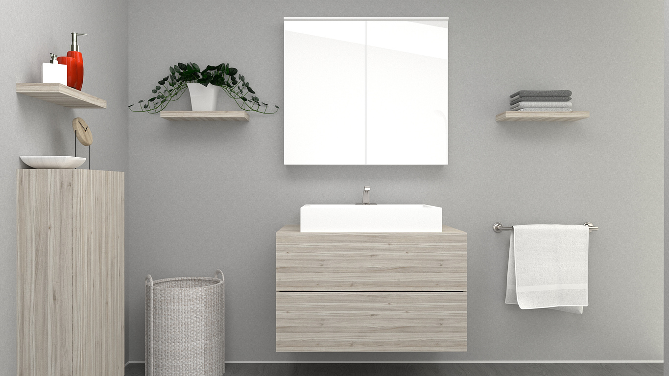
You're of to a good start but you got to work on your lighting. It looks a bit dull and flat. Maybe go with a stronger light coming from the right to give some harder shadows resulting in more contrast. Also work on your set dressing because that is a bit boring right now. Check for instance Pinterest for some inspiration.
Also make the ceramic sink a little less white. It's way too white right now.
Lastly I would change the image aspect ratio from landscape into portrait. I think that will improve the composition alot.
But like I said you're of to a good start. Just keep working on it and you will get there.

