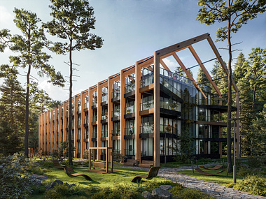
We are happy to share with you our new work! We have been cooperating with our client Gensler on several projects and are so glad to start a new one. This time we visualize a huge business centre for Gensler. The client expressed their idea of the project vision clearly, that is why we were on the same page since the very beginning of our cooperation.
All the sides of this office tower are totally glazed, making us feel an extensive space inside and outside of the complex. The interior is free of details, but the exterior in contrast performs an ornate mixture of glass, concrete, metal and wood. We can surely call such an architectural structure as modern successor of brutalism. Furthermore, our main goal in this project is a detailed design of the surroundings. We have made several different views of the facility to show how it could look unique from disparate sites and angles.
MORE PROJECTS ON: https://omegarender.com/gallery
This visualization sets an example of a non-standard workflow. It’s always necessary to follow the workflow and develop it in accordance with the deadlines specified by the client, especially when the project is ambitious. Since high quality and photorealism is our primary aim in delivering projects and we worked to a very tight schedule, we reached agreement with the client on the reduced workflow. The client’s clear vision of the project and a full understanding of the NC presentation’s angles let us skip the clay renders. Therefore, we started from the second stage working with the preview in colors, moving on from the round of revision to the preview session in order to produce perfect pictures in the end that would completely satisfy the client. Working under challenging conditions we did our best to meet the client’s expectations at its finest.
We had two rounds of revision before the final version. At the request of the client we made the space more comfortable and friendly by adding more light, green spots and working with the landscape. We also wanted to show how some elements of the environment are suitable for interaction. For example, a person sitting on the step of the leader in one of the interior pictures.
It is also important to highlight the interior, especially the huge mirror and glazed wall, behind which one can observe absolutely delightful and multi-level open space. It is extremely hard to visualize such an element, because the glass should not look cartoonish. Therefore, the indoor environment is finely developed to the smallest detail that implies scrupulousness.
One of the client’s specific requirements was to add fog on one of the visualizations. The vapor on the water gives the sense of tranquility and belonging of man to nature. Furthermore, the presence of the fog creates the feeling of extra volume both to the environment and to the object itself. This effect is a consequence of the vapor making the boundaries of the building more visible with its surroundings.
Moreover, we worked together with the client to find appropriate images of people. It was important to select fashionable, smart and neat young people, who will reflect the atmosphere and status of the place.
THANK YOU FOR WATCHING!
Please, give your feedback in the comments
