MoGamma - http://mogamma.com.au/
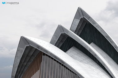
I'm pretty happy with the styling, mood and composition - I think its almost there except its still feeling a bit 'gamey' but I cant quite put my finger on why. I was going to add some subtle post effects like some subtle blooms, depth of field and a pinch of chromatic aberation... Any other thoughts on this?
Also, the irradiance solution is a little splotchy at this stage, will be fixed at final render time.
Would love to get feedback on anything and everything!
Thanks
