Articles
Insights gained over 20 years of experience in 3D rendering
In this article, our studio's founder, Artem, shares insights gained over 20 years of experience in 3D rendering. The goal is to help you streamline your rendering process, speed up your workflow, reduce client revisions, and increase satisfaction with both the process and the results. Essentially, it’s about providing you with a system that works.
Focus on the Main Subject
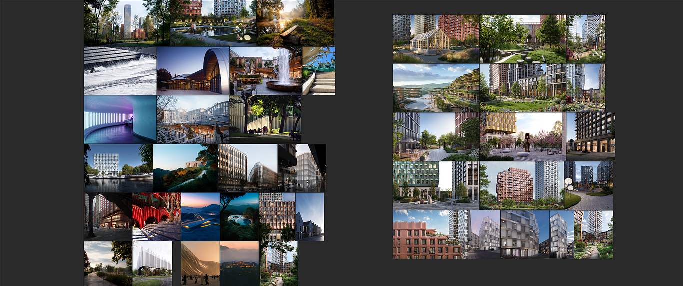
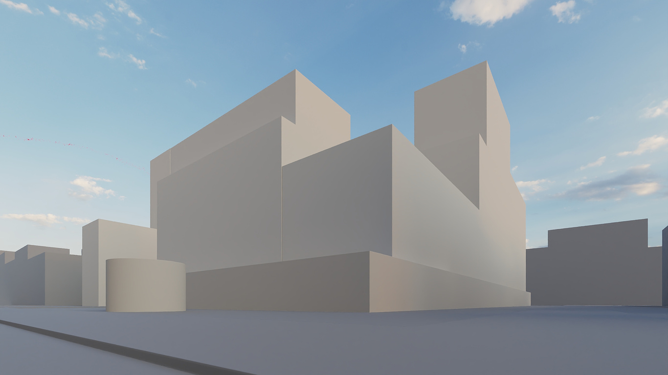
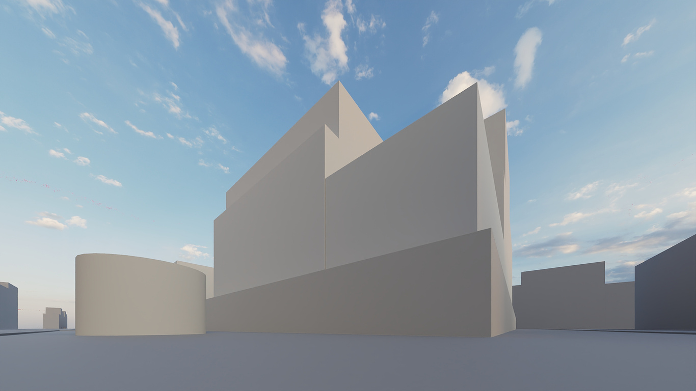
Let's start with an important question: What is the main subject in the frame? Compare the first and second sets of renders—likely, you prefer the first set. But why is that? Let’s break it down.
Focus on the Main Subject
Let's start with an important question: What is the main subject in the frame? Compare the first and second sets of renders—likely, you prefer the first set. But why is that? Let’s break it down.
1. A good angle begins with a clear understanding of your shot’s purpose—focusing on a specific, often small part of your image, with the rest serving as a backdrop to highlight the main subject.
Key Tip: Choose exactly what you are rendering. Whether it's a pair of windows on a facade, a playground framed by landscaping with architecture in the background, or a pond nestled in a garden, the angle must focus on one main subject. If you try to include everything, the result will be mediocre—a work that might still get paid but won't elevate the quality of your portfolio or your pay.
Key Tip: Choose exactly what you are rendering. Whether it's a pair of windows on a facade, a playground framed by landscaping with architecture in the background, or a pond nestled in a garden, the angle must focus on one main subject. If you try to include everything, the result will be mediocre—a work that might still get paid but won't elevate the quality of your portfolio or your pay.




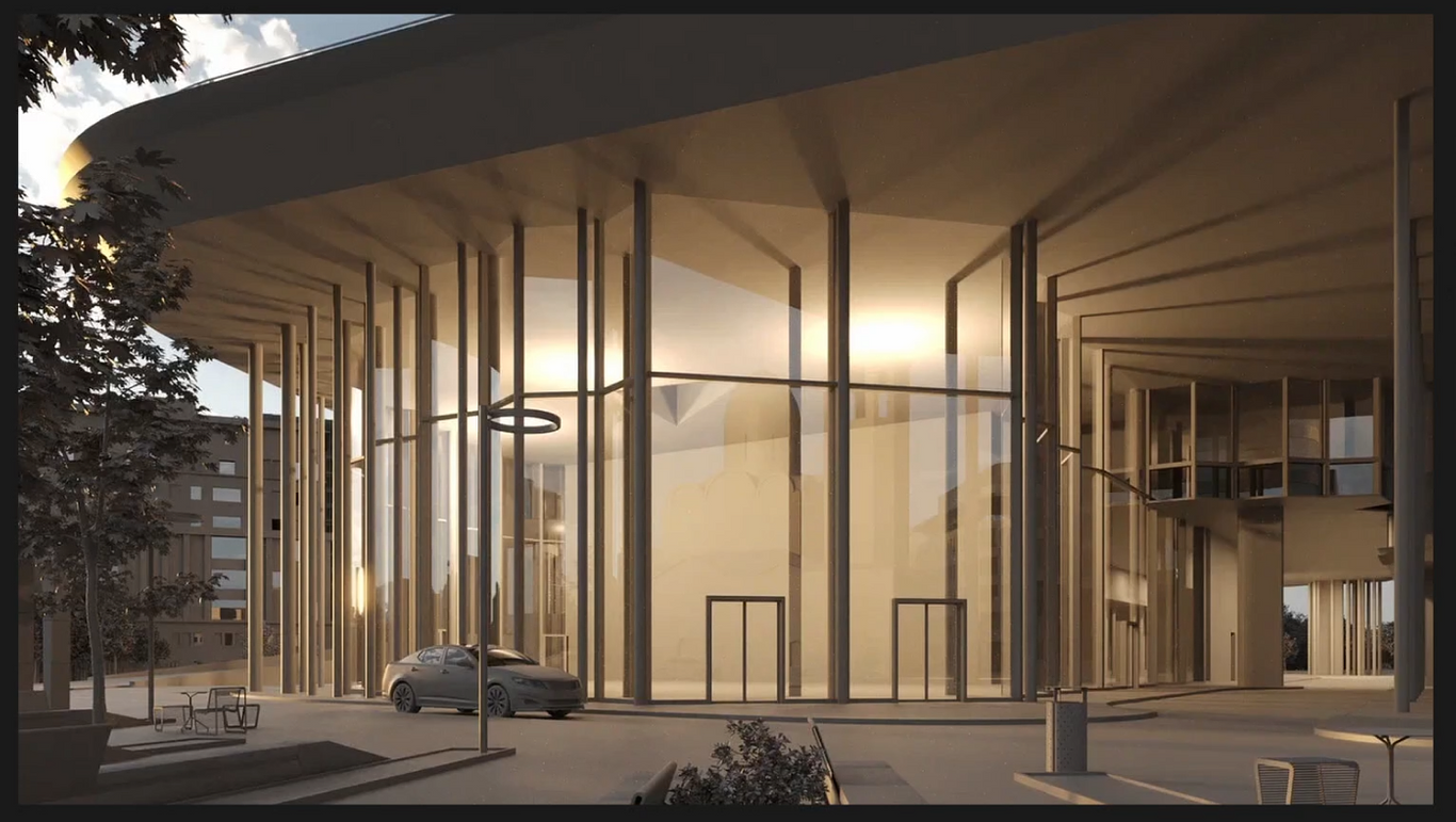
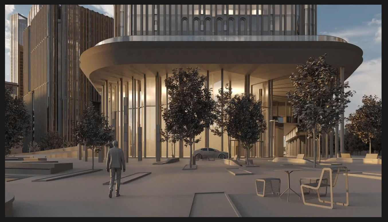
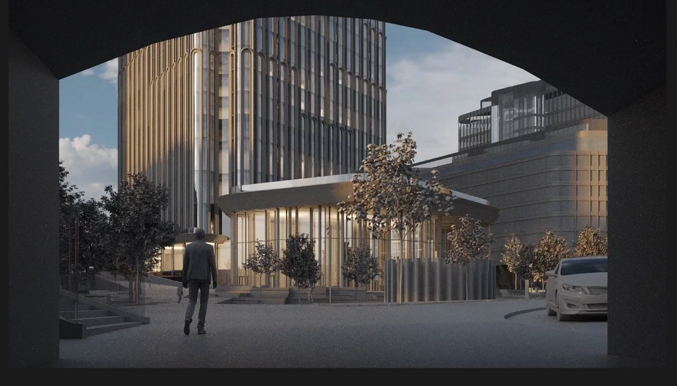
2. Smoothness in Composition. After identifying your main subject, establish the foreground and background. Typically, the main subject should be in the midground, as we aren't accustomed to viewing things too closely. For example, consider a shot with a clear foreground, midground, and background. The foreground should occupy a significant portion of the frame, while your main subject, though detailed, should take up about 1/5 of the space. Despite the focus on the main subject, ensure there is a substantial foreground. Consider how the perception of an image changes when you add a well-composed foreground, and compare it to what happens when the foreground is removed.
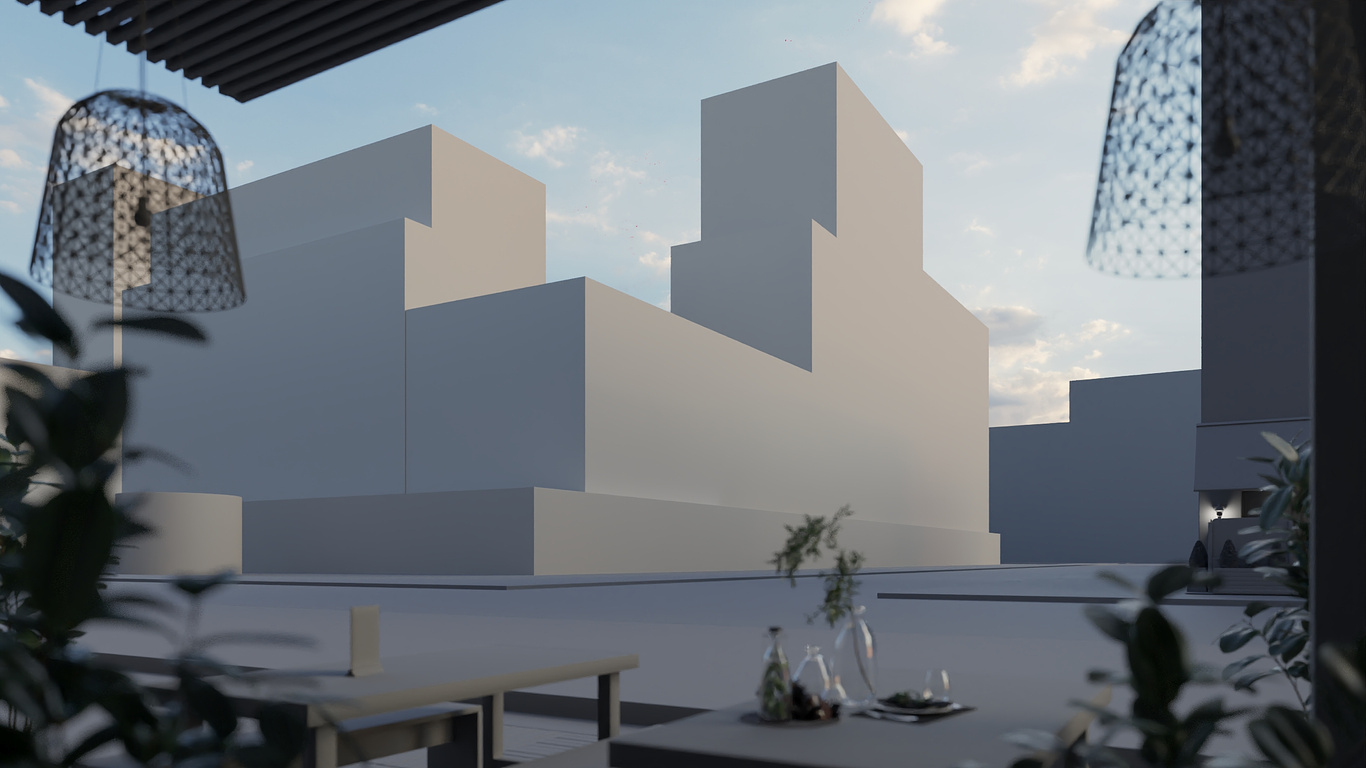
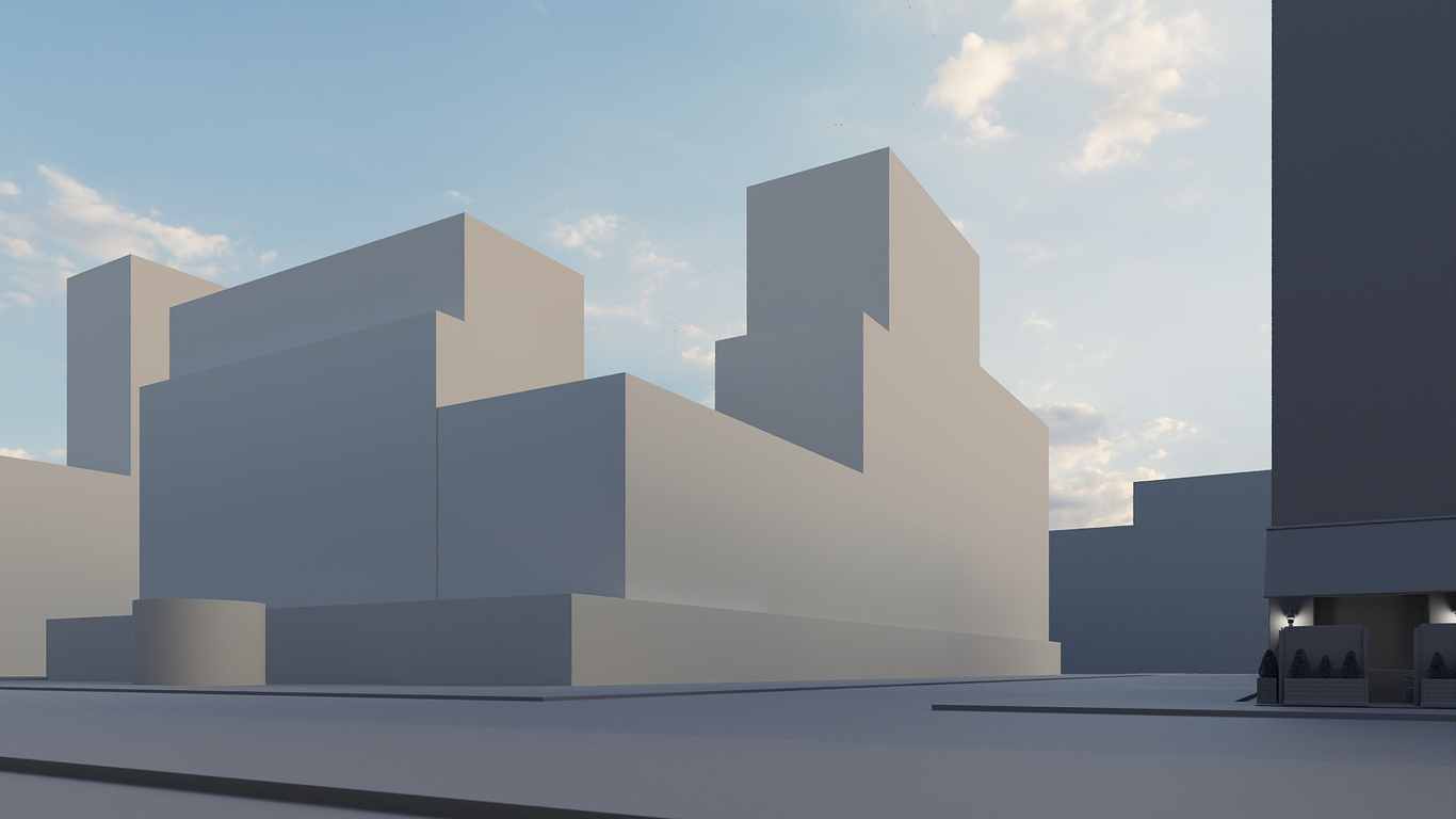


3. Composition. With your subject and perspective decided, it's time to create a cohesive composition. Don’t hesitate to step back and take a broader view—this often reveals interesting elements in the foreground. To simplify the image, separate objects along different planes and lines. A good composition is dynamic, but it benefits from careful adjustments.
Advice: Simplify the brain’s task by separating objects and ensuring even at a small size, the image clearly communicates what the main subject is. Your composition should always support your main subject.
Advice: Simplify the brain’s task by separating objects and ensuring even at a small size, the image clearly communicates what the main subject is. Your composition should always support your main subject.
4. Attention to Surroundings. Your main subject will rarely occupy more than 1/5 of the frame; the rest will be the surroundings. These surroundings should be detailed and lively, yet not too contrasting. The most contrasting element should always be your main subject.
5. Enhancing Frame Dynamics. Now that we’ve considered the subject and composition, let’s discuss frame dynamics. Good static composition is better than poorly executed dynamics. If your image has nearly horizontal lines, make them perfectly horizontal. Symmetry is preferable to weak dynamics—but if you want dynamics, enhance them effectively.
5. Enhancing Frame Dynamics. Now that we’ve considered the subject and composition, let’s discuss frame dynamics. Good static composition is better than poorly executed dynamics. If your image has nearly horizontal lines, make them perfectly horizontal. Symmetry is preferable to weak dynamics—but if you want dynamics, enhance them effectively.
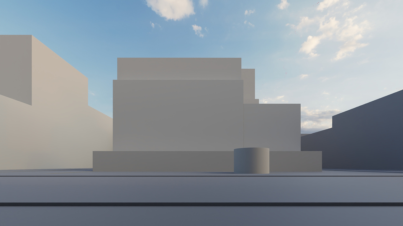
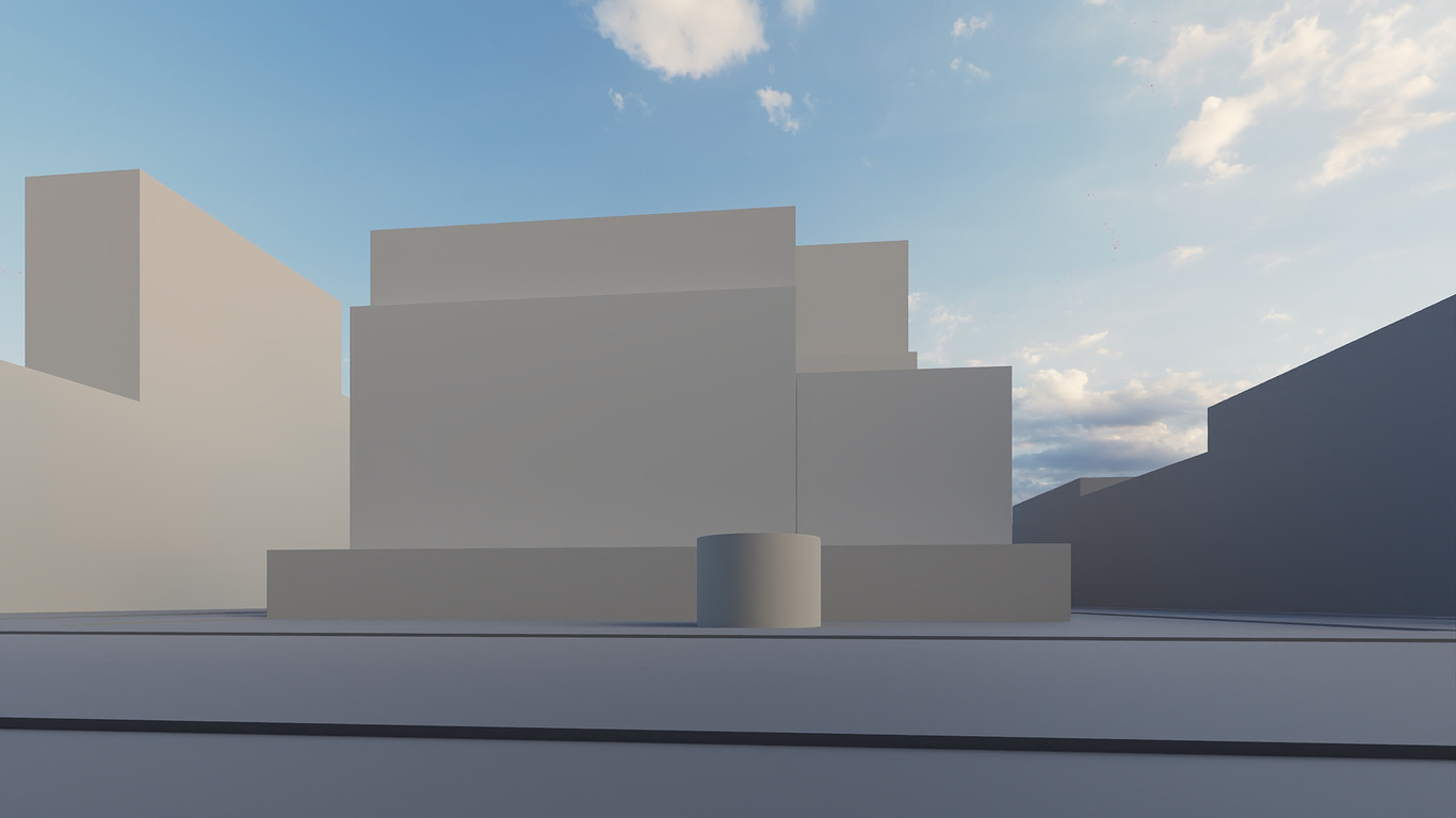
For instance, the angle of your camera can greatly impact dynamics. A wide camera angle creates sharp vanishing points, adding high dynamics to the image, which isn’t always desirable. Balance is key.
6. Using Leading Lines. Leading lines are another crucial aspect of composition. They guide the viewer's eye through the image. These lines can be anything—a path, a branch, the direction of a person's gaze, or even cloud formations. Ensure all lines guide the viewer toward the main subject.
7. Lighting. With your angle set, lighting is the next critical element. The lighting should always support your main subject. It’s the best tool for defining the shape and separating your subject from the background. Ideally, the foreground is darkest, the background lightest, and both less contrasting than the midground.
Tip: Lighting should outline the shape of your main subject without flooding it with light. In most cases, position the sun about 90 degrees from your viewpoint. Adjust the lighting by turning off the sky initially, focusing on the sunlight, and then turning the sky back on.
Recommendation: to set up lighting, use the Moso Quick Environment plugin.
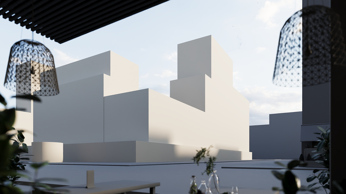
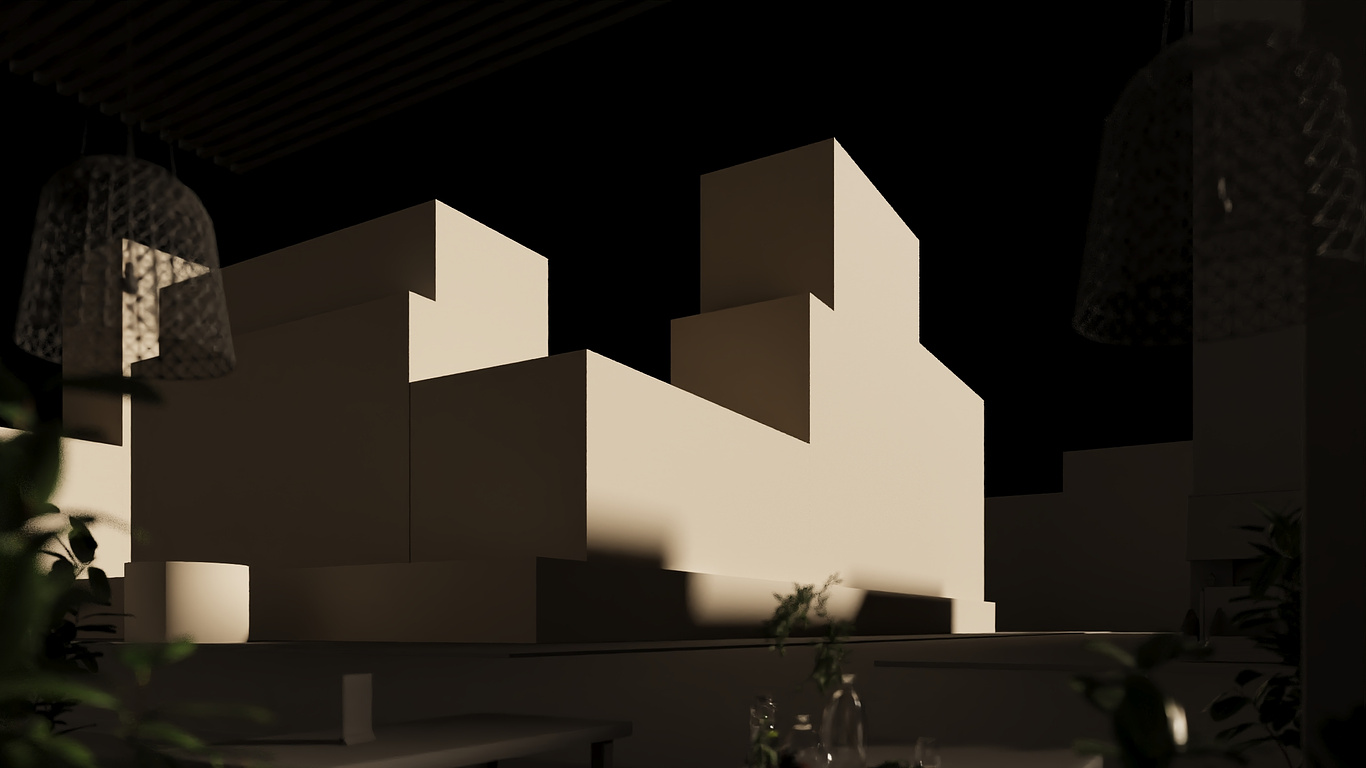
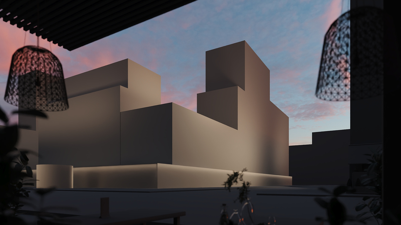
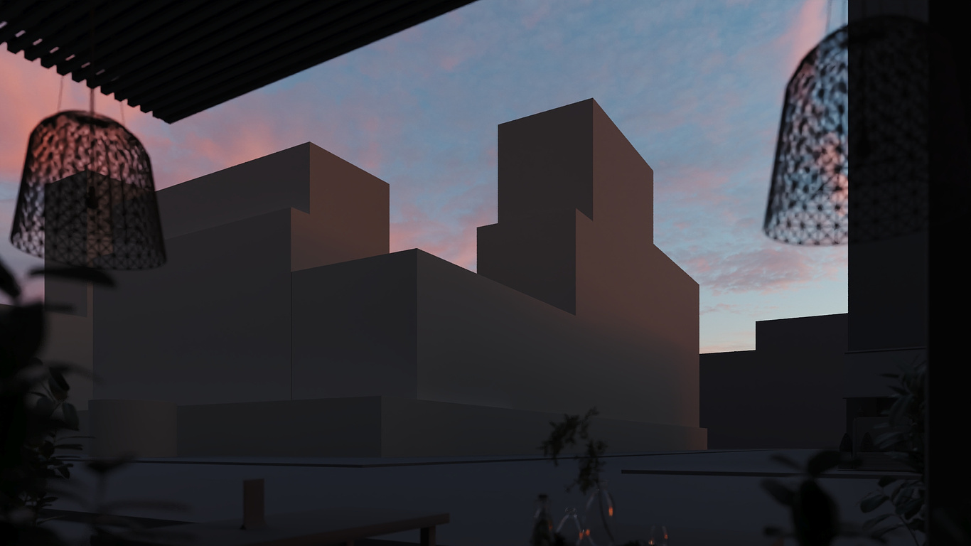
8. Contrast and Tone Mapping. A critical factor that determines whether your image stands out is contrast. High contrast should be reserved for the areas you want the viewer to focus on. Keep the foreground and background low in contrast to ensure the main subject stands out.
9. Final Refinements. Lastly, your image should look impressive even at a small size. You should immediately see the main subject, the contrast, and the shape of objects. This gives you a solid foundation for further refinements, ensuring the image is easy for the viewer’s brain to process and visually appealing at any scale.
Summary
In conclusion, the goal is to make your renders easy for the viewer’s brain to process and ensure they look great even at a very small size. This system not only improves the quality of your work but also enhances your satisfaction with the process and the final result.
You must be logged in to post a comment. Login here.
About this article
About: 1. Focus on the Main Subject 2. Smoothness in Composition 3. Composition 4. Attention to Surroundings 5. Enhancing Frame Dynamics 6. Using Leading Lines 7. Lighting 8. Contrast and Tone Mapping 9. Final Refinements Mail: hello@vis-on.studio
visibility537
favorite_border2
mode_comment0


